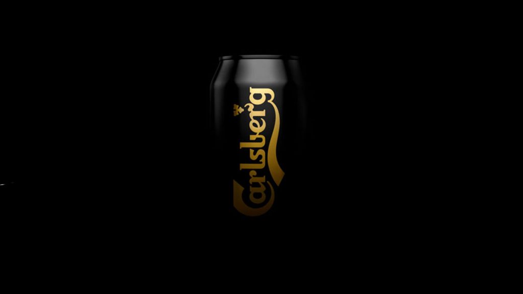
Denmark-based studio Kontrapunkt has redesigned the packaging for Carlsberg’s Black Gold pilsner.
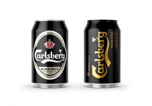
The new packaging nods to the brand’s historic Black Gold bottles, with more saturated black and golden colours than the previous design. Kontrapunkt has also added a black top cap to the packaging to help the beer stand out on the shelves.
“From the cool cat of beers to an overlooked lager in the Carlsberg range, Black Gold needed a facelift to revive its relevance,” revealed Kontrapunkt on their site.
“Paying homage to the historic Black Gold bottles, we designed a darker than dark can that reflects the bold and more full-bodied pilsner experience.”
Black Gold is in family with Carlsberg’s regular pilsner but has a slightly higher alcohol percentage and a more intense and sincere flavour.

“As the alpha male of the Carlsberg portfolio, we saturated the black and golden colours to dial up the contrast and give the design the richness of the beer itself,” added the design house.
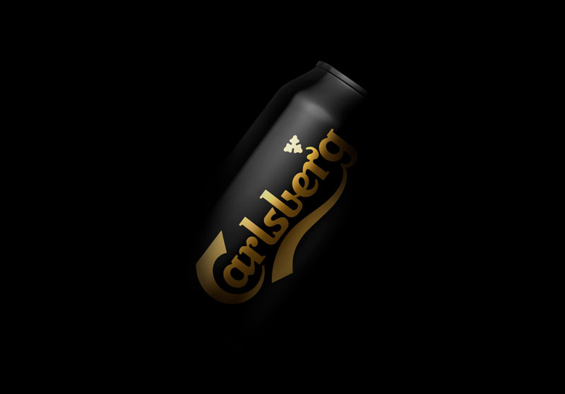
The new Black Gold design hit the shelves in the last week of June – right in time for the Danish summer.
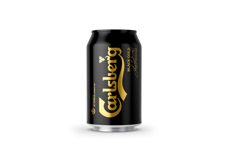
Source: Kontrapunkt

You must be logged in to post a comment Login