
Mortlach is a Scottish whisky with an impressive heritage and cult status amongst collectors. Looking more like a Cognac than a credible whisky, the previous packaging design failed to capture its brand story with its subtle screen-printed graphics that were lost in a dark bar or on the retail shelf. It was consequently in fast decline.
Co-Partnership’s task was to rebrand Mortlach with a distinctive look and feel to match its story of engineering heritage and its unique 2.81 distillation method.
As the first licensed distillery in Dufftown, Mortlach drew upon time- honoured techniques and the pure highland waters to produce a rugged spirit of regional renown.
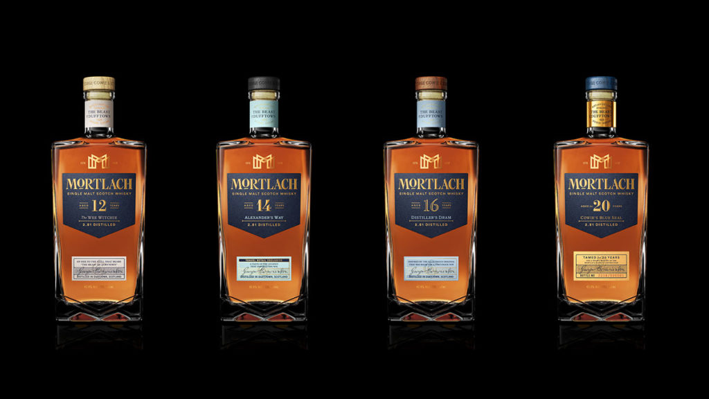
Big, bold and uncompromising, this robust whisky was not for the faint of hearted. Created with a ‘beautifully intricate’ 2.81 x distillation method devised by Dr Alexander Cowie. This method is still in use today using six stills to distil multiple times to achieve a whisky with a ‘meaty flavour’ earning the title ‘The Beast of Dufftown’.
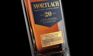
The label shape and layout was informed by the bottle and bottling line restrictions. Working with these constraints the design experts used the notes and blue prints of Cowie’s distilling invention to inspire the brand look and feel.
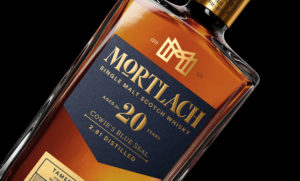
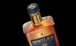
The Mortlach ‘M’ monogram represents of the six unique stills finished in gold foil to give memory to the whisky colour itself. The elevated letter ‘O’ in the Mortlach wordmark is an evolution from the previous logo with the addition of wider serifs to give a ‘beastly’ stance.
“It was important for all the whiskies in the portfolio to have strong design consistency to ensure brand recognition. For this reason, the different whiskies display subtle changes in typography and colour, with increasing use of foil embellishments as the range steps up,” said Co-Partnership.
Source: Co-Partnership
You must be logged in to post a comment Login