Independent, international design agency Cowan London unveils the brand identity and packaging design for Billson’s new range of all natural small-batch sodas – part of a bigger project to rejuvenate one of Australia’s oldest drinks manufacturers.
It was way back in 1865 when Englishman George Billson first started making drinks from the exceptionally pure Alpine spring water rising from the ground at Beechworth, north-east Victoria. They’re still doing it today, making Billson’s one of the longest continuing beverage manufacturers in Australia.
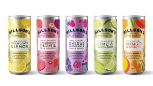
In 2017 new owners came in, inspired by this heritage and eager to breathe new life into the brewery. The new all-natural range of five lightly sparking, 100% natural sodas is made from local fruits and herbs mixed with the pure spring water that still flows from the brewery’s onsite well.

Billson’s Marketing Manager, Julia Vesval, says: “With the launches earlier in 2018 of our classic cordials and sodas we delivered a clear heritage and provenance story to consumers. For the new soda range, we needed Cowan to design packaging that would hit the flavour and natural cues, whilst also making our existing heritage brand story relevant for a contemporary audience.”
These are cans fizzing and popping with fresh, fruity flavours. Contemporary illustrations of the locally-sourced fruits are set against brightly-coloured pearlised backgrounds. The brand leads boldly on pack, supported by the ‘small batch’ message before proudly introducing the unique recipes.
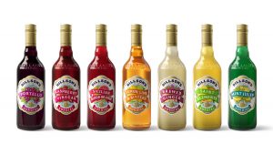
Samantha Dumont, Creative Director at Cowan London, says: “Designing for this new, contemporary range was an interesting challenge and we took a fresh approach, using a clearly differentiated design strategy to set this range apart from the classic ranges. To find inspiration for the classic ranges, we loved rooting around in the 200-year old archives for inspiration – a highlight was discovering an original Raspberry Vinegar label which led us to the fluted oval label and the original AAB trademark.”

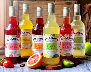
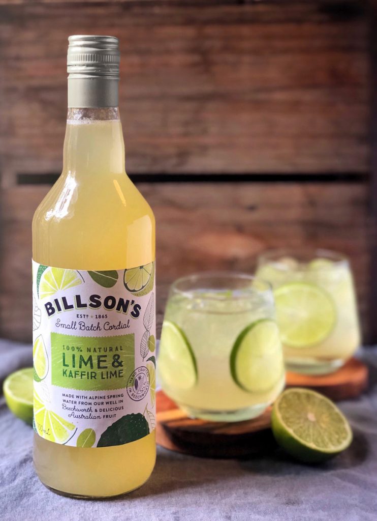
The approach for the classic ranges is clear, with the brandmark now playing a prominent role on the label, and the typography and graphic details developed so they look and feel relevant to today’s consumer. The result is a design which respects the history of the old label, as a quirky interpretation of the original design.
The launch of the all-natural fruit sodas is one part of a remarkable series of launches. 2018 kicked off with the still and sparkling Alpine spring waters, and was soon followed by 15 traditional and six contemporary cordials. Throughout 2019, we will see the brewery roll out tonic waters, beers, ciders, and even gins.
“It’s inspiring to be part of a relaunch happening at such a pace,” says Dumont. “It’s giving us the opportunity to build a varied portfolio of designs, finding fresh ways to convey the rich heritage of this site. But it also requires a very entrepreneurial approach, with us adapting, developing and building the brand through each design.”
The new team at Billson’s has a passion for both the history and future potential of the brewery. Looking ahead, it plans to turn the site into a destination venue for the growing numbers of tourists visiting the historic town of Beechworth, drawn by local wine producers and other ‘foodie’ attractions, including Billson’s.

Vesval concludes: “The Cowan London team has given Billson’s a look that’s as fresh and enticing as the drinks we produce. The Billson’s heritage is hugely important to us so it’s great to see its spirit living on in the new designs, and this lays strong foundations for working together on future product ranges.”
Source: Cowan London

You must be logged in to post a comment Login