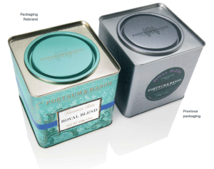
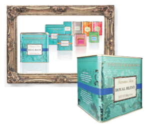
 Fortnum & Mason approached Decide (formerly tdg The Design Group) in the Autum of 2011 to redesign their entire tea range to improve shopper navigation at shelf by effectively communicating the various tea categories in a variety of formats (loose tea and tea bags) in an attractive and engaging manner capitalising on Fortnum & Mason’s heritage and unique brand characteristics.
To create a design that has a unique personality and yet also synergises with the other Fortnum’s food ranges alongside which it appears instore.
The new design features a range of decorative elements which conjure up the ambience of the luxury tea experience for which Fortnum’s is famous and which are inspired by the interior design details of the Diamond Jubilee Tea Salon.
Each of the seven tea ranges and the products contained within are clearly colour coded with the application of highly legible fonts for improved navigation. The additional colour coding applied to the lids of all tins and caddies , and unique complementary decorative elements for each range helps reinforce differentiation.
 The combination of improved variant differentiation via effective colour coding, enhanced product descriptor legibility, the naming of each range and the ‘bamboo’ panel border and ‘flowing’ decorative design on the Famous Teas increase the ability of the range to communicate with, and appeal to, Far Eastern markets.
The Eau de Nil colour (which our research showed to be synonymous with the Fortnum & Mason brand at home and abroad), was applied to the Famous Teas hero range, with the colour also being applied to the lids of the tins to optimise appeal to the global shopper.
In addition, the pattern created for the House Teas hero range was used as inspiration for the design of a specially commissioned range of fine bone china tea set accessories branded as the ‘Georgian Blue’ collection.
The new look rolled out in the Summer of 2013 in UK and Far East.

You must be logged in to post a comment Login