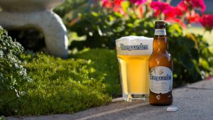
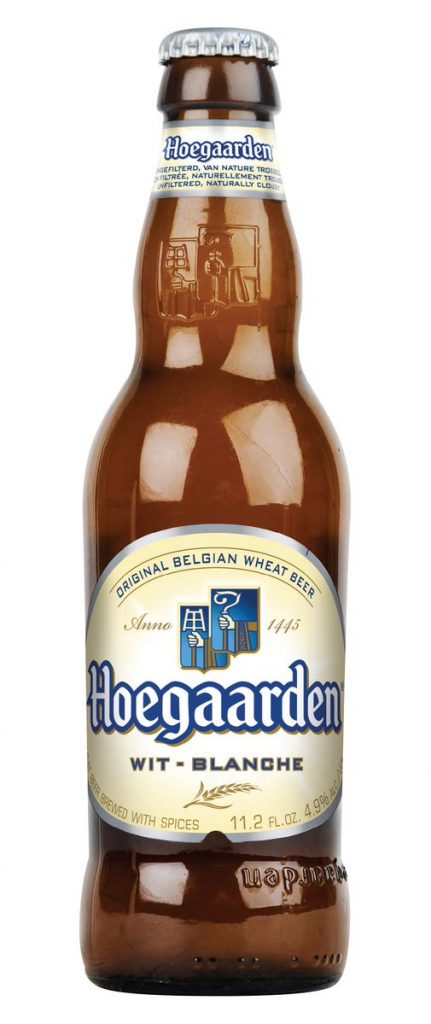
 Hoegaarden, the original Belgian wheat beer, has rolled out refreshed packaging across the on-trade and off-trade in the UK. With its natural ingredients and a nod to its Belgium heritage, the new design features the style’s trademark unique ingredients (wheat, orange peel and coriander seed) in botanical illustrations.
The new packaging brings a more modern take on the brand’s heritage, reflecting how Hoegaarden is as relevant today as when the brewery was established. The white (wit) style was originally produced in the Belgian village of Hoegaarden in 1445, when monks began adding unusual ingredients from The New World to their traditionally sour wheat beer.
 The resulting beer was refreshing and a little sweet with herbaceous and earthy aromas from the coriander and yeast. In fact, Hoegaarden still produces its beers according to its long-standing tradition and closely-guarded recipe in the village of Hoegaarden.
As a result, Hoegaarden is recognized by many experts to be the classic and best expression of the Belgian Wheat style, bringing home a gold medal for Best Belgian Wit in the 2016 World Beer Cup.
“We are thrilled at long last to introduce the brand new Hoegaarden branding to the UK, just in time for summer. Our new ‘clothes’ perfectly reflect our refreshing and unique flavour and the design adds a new, contemporary twist. Summer is our season, where Hoegaarden can be enjoyed on a patio or rooftop, or in the park on a warm, sunny day, so we hope our fans are excited about the new packaging and design,” said Harris Damashek, Global Brand Director of Hoegaarden.
Hoegaarden has refreshed the design on its 330ml, 750ml and 4x330ml bottles in the off-trade and the tap, handle and badge lens design in the on-trade. Against a crisp white matte background, this updated Hoegaarden design is adorned with botanical illustrations inspired by the classical 19th Century Belgian line drawing style.
Source: AB InBev UK

You must be logged in to post a comment Login