
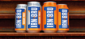
 Irn-Bru’s iconic branding has redesigned to reflect the brand’s rich history while adding a modern twist to its famous girder symbol.
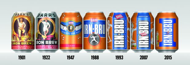
It is only the eighth redesign in the 115-year history AG Barr’s most successful soft drink and has been led by design agency Jones Knowles Ritchie (JKR).
The new Irn-Bru’s cans and bottles see the return of its original strongman, Adam Brown, who featured on the original packing in 1901. JKR have ensured that the brand’s instantly recognisable blue and orange colours, which were first introduce in 1947, have remained as the basis for the redesign.
Discussing the new look Adrian Troy, head of marketing at Irn-Bru, said: “Girders are such a strong part of our heritage, we knew we had to have them front and centre on our packs. The new designs really modernise Irn-Bru but stays true to our roots – Irn-Bru is a brand built on strength and power. The packaging is iconic and stands out and ensures IRN-BRU’s position as Original and Best. We love the new look and we’re excited to see them in stores.”
The new look follows close on the heels of the introduction of the sugar tax which AG Barr summed up as “extremely disappointing”.
In response to the new legislation on sugary drinks and a decline in revenues, the company’s chief executive, Roger White, promised shareholders that it would “substantially” reduce the portfolio’s sugar content, as well as redouble efforts to boost “brand strength” and “consumer-driven innovation.”
You must be logged in to post a comment Login