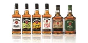
 Jim Beam is aiming to give it’s portfolio of bourbon drinks a more premium feel and has undergone its first ever global packaging redesign.
The Beam Suntory-owned brand said the updated bottle looks to better represent “the premium bourbon inside” and contemporise the Jim Beam brand to appeal to younger drinkers while celebrating its heritage.
The new Jim Beam bottle has a bolder structure with a clean label design, refreshed distiller portraits and a refined ‘rosette’ logo, to tie together the brand’s flavoured product range, which includes Jim Beam Apple, Jim Beam Honey, Jim Beam Maple and Red Stag by Jim Beam.
Meanwhile the Jim Beam Devil’s Cut and Jim Beam Rye bottles feature a more rectangular bottle shape with premium label enhancements, including extra fine detailing, crafted borders and real gold foil finishes.
Janice McIntosh, marketing controller for Imported Whiskey at Maxxium UK, which is rolling out the new packaging, said: “In the UK, Jim Beam is performing strongly with volume sales of the portfolio up 10.2 per cent. The new packaging design comes at the perfect time for the brand as more consumers continue to discover Jim Beam, helping to grow the bourbon category. The new packs support our customers as they take advantage of the bourbon boom and meet shopper demand for premium, quality brands with heritage.”
The new packaging will be available on shelves from April in the UK.
As an ongoing evolution of Jim Beam’s current ‘Make History’ campaign, the premium packaging launch is being supported with in-store point of sale showcasing the upgraded bottles and advertising featuring global brand partner, Mila Kunis.

You must be logged in to post a comment Login