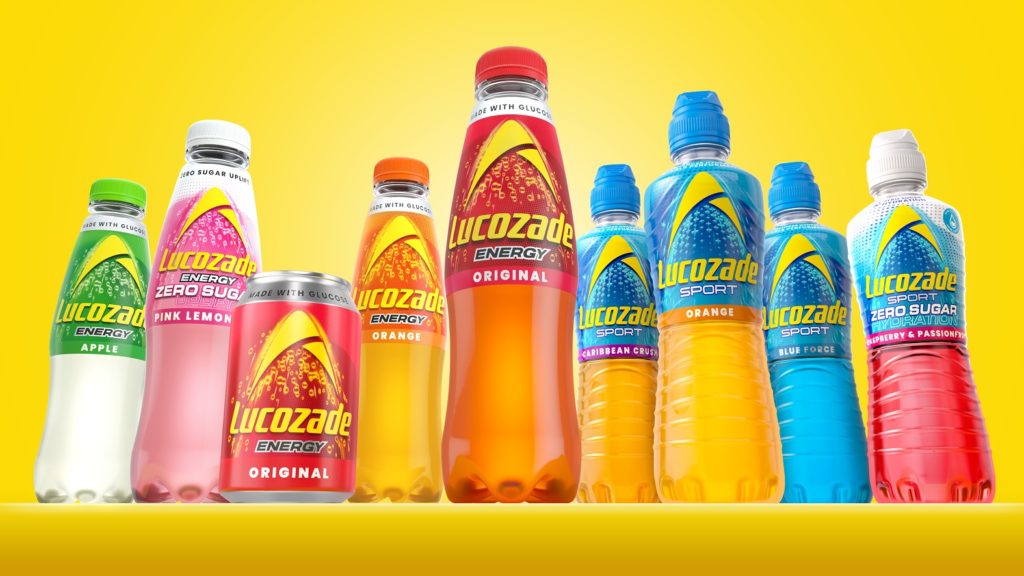
Pearlfisher London today announces a new collaboration for the redesign of Lucozade – a major refresh in its 97 year history, including the creation of Lucozade’s new visual identity and packaging design. The new look consolidates its ranges of Lucozade Energy and Lucozade Sport drinks under a unified masterbrand approach, enhancing its visibility and appeal within a competitive retail landscape and crowded soft drinks sector.

Pearlfisher‘s vision for Lucozade was clear: to create a powerful and cohesive brand presence that resonates with both long-standing fans while also appealing to new shoppers. Strategically, this meant capturing and expressing the inherently vibrant energy and dynamism of Lucozade, and uniting this across every drink in the portfolio through design. With a consistent Lucozade look and feel, it was still important to flex the sub-brands so that the distinct offerings for both Lucozade Energy and Lucozade Sport were clear as part of this overarching narrative.
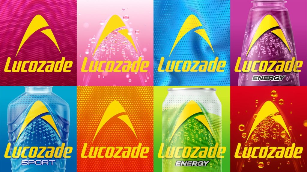
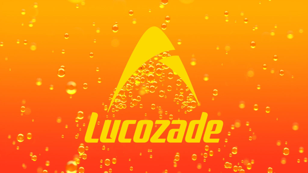
The answer was found in the revitalisation of the iconic Lucozade arc and wordmark. The new design consciously moves away from the vertical Lucozade wordmark, rotating it to lock up and amplify the arc with a burst of bubbles. The arc has been redrawn, modernised and flooded with an optimistic, vibrant yellow. It remains constant and prominent across the portfolio, cementing it even further as the iconic symbol of Lucozade’s positive energy.

“We know how important it is to have a recognisable and distinctive brand through all channels – whether online or offline. With the arc elevated to be at the heart of the design, our approach was to then refine and communicate the distinct offerings of the drinks, from glucose to electrolytes, ensuring clarity, consistency and relevance,” explains David Jenkinson, Partner, Design & Experience at Pearlfisher. “This rebrand was all about enhancing Lucozade’s impact on shelf and reinforcing its credibility and iconicity as one of the UK’s most established energy and sports drink brands.”
The redesign was informed by extensive consumer research, including agile prototyping and real-time workshops that allowed for immediate integration of consumer feedback into the design process. In addition to the overarching masterbrand identity, to clarify the uniqueness and credibility of Lucozade, Pearlfisher introduced a suite of assets that work with and around the arc. This included the uplifting bubbles of Lucozade Energy propelling the arc, the bespoke, athletic mesh-inspired pattern for Sport and the introduction of the colour white as a consistent signifier for zero sugar across the portfolio.


Elise Seibold, Marketing Director at Suntory Beverage & Food GB&I, comments: “This has been an exciting journey in developing the iconic Lucozade pack of the future, standing as one confident masterbrand, made up of distinct drink ranges that have separate offerings. Our revitalised brand logo is the beacon of Lucozade’s positivity, surrounded by elements that cue the brand’s credibility as the original energy brand. We can’t wait to see the packs hit the shelves this summer, as part of a huge year for Lucozade.”
The new masterbrand platform, “Bring the Energy” was created by creative agency, adam&eveDDB and is a rallying call that shows how Lucozade helps people to rise to the challenge and to move with energy in the moments that matter to them. It is designed to shape every facet of Lucozade’s business and marks a significant organisational shift for the iconic British drinks brand. Lucozade’s new look will debut in the UK with a TV ad also created by adam&eveDDB, “Basketball x Northern Soul”.
Lucozade’s new look will be on shelves from summer
Source: Pearlfisher

You must be logged in to post a comment Login