
Creative agency, BrandMe, introduces a new identity and packaging design for well-loved tofu brand Lunter, in a move to spark culinary creativity, elevate taste appeal and drive growth across Europe.
BrandMe’s challenge was shaping a rich brand story and positioning that aligned with current consumer desires for ease, excitement and exploration in the kitchen. The result is a cohesive portfolio system that spans Lunter’s diverse product range of tofu, spreads and ready to cook, and expresses the brand’s personality while also enhancing impact and simplifying range navigation on shelves.
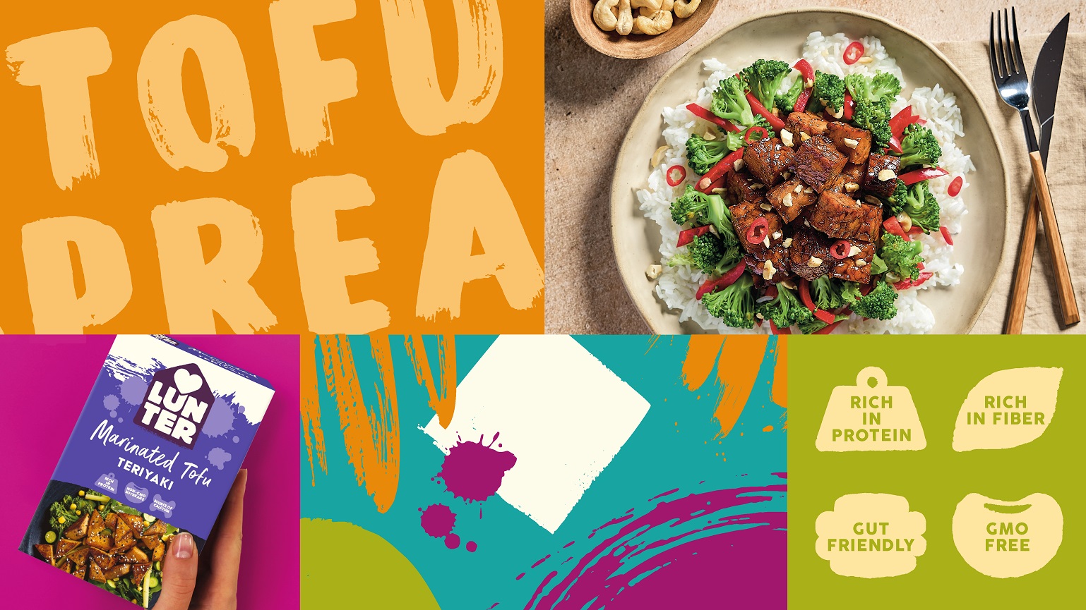
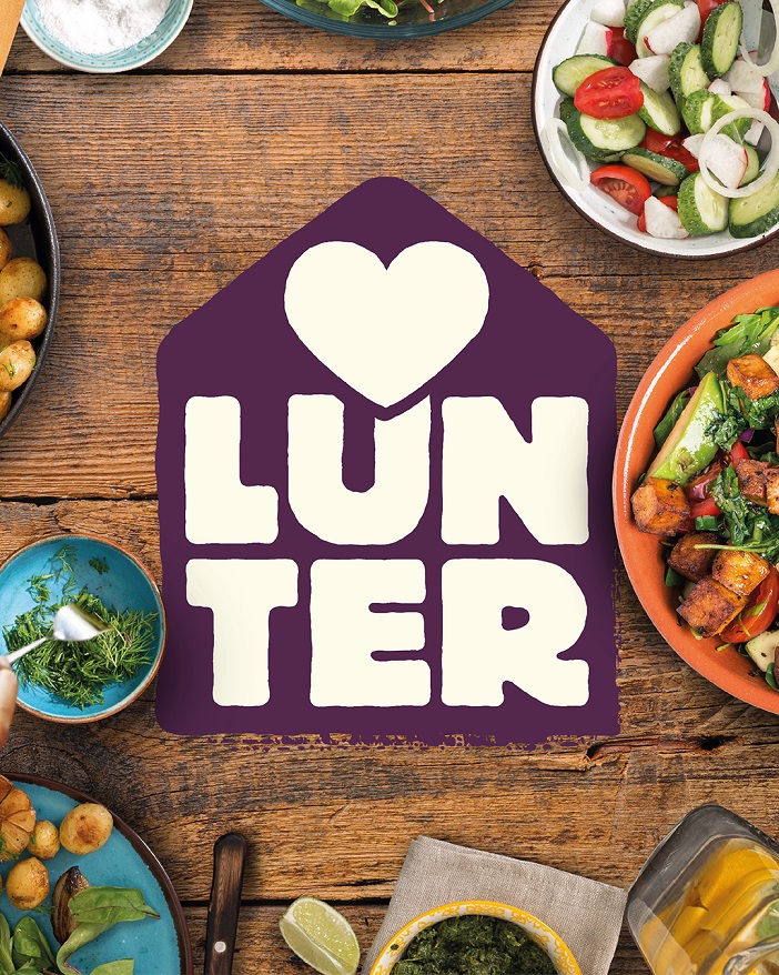
The refreshed identity delivers the brand’s purpose of sharing the love for feel- good food. A vivid colour palette and hand-crafted illustrations offer a warm, new visual language that works strongly across packaging, point of sale and communications, for a bold, unified brand presence.
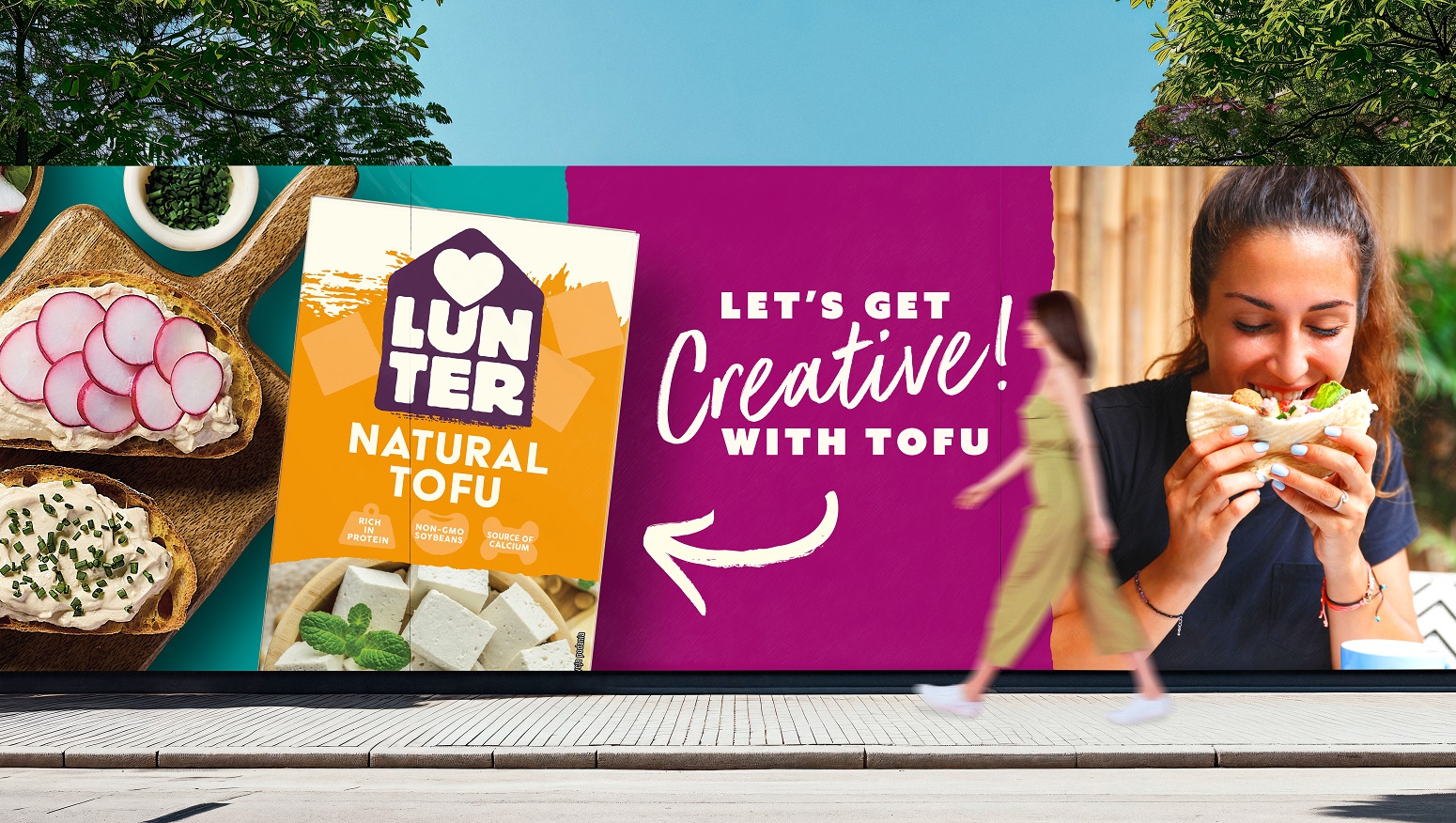
BrandMe Creative Director, Charlotte Elder, says: “Our bold new identity and packaging architecture gives brand confidence yet at the same time communicates Lunter’s positive and friendly positioning. With our new approach we wanted to convey a bright and fresh feeling that reflects the product itself. The tofu category is synonymous with using natural, earthy colour palettes, so we wanted to bring a vibrancy to the brand without detracting from the taste of the products, so they stand out from the crowd and are easy to shop. Lunter is at the heart of the home.”
Martina Schmidt, New Originals Company Chief Marketing Officer says: “We’re proud of our collaboration with BrandMe, whose creative excellence helped us reimagine the LUNTER brand. Their thoughtful, strategic approach allowed us to stay true to our core values—love for genuine food, respect for our heritage, care for our loved ones and the planet, and a commitment to high- quality ingredients—while creating a fresh visual identity ready for future growth. We’re very happy with the look and feel of our new packaging: vibrant, distinctive, and designed to stand out on the green-heavy plant-based shelf. It brings clarity to our portfolio, making it easier for consumers to find and choose our products with confidence.
This transformation strengthens Lunter as a brand that celebrates wholesome, feel-good food and is ready to grow across Europe.”
Source: BrandMe
You must be logged in to post a comment Login