
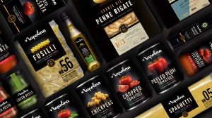
Napolina, one of the UK’s leading Italian cooking brand, has unveiled a new look for its full product portfolio with strategy and design by brand consultancy Brandon.
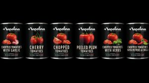
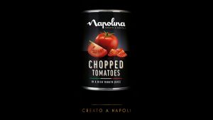
The updated range is currently rolling out, starting with tinned tomatoes that launched on shelf in September.
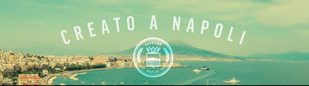
Napolina, which originally launched in the UK in 1965 and is famed for its passion for the quality of its food, approached Brandon to help refresh the range in line with a new brand proposition “For the love of Italian food” and transition from an ingredients brand to be about cooking great tasting Italian food.
Neil Brownbill, Commercial Director for Napolina says: “Brandon has created a look for our range that truly reflects the love, care and passion that Napolina is born from. We now have a consistent design architecture and brand codes that communicates the quality of our products, as well as gives us the opportunity to expand the range, continue our work sharing our love for authentic Italian food and inspiring consumers tocreate delicious new meal creations.”
“In order for consumers to choose Napolina over other brands we needed to communicate the quality and passion behind the products, elevating the brand to support the new proposition,” said Simon Ellis, Client Services Director of Brandon.
“We worked closely with the Napolina team, undertaking consumer research to create a strategy that best communicated the brand’s ethos, celebrating its love for the best, authentic ingredients and helping to share its passion to inspire delicious new meal creations.”
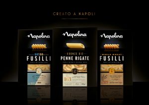
The new look for Napolina was born out of the new brand proposition “For the love of Italian food.” Keeping the black background and subtly evolving the brand logo to ensure instant recognition for shoppers on the go, the brand refresh reflects a dash of effortless style, synonymous with Italian culture and the beauty and simplicity of Italian cooking. This inspired the creative direction with its stripped back, elegant and consistent architecture.
Simon continues, “It was important for us to create a clear and consistent brand architecture across the extensive range and multiple categories, whilst also creating ownable brand codes.”
Current assets such as the logomark were refined and new elements such as the photography developed to create an effortlessly stylish look.
Strong, single product shots are showcased proudly on each product to reinforce the pride and confidence of the brand, all to hero the quality expected from Napolina.
Source: Brandon
You must be logged in to post a comment Login