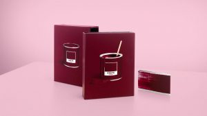
 Costa Coffee has turned to branding and communications agency Our Design Agency (ODA) to support with the delivery of its first brand colour toolkit to assist with embedding consistency across its international markets.
As a global brand, Costa Coffee currently serves 31 markets including China, UAE and the UK. As the brand continues to enjoy growth, there was a clear requirement to ensure that global partners were provided with a consistent reproduction of the brand’s iconic Costa Coffee Red in order for them to produce and deliver on-brand assets in-market.
 Having worked with Costa Coffee for four years on refining the customer experience across its UK store estate, ODA worked in partnership with Costa Coffee to deliver the first brand colour toolkit as the coffee shop chain entered its next phase of growth.
Grant Willis, Creative Director at ODA, says: “For Costa Coffee to truly own its brand colour, it must be accurately reproduced across all different touchpoints. Until now, there have been fluctuations across its estate, so there was a clear opportunity to work in partnership to address this and create a toolkit to ensure consistency.”
ODA’s brief was to create the definitive Costa Coffee Red colour, then work with the brand’s partners to ensure it could be reproduced across each of the different substrates within a store, from exterior signage to packaging.
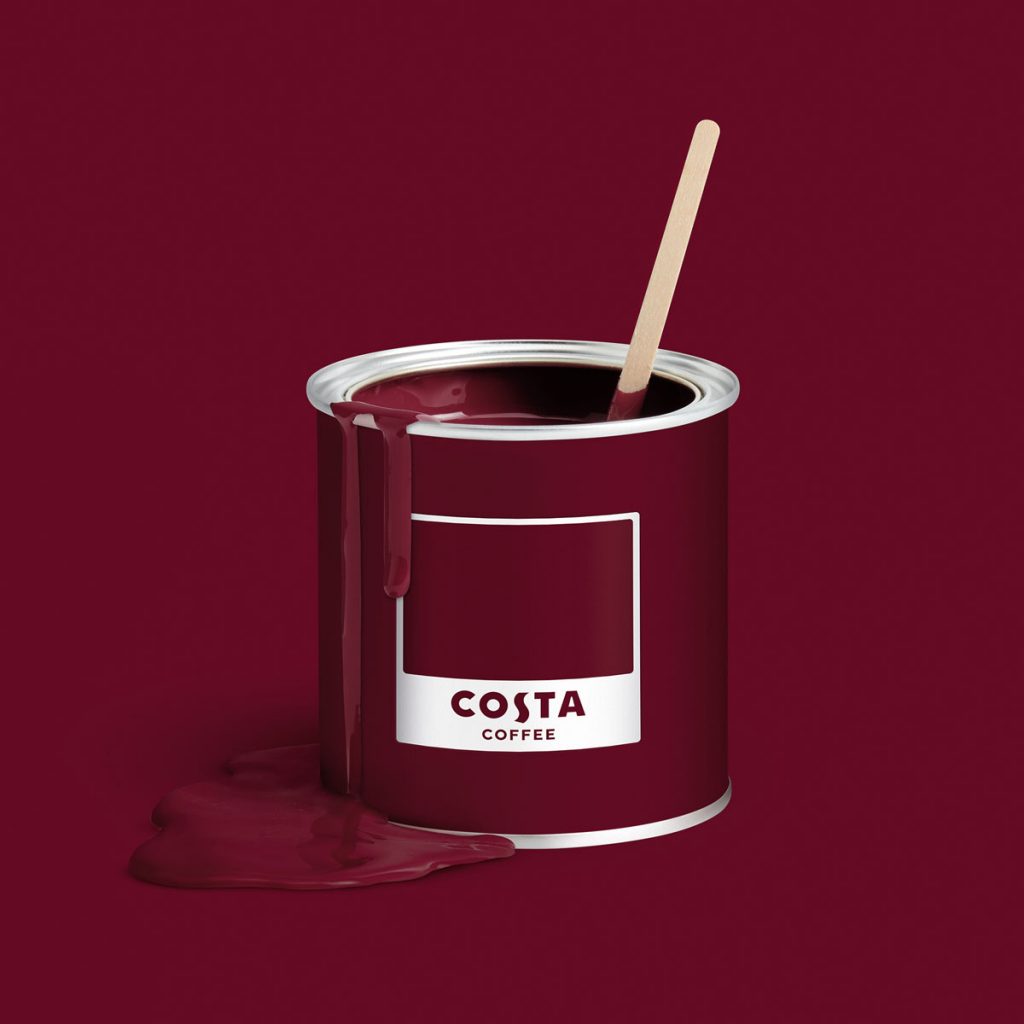
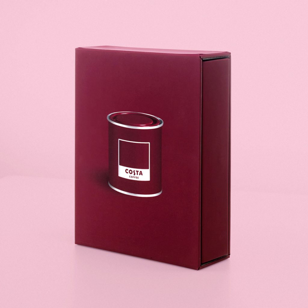
 Willis says: “Even though the book is intended for external suppliers, we set out to create something with real Costa Coffee personality. There are references to paint pots and brushes throughout. We also used a coffee stirrer in the paint pot as a visual pun to underline the importance of this colour to Costa Coffee.”
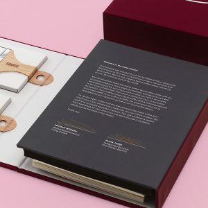
The book has been designed with printers and suppliers in mind. Each substrate has been included as either a page or a tile, which can be removed from the book and matched on-press to ensure the most accurate reproduction. Each book also contains two swatch books – one on coated paper and the other uncoated – so printers can retain a physical sample for future reference.


Matthew Williams, Director of brand and insight at Costa Coffee, says: “The faithful reproduction of our iconic Costa Red is vital for maintaining brand consistency as we expand around the world. This was a complex and painstaking job that ODA handled brilliantly. Adding some of our brand personality to the guide book was an inspired way of getting the message across. We’re delighted with the result.”
Source: Our Design Agency

You must be logged in to post a comment Login