In just the three years since launch, Seedlip has not only taken the drinks world by storm, but has established new behaviour and norms within drinking culture.
Seedlip’s success as an undisputed lifestyle leader continues to challenge the previous boundaries of the beverage industry and most recently Claire Warner, Managing Director of Æcorn Aperitifs, partnered with Pearlfisher to expand on the non-alcoholic drinks category and the options in the aperitifs space.

Traditionally, aperitifs have been enjoyed as a before-dinner drink to increase the enjoyment of food. Æcorn Aperitifs makes way for exciting new experiences, narratives and occasions that extend the backbar beyond wine, spritzes and vermouth with three varietals – Dry, Bitter and Aromatic.
Æcorn Aperitif’s proposition is multi-faceted. It integrates the desirable qualities from the categories of nature, beverages and lifestyle. Thus, Pearlfisher’s design direction for the brand progresses from the lives consumers are living now and creates a more resonant and relevant future for the brand and the beverage industry overall.
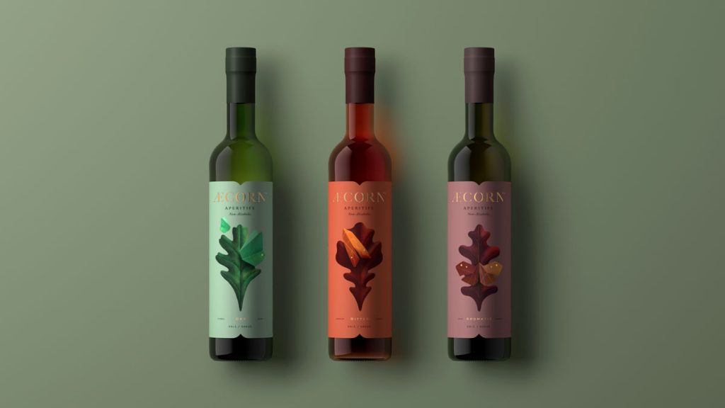
Æcorn Aperitifs expresses the art of nature through its botanical ingredients and brand design. Inspired by 17th century herbal remedies as well as lepidopterology (the study of moths and butterflies), Pearlfisher created a refined brand world in which Æcorn Aperitifs can develop.
“The identity crafts details of mimicry and mirroring much like the markings on a butterfly’s or moth’s wings,” said Hamish Campbell, Pearlfisher Creative Director. “In the logo, the ‘A’ and ‘N’ reflect one another in angle and character, while the ‘O’ is embellished with a subtle dip on its base, hinting at the silhouette of an acorn.” He continues, “The bottle label matches the dip of the ‘O’ and is abstractly designed like symmetrical wings.”
The spelling of the brand name Æcorn Aperitifs is influenced by the old English word for acorn. While the dipthong (Æ) pays homage to Carolus Linnæus, the father of botany. Pearlfisher performed extensive research on the aperitif space and leveraged these foundational elements to develop original cues for the category as a whole.

“We took all the elements provided by the Æcorn team and wove them into a story of duality – the levity of the butterfly and the foundation of the oak, a key ingredient in each varietal,” said Pearlfisher Design Director, Priyanka Krishnamohan. “The team at Æcorn shared an aphorism with us that says, ‘From small acorns, mighty oaks grow’ and this set us on the path for the brand to cover new territory as a nature company, establish brand world touch-points and breathe new life into the aperitif drinking occasion.”
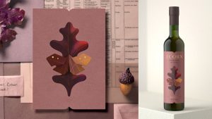
Part of making Æcorn Aperitifs relevant today is considering the consumer and how best to introduce non-alcoholic offerings without compromising brand integrity. Pearlfisher created illustrations for each varietal with changing butterflies and/or moths and oak leaves – crafted with dimension, iridescence and an imperfect geometry. The labels are printed over pearlescent paper to illuminate its opaline, butterfly-like characteristics.
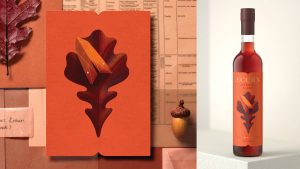
From its identity, packaging and brand world, Æcorn Aperitifs drives appetite and interest in a unique style for a unique brand, living alongside its counterpart, to create a distinct ecosystem of brand experiences. The brands embrace minimalism, quiet confidence and beauty in both one’s hand and on the shelf.
“It’s hard to summarise how proud we are of what we created and how grateful we are for Pearlfisher helping to articulate our vision in such a beautiful and distinctive way,” said Claire Warner, Managing Director at Æcorn Aperitifs. “We hope that the introduction of Æcorn Aperitifs will now give everyone who is not drinking, a seat at the table.”
Æcorn Aperitifs are available for purchase online and exclusively in-store at Selfridges as well as two of the best cocktail bars in the world, Lyaness and The American Bar at The Savoy.
Source: Pearlfisher

You must be logged in to post a comment Login