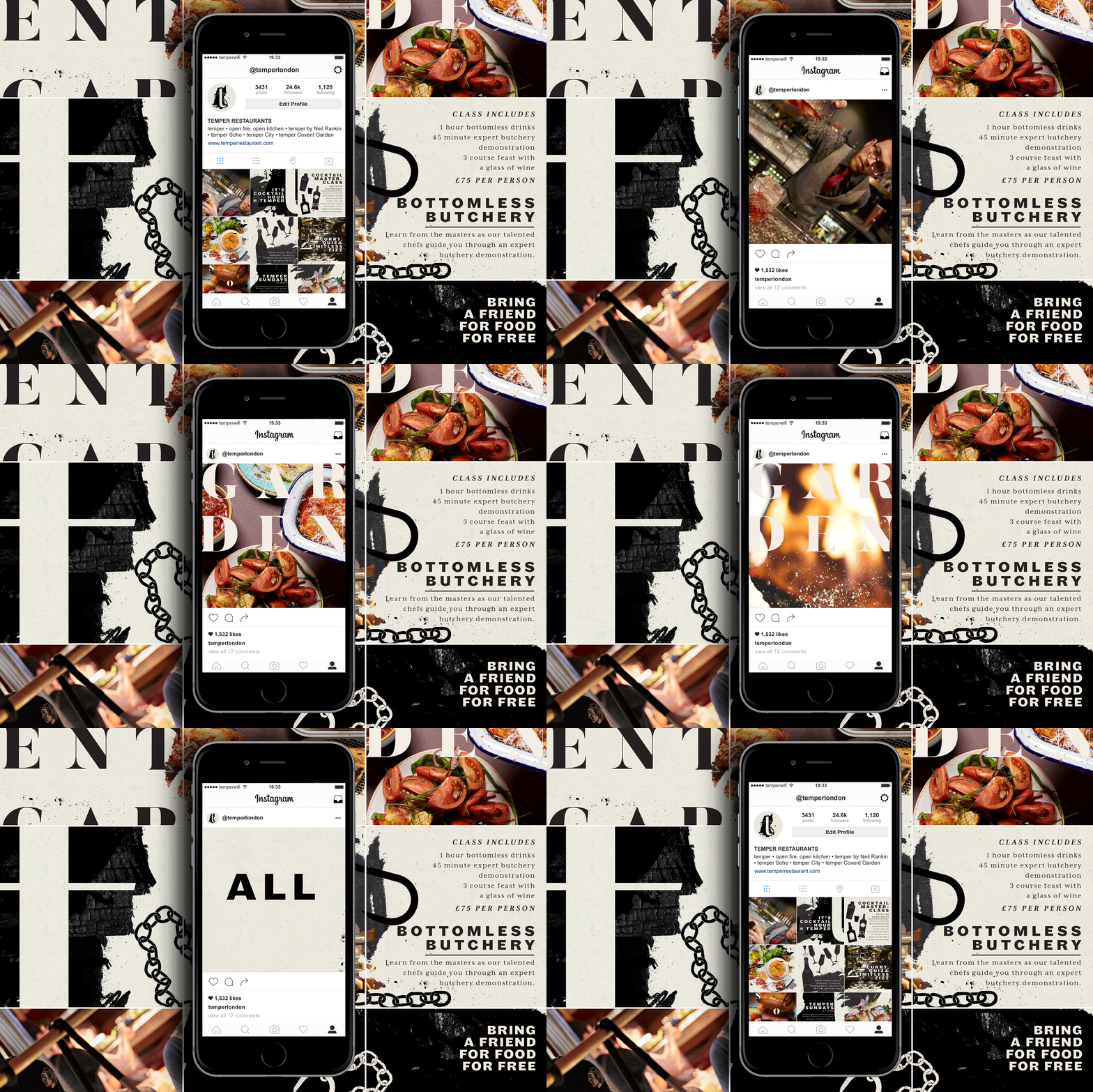
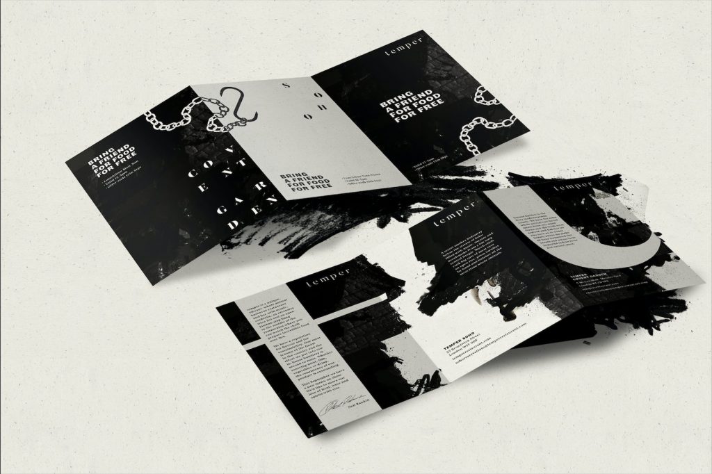
London-based branding consultancy Run For The Hills, launched their exciting, bold and edgy new brand look and feel for London restaurant group Temper.
 The brief was a re-design of all Temper assets from the website to the menus and all marketing communications. Which needed to be shot through with attitude and cool, befitting of Temper’s celebrity head chef, Neil Rankin and the other Temper founders.
Restaurant group Temper, is a unique, whole-animal barbecue concept restaurant with three venues, in Soho, the City and Covent Garden. The Run For The Hills graphics team spent six months cooking up their branding design in the studio, with regular input from Neil Rankin and fellow Temper founder Sam Lee.
 The design shop first set about creating an edgier, bolder new typographic style. Then introducing a range of etched illustrations, and charcoal textures. This slightly off- kilter formation of typography became the heart of the final graphic look and feel.
Central to Temper’s new branding is an emphasis on distressed and burnt textures, a playful experimentation of positive and negative space and the use of striking, artistic cropping from highly textural backgrounds. Forming very carefully- considered, but thoroughly unstructured- feeling typography. Fashioning a suite of assets designed to create a really powerful visual tone of voice, which is the core of Temper’s new brand evolution.
 The designers created a unique type formation for each of the three restaurants, for Temper to use across every element of the brand; online, signage, menus and flyers. To keep with the concept of playful asymmetry, the team also gave the physical menus a pleasing lack of symmetry, on a range of recycled craft papers that can be printed in-house to allow the team to respond to an often-changing food offer.
 Rankin’s tattooed arm takes centre stage in a stop frame animation kind of way and the new website created by Run For The Hills is full of quirky animation. The site also heralds the culinary heroics of the whole Temper kitchen and front of house team, and tells tales of some of Temper’s much- loved suppliers.
Chris Trotman, Creative Director of Run For The Hills, commented: “The real jewel in the crown of the whole rebranding project is Temper’s shiny new website. we used a predominantly inky colour scheme with charcoal textures, befitting of the restaurant’s fire pit concept. To express the down-to-earth qualities of the brand we devised animated retro-style TV sets and record players as navigation tools. There’s lots of quick, stop-frame animation to add extra punchiness.”
To herald the new branding and visual identity, Run For The Hills did a mash up style take over of Temper’s Instagram, curating a feed filled with insta-squares featuring favourite new creations, illustrations and brand assets, shot through with lashings of attitude and whole Temper cool.

Source: Run For The Hills

You must be logged in to post a comment Login