
The Silver Spoon Company – a business of Associated British Foods – collaborated with Bristol-based strategic brand design studio, Outlaw, to deliver the biggest rebrand in its history. Aiming to cement its position as the nation’s favourite sugar brand and inspire more moments of baking joy.
As the UK’s leading sugar brand1, Silver Spoon boasts over 50 years of heritage, 100% prompted awareness and a presence in nearly half of UK households. But although the brand had good equity it needed stronger, more distinctive visual assets, and wanted to mean more to consumers faced with a busy sugar fixture.
Through research the brand had discovered that 80% of British consumers had baked at least once in the last year, but while the majority preferred to bake from scratch, they also often didn’t know which sugar was best for them.
So with an ambition to inspire more moments of baking joy, Silver Spoon evolved its positioning to better reflect the strong credentials it has in home baking.
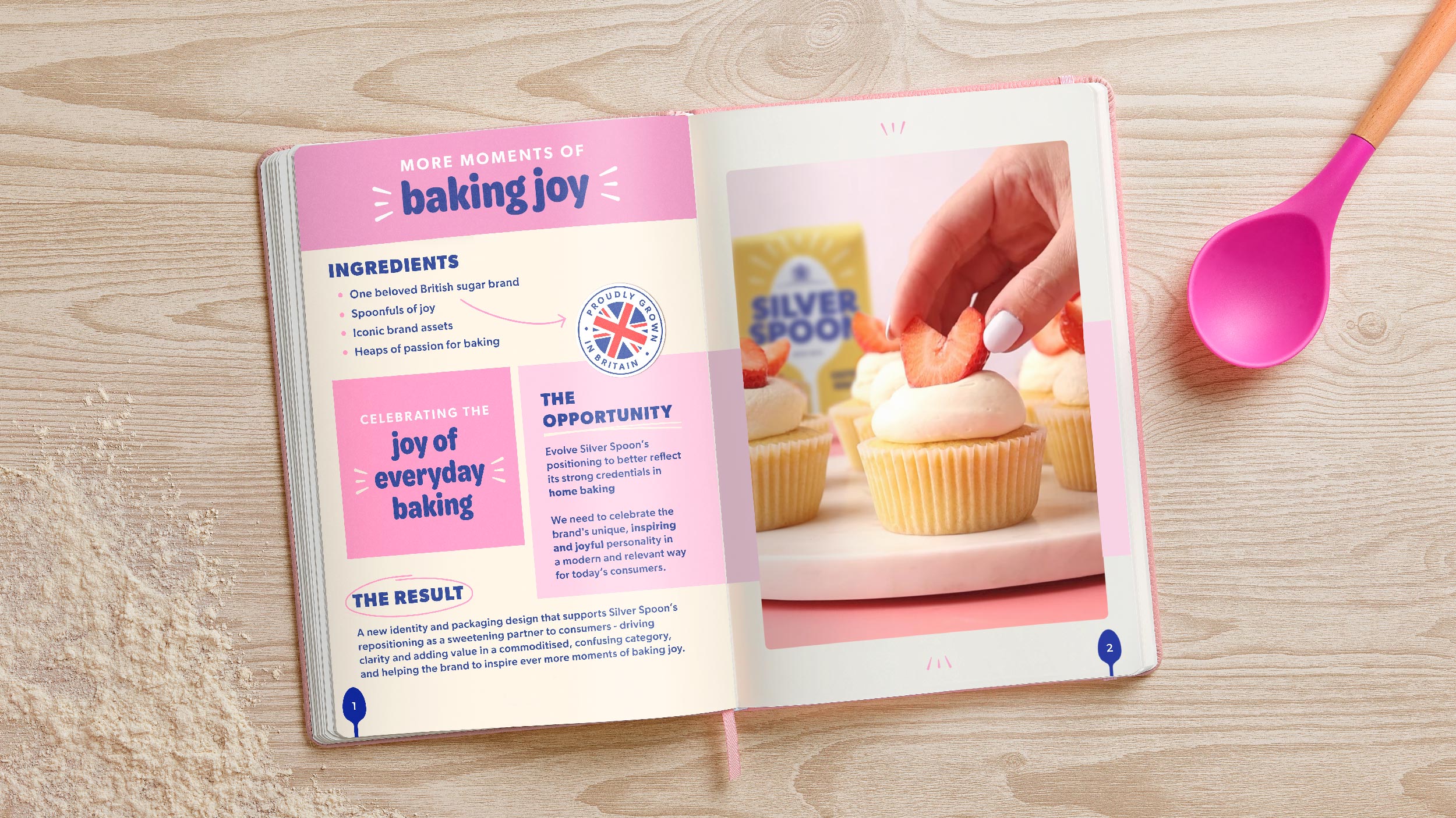
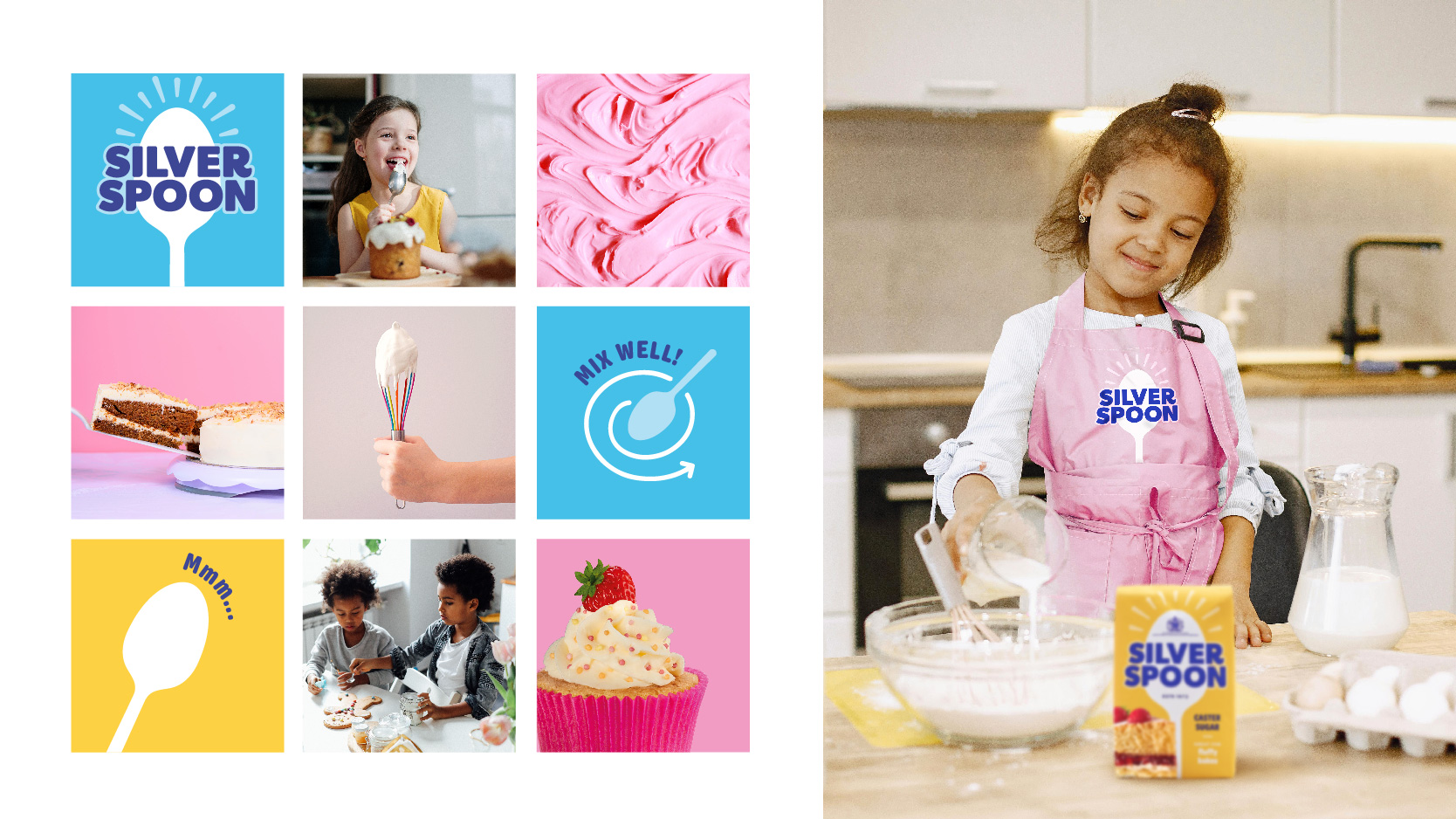
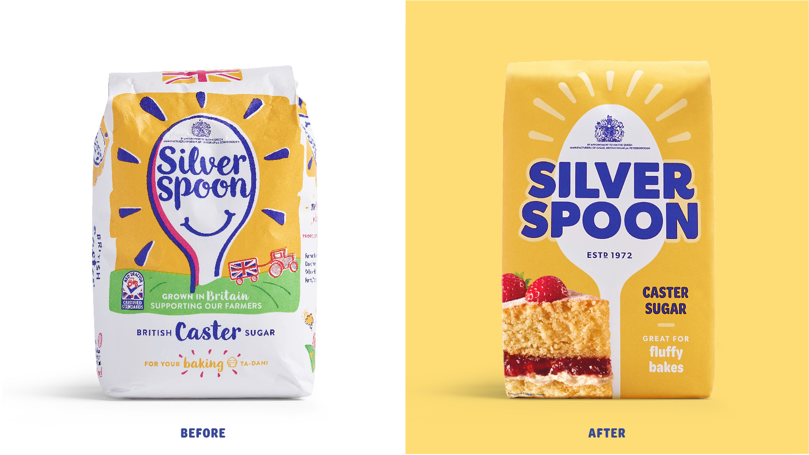
In line with the new positioning, Outlaw rejuvenated this British classic to celebrate Silver Spoon’s unique, inspiring and joyful personality and capture a world of baking that would feel modern and relevant to today’s consumers.
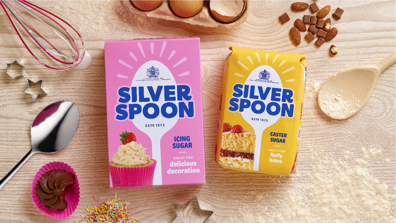
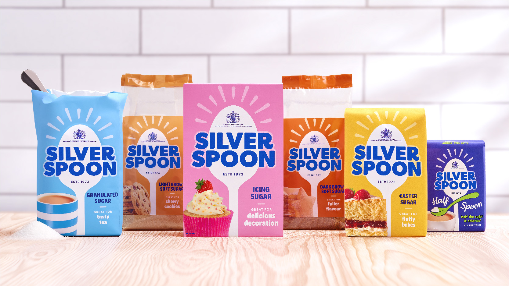
The new all-caps navy-blue word marque has a boldness that’s easy to spot from a distance in store – while retaining moments of craft and personality within the typography – and combines with a cleaner, more confident white spoon device and ‘sparks of joy’ to create masterbrand cohesion across the entire range of sugars and sweeteners.
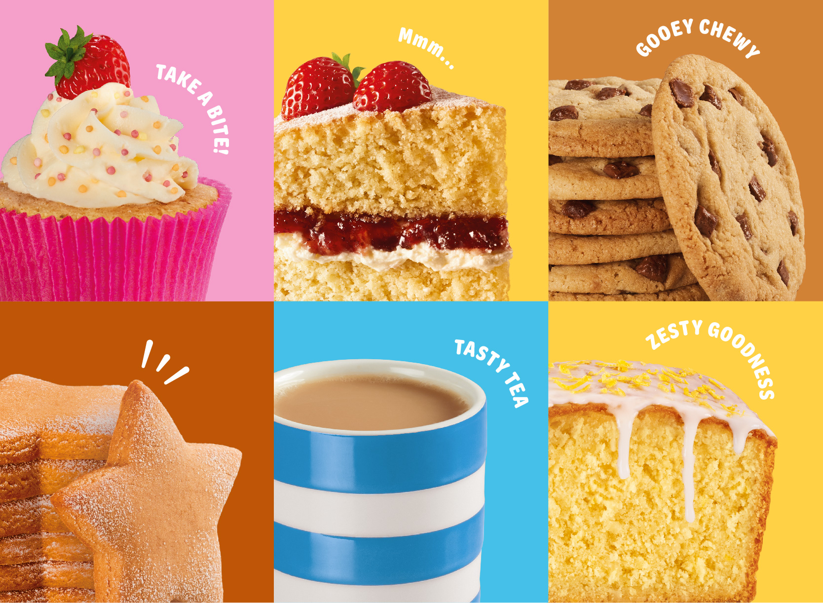
To help navigation, individual sugar types retain their known colourways – now flooded across the entire pack – but also feature food or beverage photography and a usage line to help consumers find just what they need from the options on shelf, whether that’s caster sugar for fluffy bakes or demerara for the smoothest coffee.
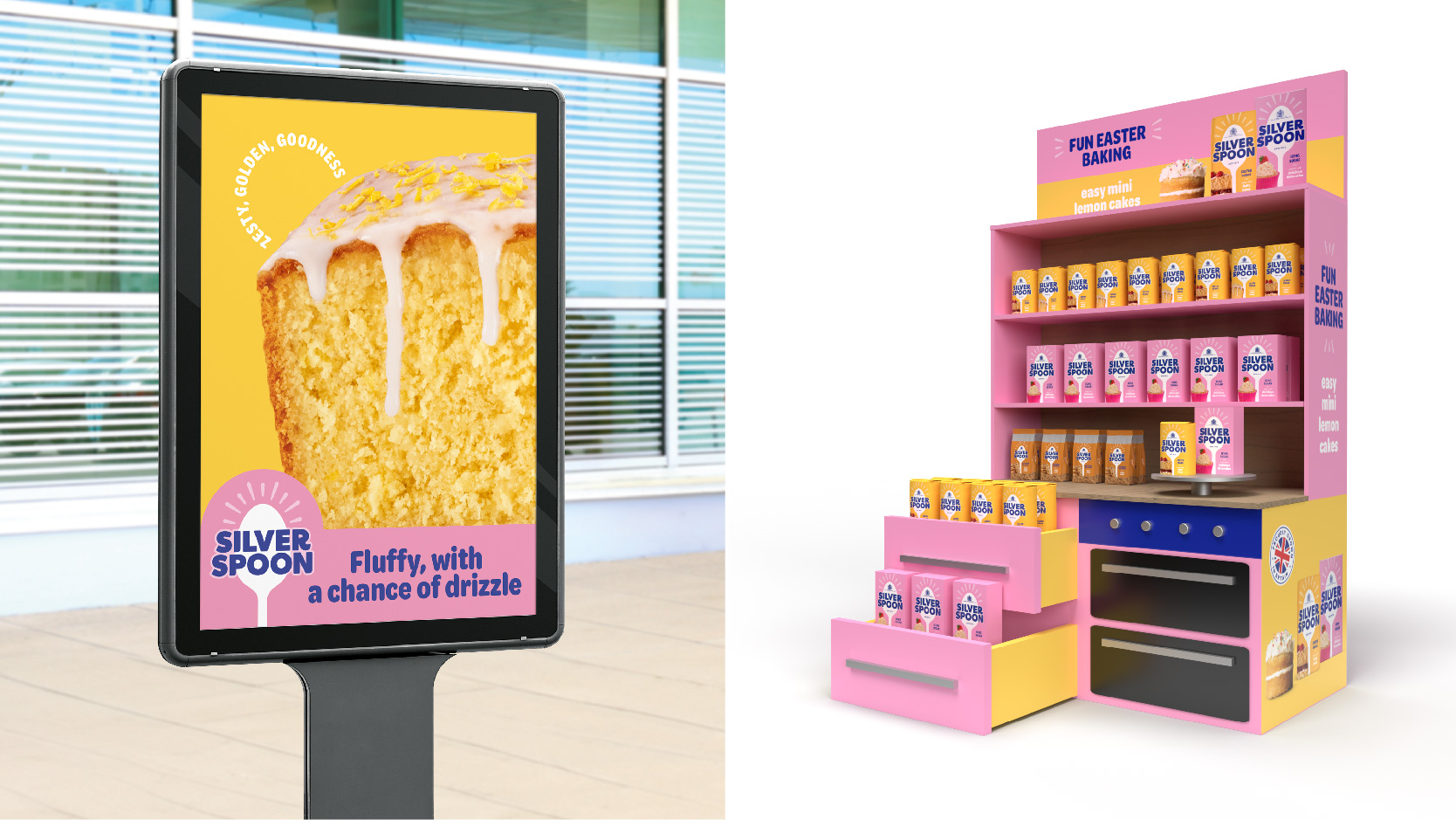
A new tone of voice platform was also established to ensure brand copy stays deliciously sweet and consistently joyful across packaging, website, social and campaigns.
The result is a new identity and pack design that supports Silver Spoon’s repositioning as a sweetening & baking partner to consumers, bringing clarity and adding value to a busy category and helping the brand to inspire ever more moments of baking joy.
Outlaw Design Director, Alex Rexworthy said: “Our new design for Silver Spoon celebrates the joy of baking and brings spoonfuls of fun to a functional category. With stronger masterbrand assets and a clear system of colour, visuals and copy we’ve created a design that makes today’s range of products easier to navigate and be inspired by, while also setting the brand up for the exciting baking innovations of tomorrow.”
Silver Spoon Marketing Manager, Jade Damarell said: “In repositioning and redesigning the Silver Spoon identity and packaging we’ve made it clearer and easier for consumers to buy the best sugar for their needs. It was a hugely positive and enjoyable creative experience collaborating with Outlaw on the project. The team has become an extension of ours, and we’re excited to see what the future holds.”
1 https://www.telegraph.co.uk/business/2021/07/12/beet-britains-sugar-industry-not-sweet/
Source: Outlaw
You must be logged in to post a comment Login