
 In this, its 25th anniversary in the UK, Sacla’, the company that introduced pesto to the nation, is relaunching the brand, starting with its famous Pesto range and its new pasta sauces. The process is being led by Springetts Brand Design Consultants.
Andy Black, managing director of Springetts, says, “There are many Italian offerings out there, content with being generically Italian. We were keen to invest in those things that make Sacla’ different from the ‘me toos’ and capitalise on the company’s leadership, authenticity and pioneering behaviour with a brand position that allows them to step change and pull away from the growing list of competitors. Our strategy has been to bring to life the culinary heritage of the brand and the sense of ‘wow’ that Sacla’ products add to meals as a result of the company’s four generations of family know-how.”
The project has involved the development of a new brand architecture designed to cater for the needs of a broader audience and help segment their growing product portfolio. Sacla’ Pesto has always been the preserve of cooking socialites, scratch cooks who see Sacla’ as a partner in the kitchen, but, as part of a new strategy, Sacla’ is increasing its portfolio to continue extending its offering beyond Pesto into products designed to help the time-poor jugglers amongst us that need more help in the kitchen.
![]() The creative theme of transformation has been used to reconnect consumers with the promise that products from Sacla’ can transform mealtimes through real Italian wow-how.
The creative theme of transformation has been used to reconnect consumers with the promise that products from Sacla’ can transform mealtimes through real Italian wow-how.
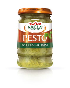
The new look packaging introduces an up to date logo with a copper lock-up and more copper introduced across the branding to form a strong visual brand architecture to draw the portfolio together. The logo replaces the previous cream background with white, which gives the logo a strong contemporary Italian feel. The copper flourish provides a shorthand for creativity in cooking.
The copper lids have always been iconic and distinctive on-shelf, and so the new designs incorporate the use of copper as a core piece of brand collateral with metallic labels that feature a beaten texture on the copper foil to emphasise the culinary heritage and family know-how of the Sacla’ brand.
Coloured illustrations tie in with the product descriptors across the portfolio, making it easy to navigate. As the jars are small, the new flourish tessellates from one pack to the next to maximise brand impact at point of exposure.
You must be logged in to post a comment Login