
 April sees the relaunch of Vimto with new packaging by Springetts Brand Design Consultants.
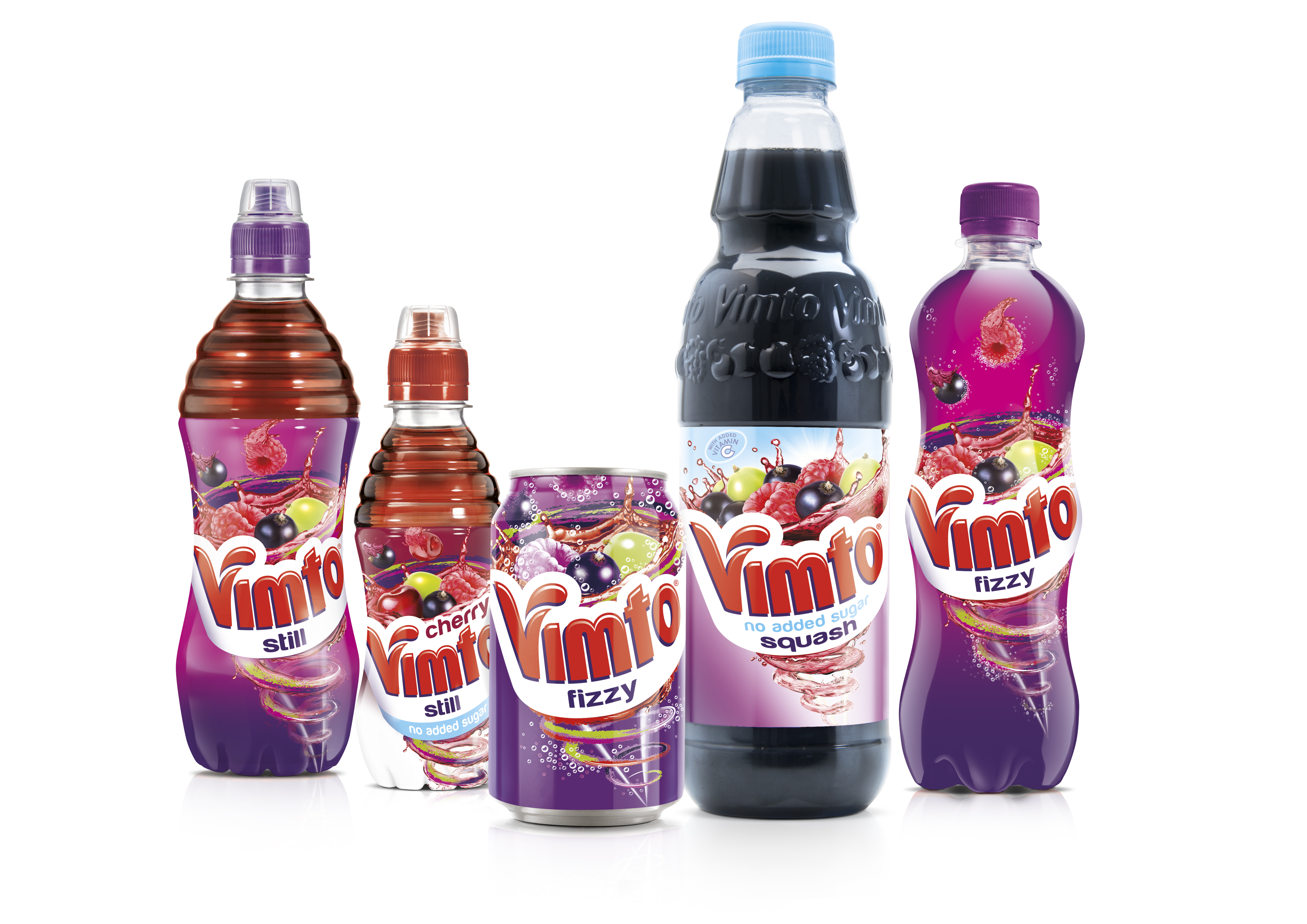
The new packaging across the whole range of squash, carbonates, still drinks and an expanded No Added Sugar range has been designed to drive trial and frequency of purchase.
The branding is designed to convey a more emotional and fun approach to the packaging, rooted in Vimto’s deliciously unique flavour.
The bottles feature a new Vimto logo – a smiling vortex – a visual metaphor for the brand’s positioning of ‘seriously mixed up fun’.
It emanates from below the logo before bursting from the logo towards the bottle opening, giving the consumer the impression that they will taste full Vimto flavour from the very first sip to the very last.
You must be logged in to post a comment Login