
Derek&Eric believe great brands deserve great design. So when Longbottom & Co, the gold standard of tomato juice, came to them with a visual identity that didn’t quite match their premium reputation, they knew it was time for a royal makeover.
Business Challenge
Longbottom & Co have always stood out in the tomato juice category for their uncompromising commitment to quality. Using only all-natural, easily pronounceable ingredients and freshly pressed tomatoes, they’ve built a reputation for creating products that are second to none. Their “Mary” range, in particular, epitomizes excellence in a competitive market dominated by mediocrity.
However, the brand’s visual identity told a different story. Instead of reflecting the superior quality of the product, the design felt generic and uninspired—evoking “own brand” rather than “iconic.” This disconnect posed a clear challenge: how to craft a design that captures the essence of the product and elevates the brand to match its premium standing?
Creative Solution
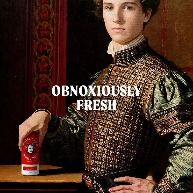
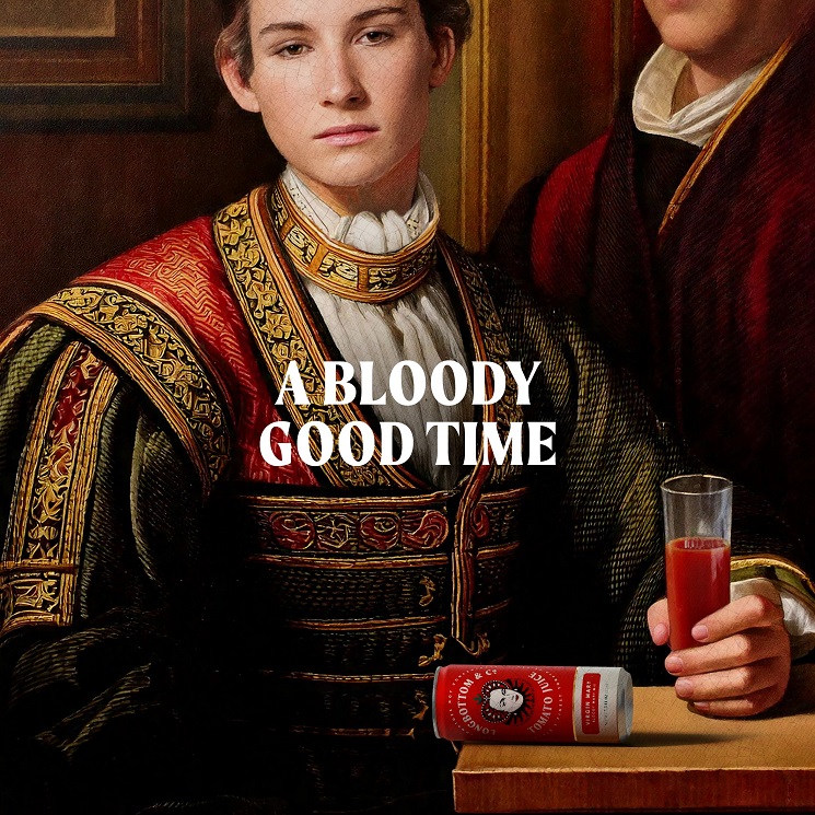
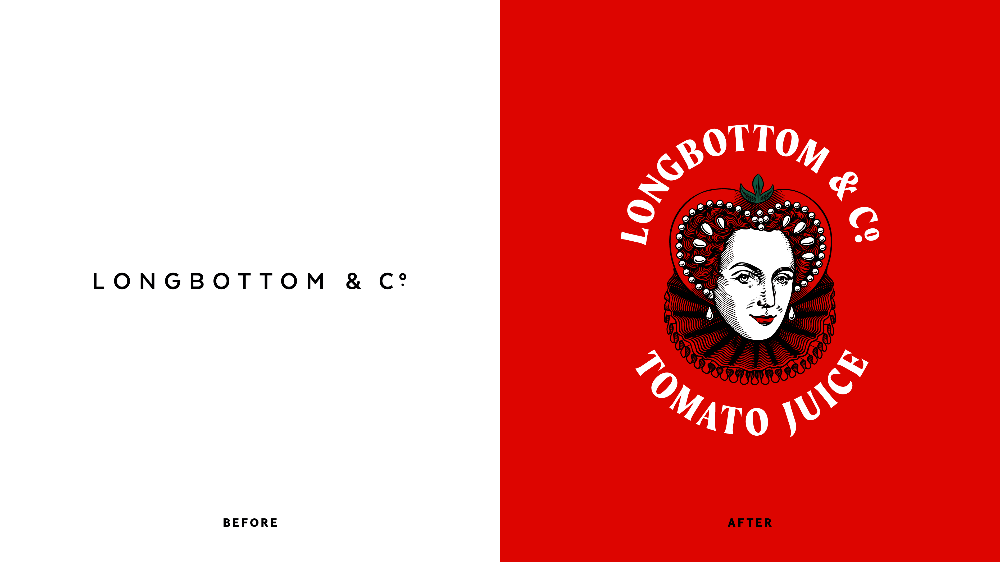
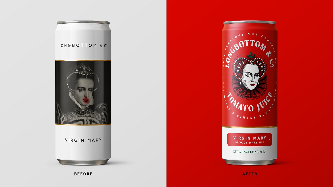
The rebranding of Longbottom & Co focused on balancing the brand’s British heritage with a playful, premium twist.
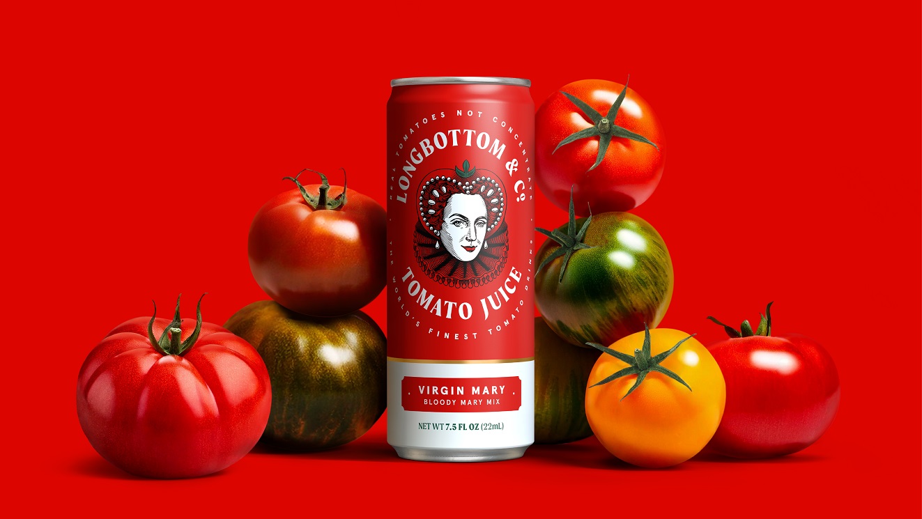
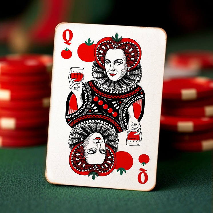
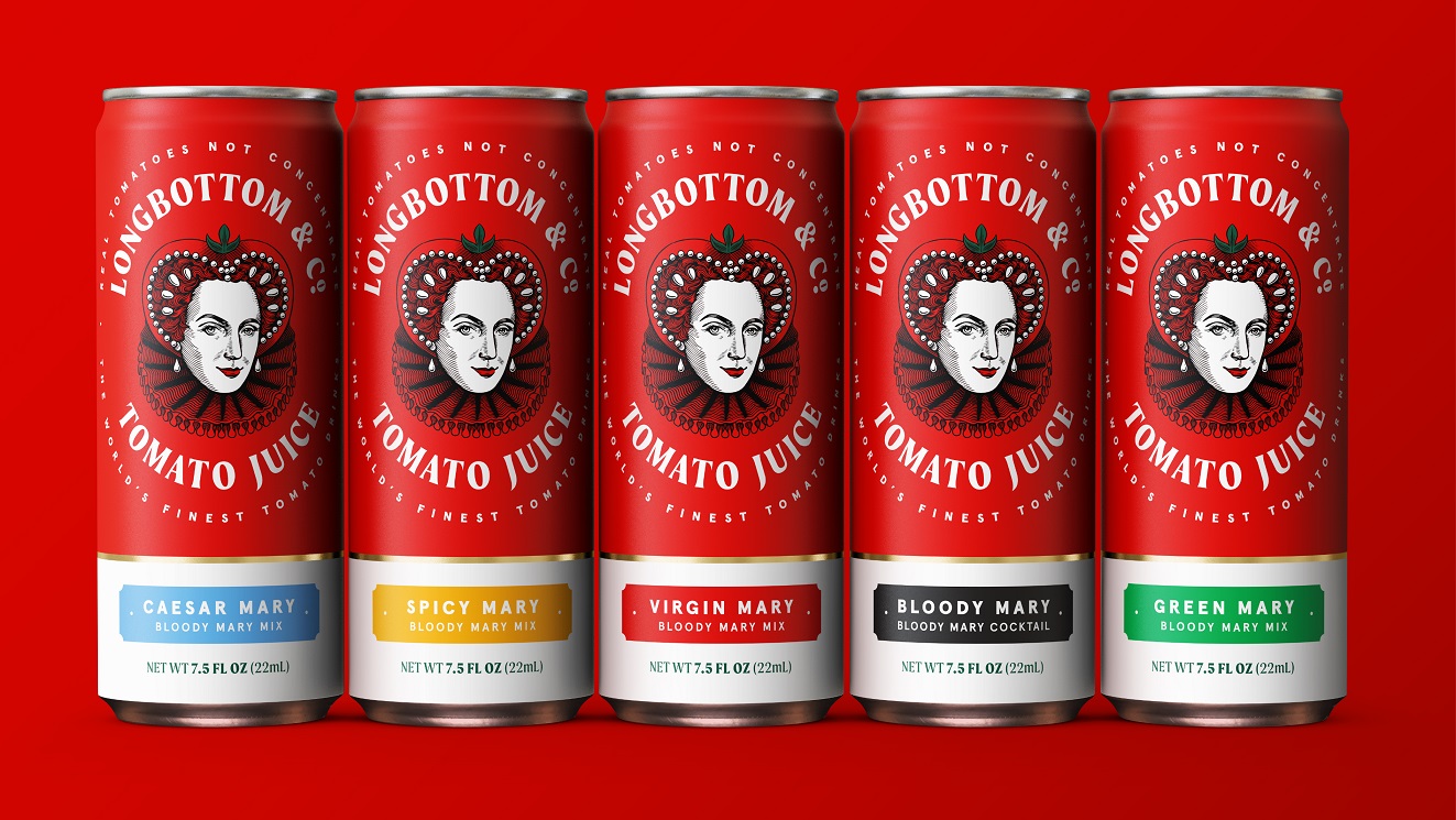
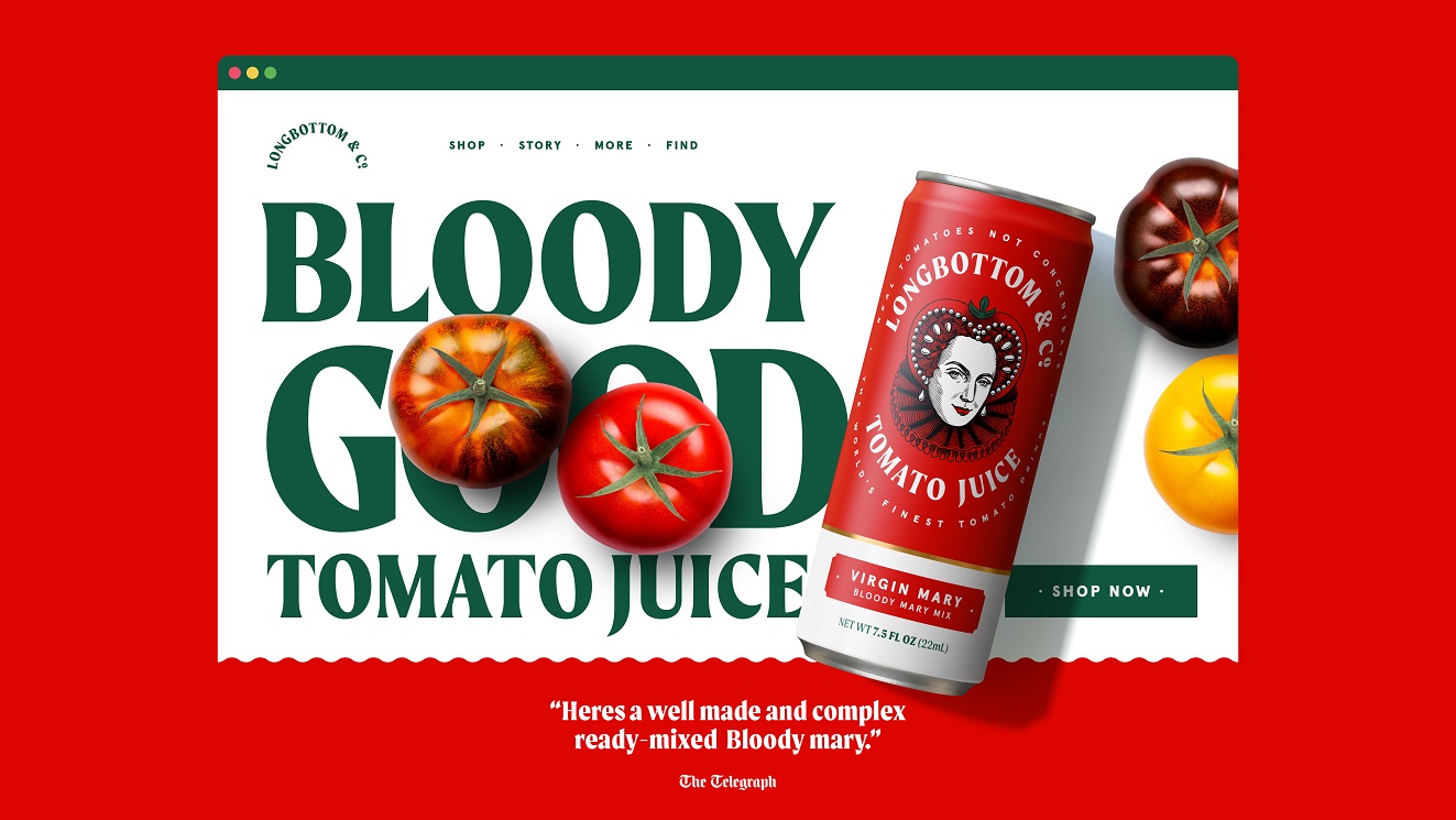
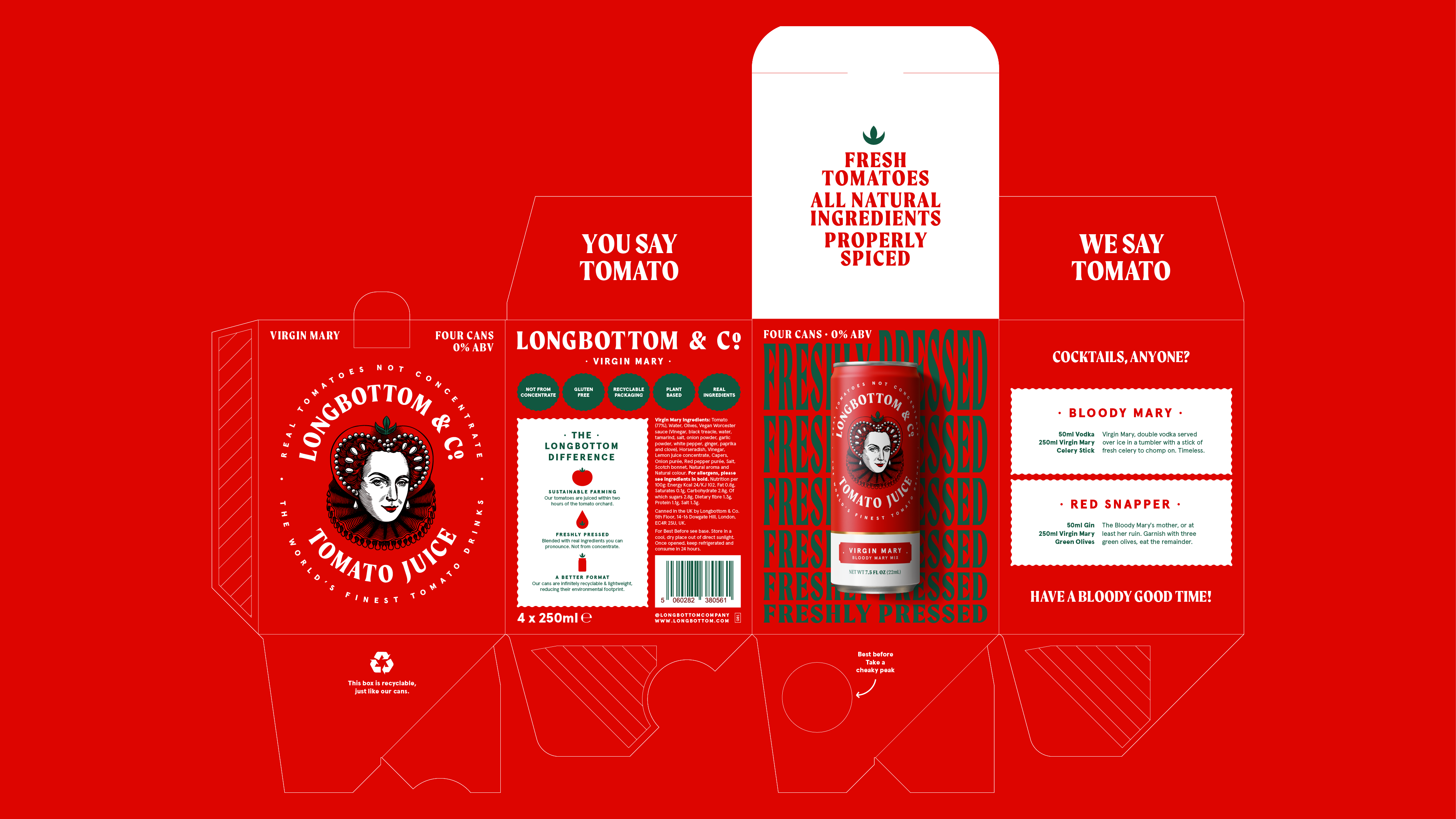
At the heart of the redesign is a reimagined Queen Mary mascot. Her Tudor-inspired tomato headdress is a visual double entendre, blending craftsmanship with cheeky humour. A knowing smile and a twinkle in her eye breathe life into her character, embodying the brand’s unique mix of wit and sophistication.
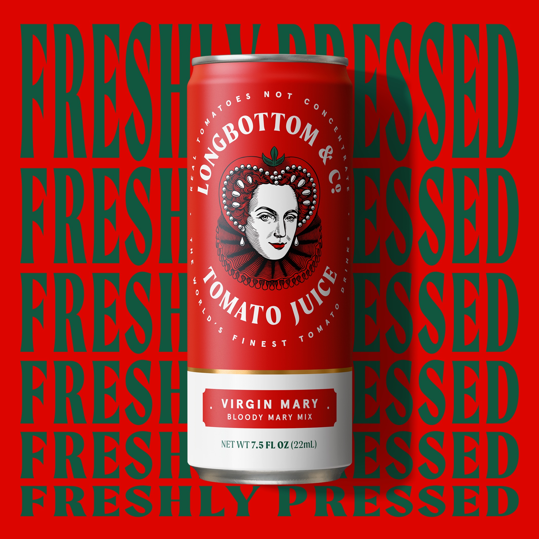
To frame this bold mascot, a meticulously crafted typographic roundel anchors the design, exuding elegance and professionalism. The colour palette draws inspiration from the vibrant hues of the freshest tomatoes, ensuring the packaging feels alive, appetizing, and premium.
This striking combination of heritage and humour repositions Longbottom & Co as a standout in its category—a brand that commands attention while remaining approachable.
Key Outcomes
- A distinctive and memorable identity that captures the brand’s British charm and modern wit.
- Visuals that radiate premium quality while remaining playful and accessible.
- A cohesive design system that grabs attention on shelves and engages a discerning audience.
- An elevated perception that transforms Longbottom & Co into the royalty of tomato juice branding.
With its playful yet proper aesthetic, Longbottom & Co is more than just a tomato juice—it’s a true icon of crafted fit for a queen.
Credits:
Strategy: Silas Amos
Illustration: Alex Maxchin
Artwork: The London Artworking Co.
Source: Derek&Eric
You must be logged in to post a comment Login