
GU – Simply Irresistible
Derek&Eric has completed the first ever global rebrand of Gü, rolling out worldwide this month.
Business Challenge
Founded in 2004, Gü’s innovative identity cut through the competition, helping to bring their vision of indulgent, restaurant style desserts into the home.
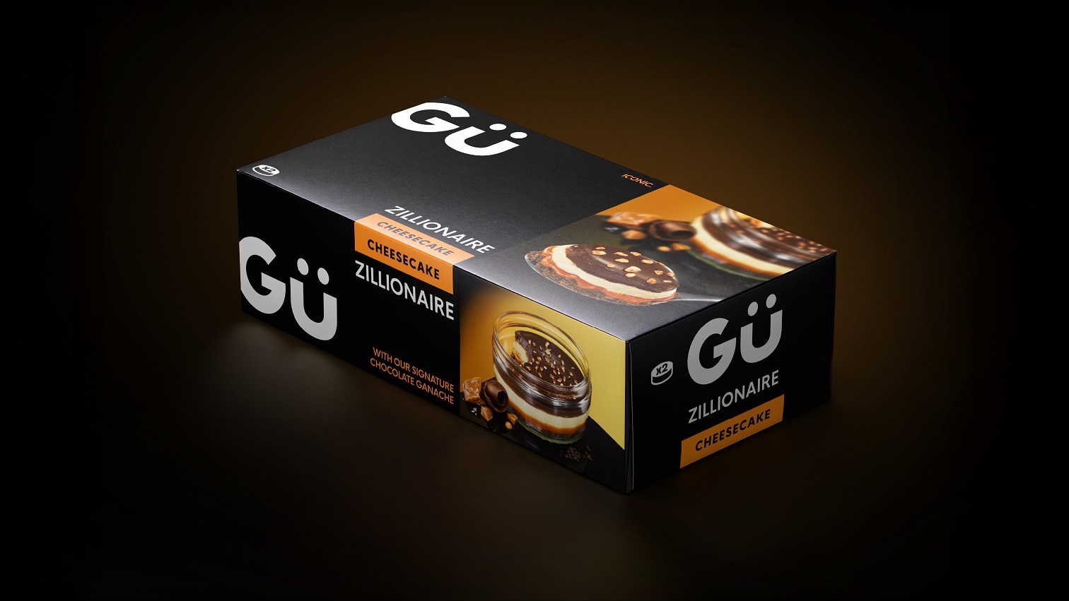
Today, Gü has an enviable level of recognition, with iconic products such as the 5 layer Zillionaire Cheesecake firmly established as national favourites.
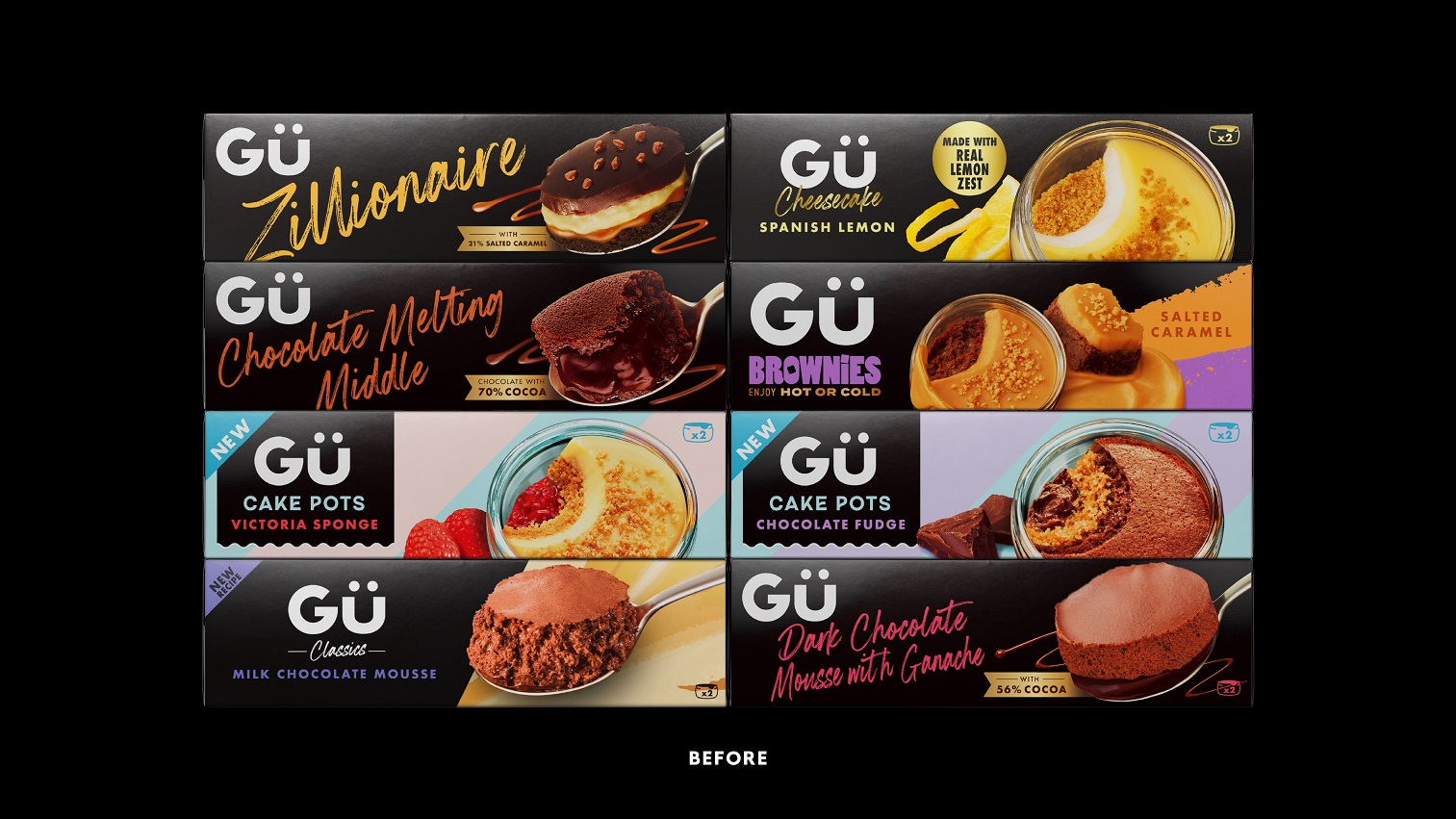
But over the years, iterative design evolution has led to a disparate and confusing portfolio, lacking the single minded excellence that once dominated the shelves, solidified a rarified status and justified a ‘worth paying more for’ price point.
How can design help a brand to reclaim it’s rightful place?
Creative Solution
Our design strategy was to reclaim Gü’s distinctive essence in a contemporary way by going back to the start; a time when the brand was unapologetically indulgent and just a little bit cheeky.
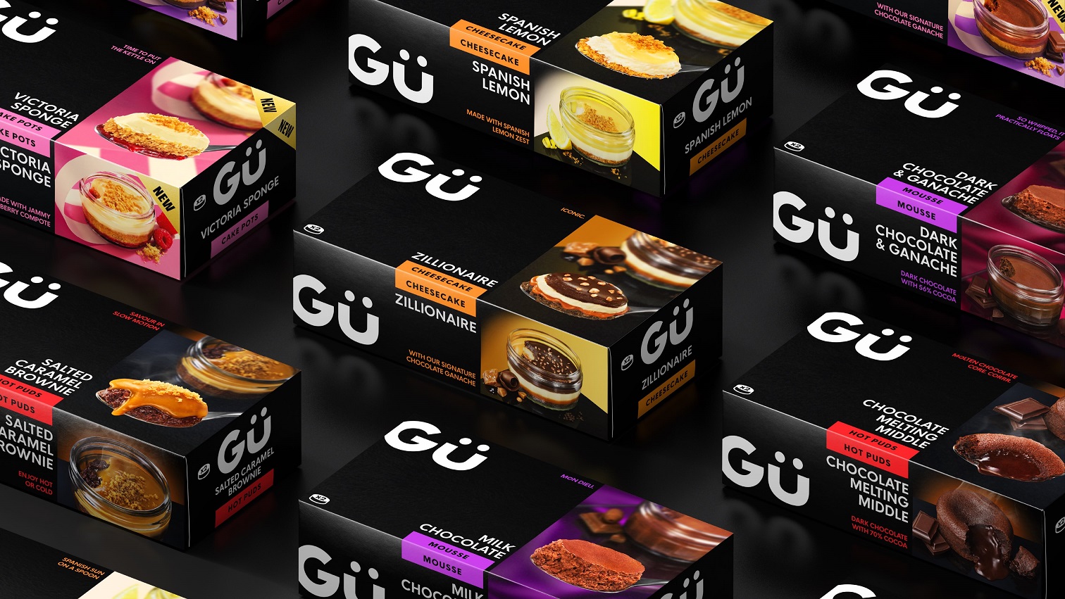
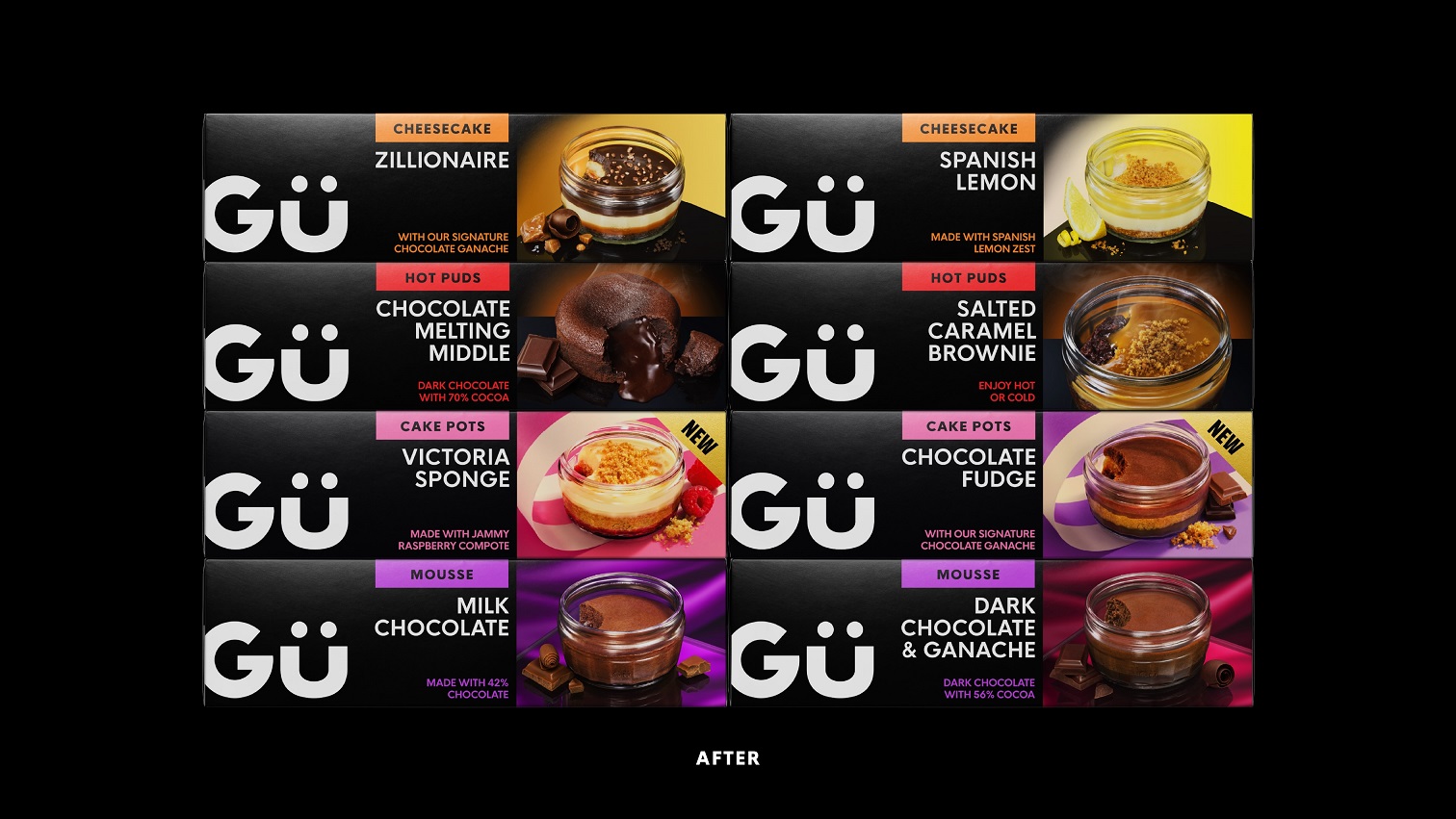
We crafted the Gü wordmark, simplifying awkward elements and establishing a more solid foundation to build out from.
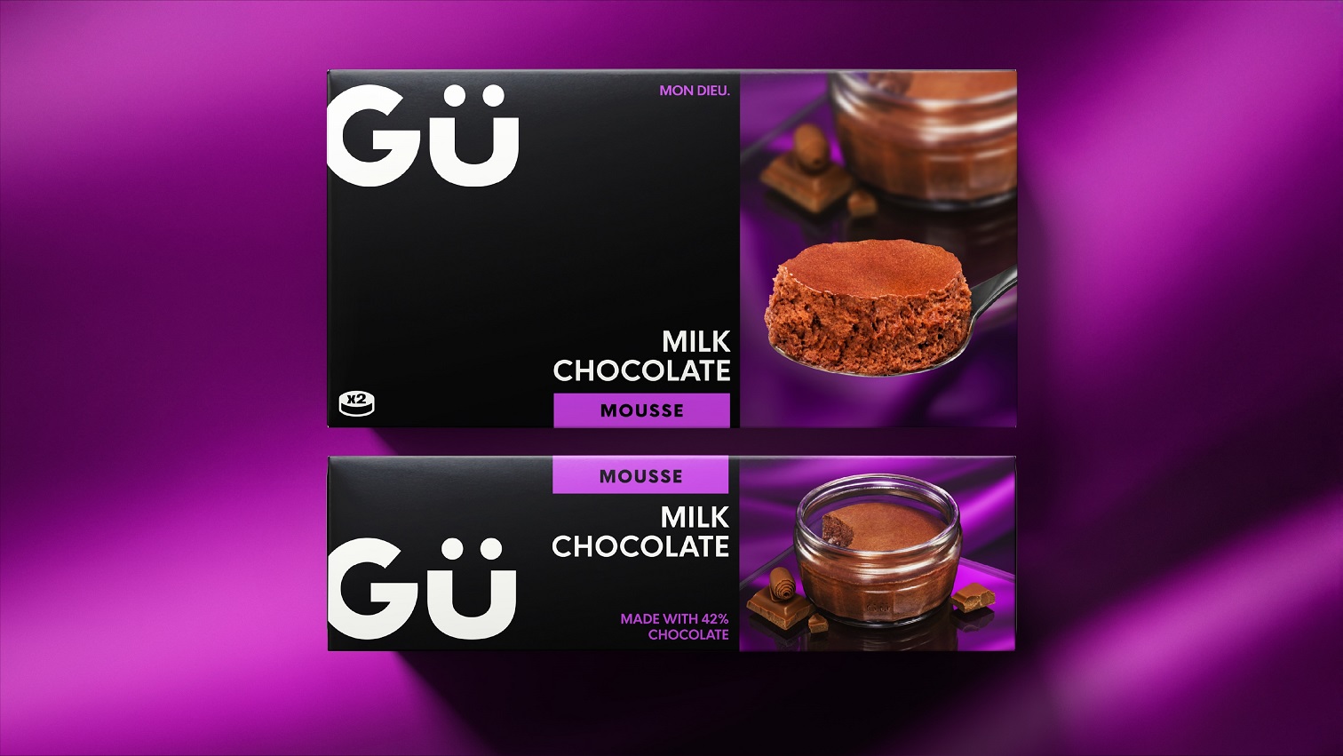
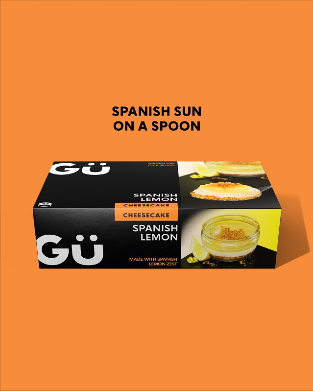
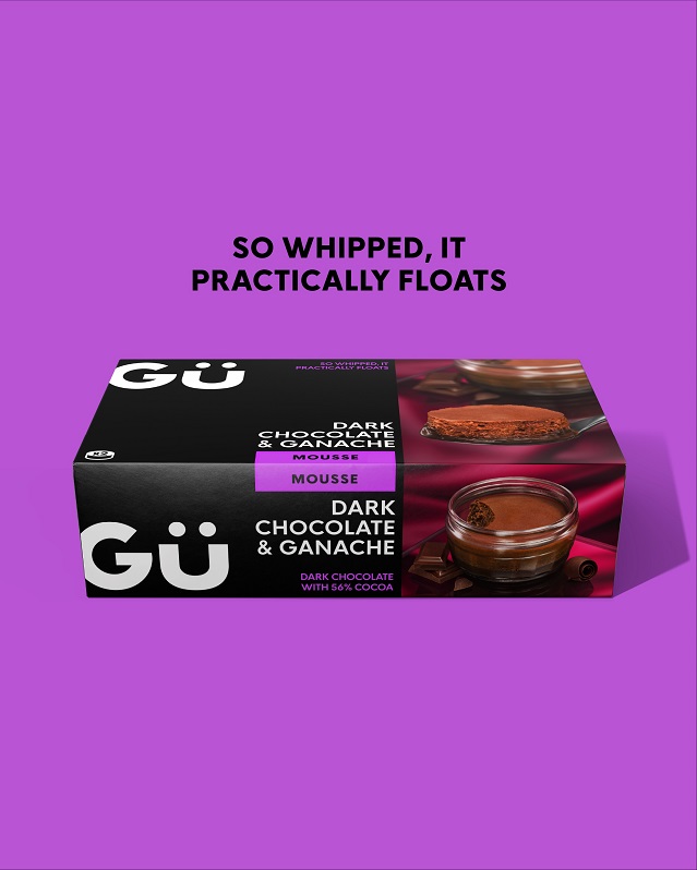
The packaging system rationalises the range, utilising geometric layouts, colourful tabs and a ‘less is more’ sensibility, delivering a considered elegance that aids consumer navigation.
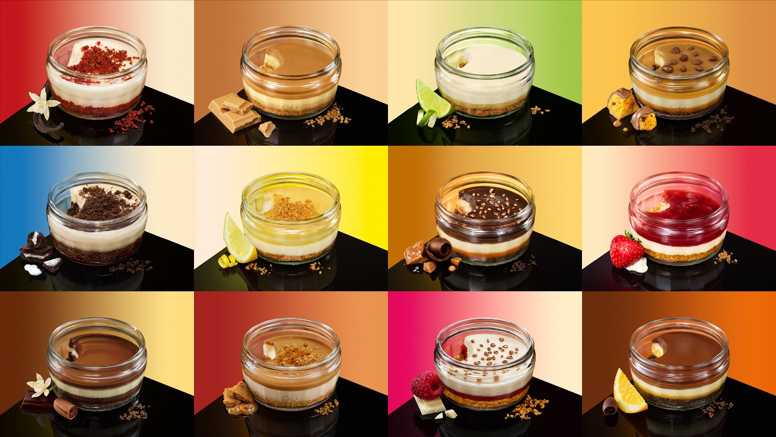
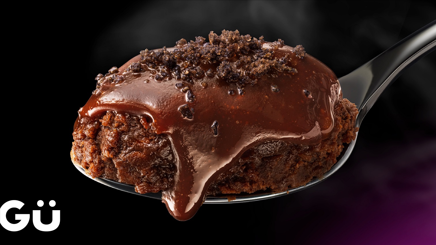
All new photography takes learnings from modern, expressive styles, giving an elevated prominence to the delicious puds themselves, balancing brand recognition and individual stand out with poise.
Simply irresistible.
Source: Derek&Eric
You must be logged in to post a comment Login