
Craft beer has spent years competing to be louder, darker and more serious. Harbour Brewing Co. decided to head in the opposite direction.
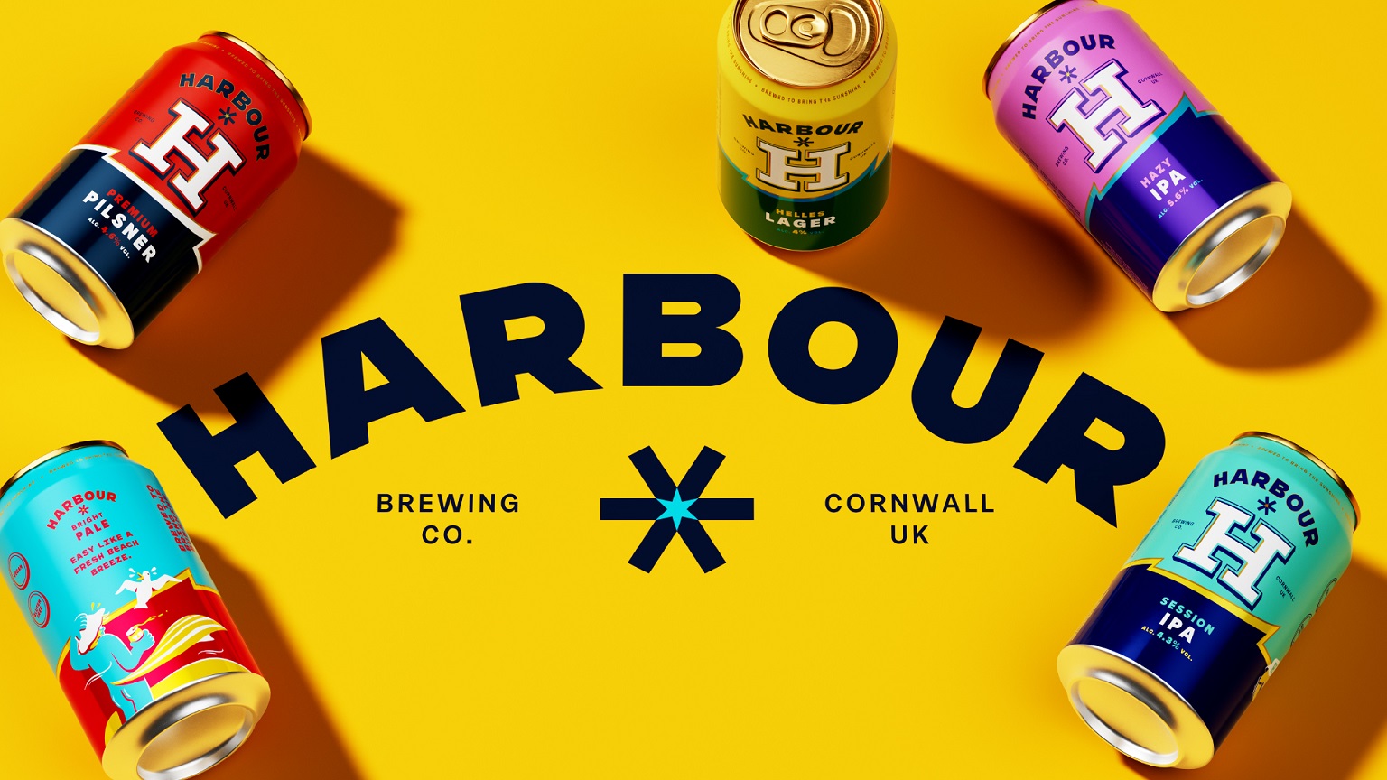
Working alongside the Cornwall-based brewery, independent design agency Thirst has unveiled a vibrant new identity and packaging redesign inspired by the freedom of the Cornish coast, the reward that comes after a day outdoors, and the simple pleasure of good beer shared in good company.
Across beer and lifestyle, coastal brands have often settled into a muted, and slightly desaturated visual world. Harbour saw the coast differently. Rooted in an optimistic vision of modern Cornwall, the new identity captures the colour, warmth, energy and togetherness of life by the sea, inviting drinkers to cool down, relax and stretch the fun a little longer.
Built around the strategic idea Sun-Soaked Playground, the redesign transforms Harbour from a brewery anchored to a place into a brand built around a feeling. Rather than representing one destination, Harbour becomes a meeting point – wherever people gather after the surf, the swim, the hike or the ride to enjoy life’s brighter moments together.
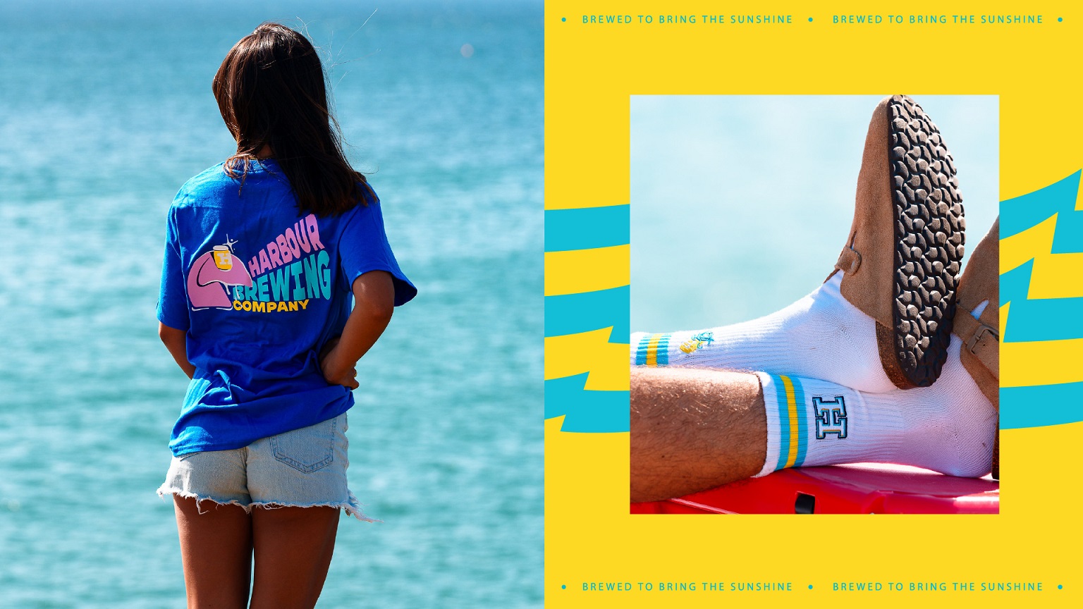
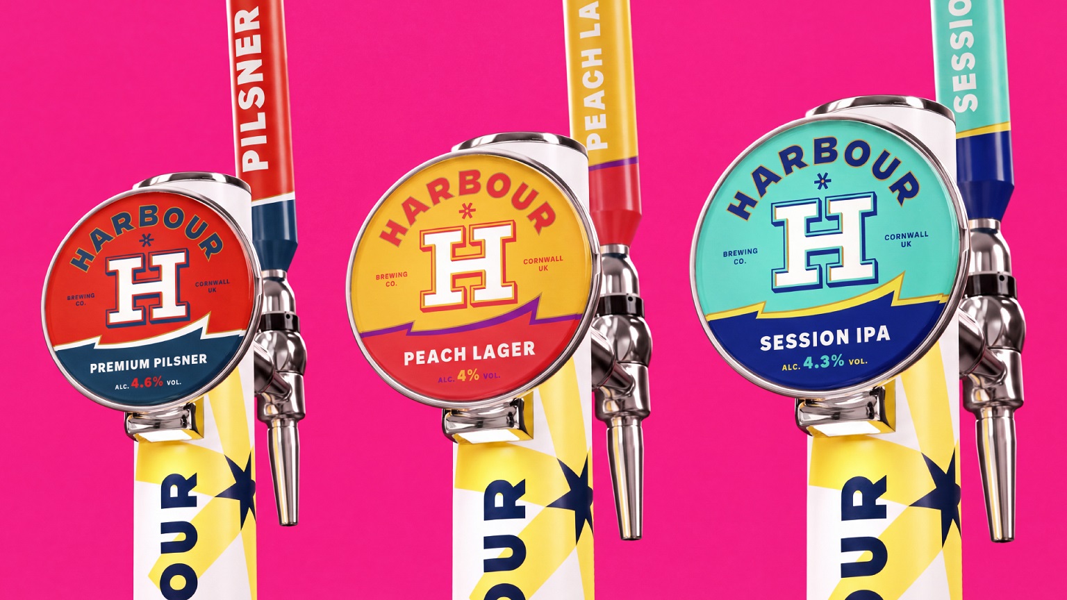
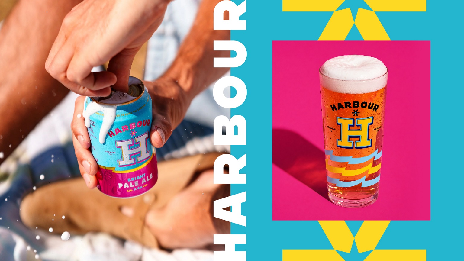
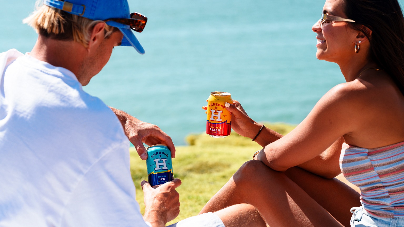
That idea comes to life through a bold visual identity centred around an unmistakable white H marque. Inspired by the structural forms and wayfinding of working harbours, the marque creates depth through light and shadow while acting as a confident masterbrand anchor across cans, taps, glassware, merchandise and brand experiences.
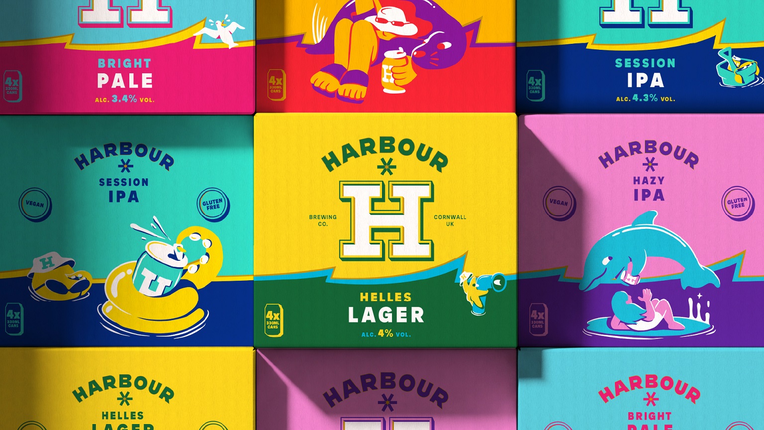
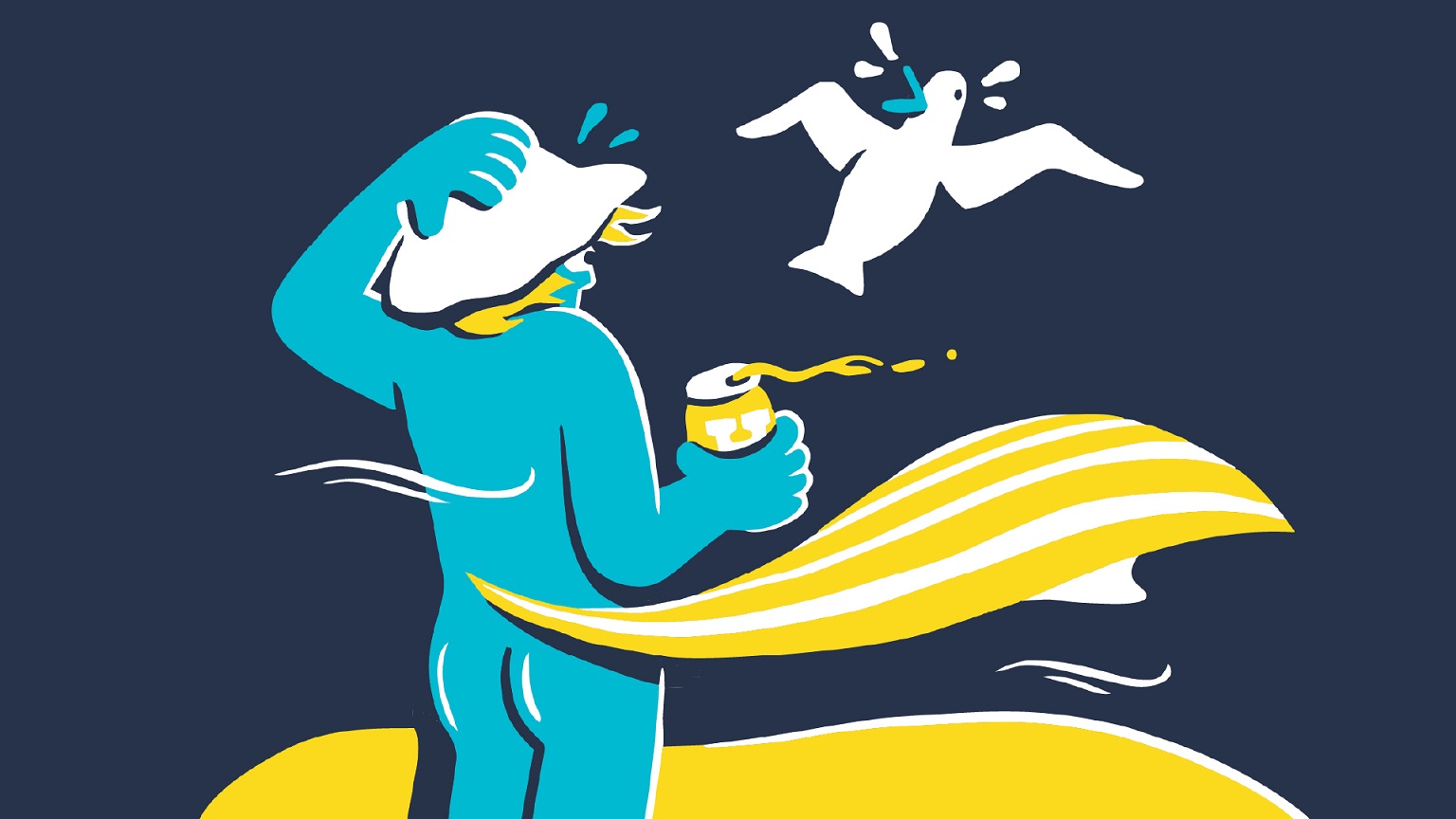
A palette of sunshine yellows, clear-sky blues and deep ocean navy is paired with dynamic wave graphics and a bespoke illustration style created in collaboration with illustrator Con McHugh. Together, the system captures the optimism of the Cornish coast through a visual language that feels contemporary, playful and full of personality.
Behind the expressive visuals sits a disciplined brand system designed to grow with Harbour, grounded in familiar coastal cues drawn from painted boats, buoys and beach huts. Each beer has its own distinct character and colour palette, while the H marque, wave device, gold detailing and consistent architecture create a recognisable family across the range. The result is stronger shelf impact today and a flexible platform for tomorrow’s products, experiences and collaborations.
The redesign also gives Harbour a clearer point of difference in an increasingly crowded craft beer category, helping the brewery strengthen recognition both on shelf and in the on-trade as it continues to expand beyond the South West.
“Harbour already had a brilliant spirit. We wanted to bottle that feeling,” says Sam Cutler, Creative Director at Thirst. “We kept coming back to those moments after the action – when the boards are down, the sun’s still out and everyone settles in for a beer. The identity needed to feel as relaxed and playful as that, while working incredibly hard as a brand. There’s a huge amount of craft behind every decision, but hopefully what people notice first isn’t the design but the feeling. The hardest thing to create is something that feels effortless.”
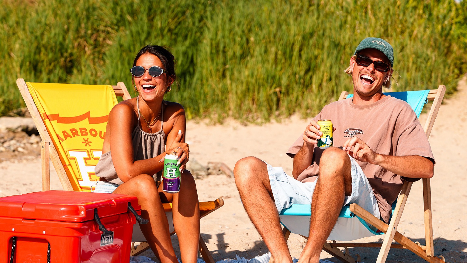
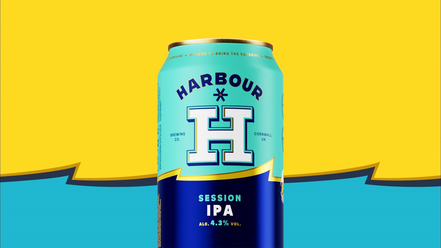
The identity has now rolled out across Harbour‘s packaging, merchandise, digital channels and branded experiences, helping bring greater consistency and impact to every customer touchpoint. The early commercial response has been equally encouraging. Since launch, Harbour has reported sales up 45% year on year and 18% ahead of budget, demonstrating that the new brand is resonating with both existing customers and new drinkers alike.
“Thirst understood very quickly that this wasn’t just about making Harbour look different – it was about helping us grow,” says Eddie Lofthouse, Founder at Harbour Brewing Co. “They understood where Harbour was heading, not just where we’d been. What they’ve created feels unmistakably ours, while giving us far more room to evolve. From the packaging to the wider brand world, every element feels considered, commercially strong and true to who we are. The early response has been incredibly encouraging, and we’re excited to keep building on that momentum.”
As Harbour continues to expand across the UK, the new identity provides a flexible platform for future beers, collaborations, merchandise and experiences – bringing the optimism of the Cornish coast to every touchpoint.
Source: Thirst
You must be logged in to post a comment Login