
custom typography and a vibrant palette, andstudio crafts a brand identity that reflects one coffee company’s blend of innovative business model and quirky aesthetic.
The award-winning brand and digital design agency andstudio has transformed the visual identity of OddWorks, a subscription-based small-batch cold brew coffee brand based in the UK.
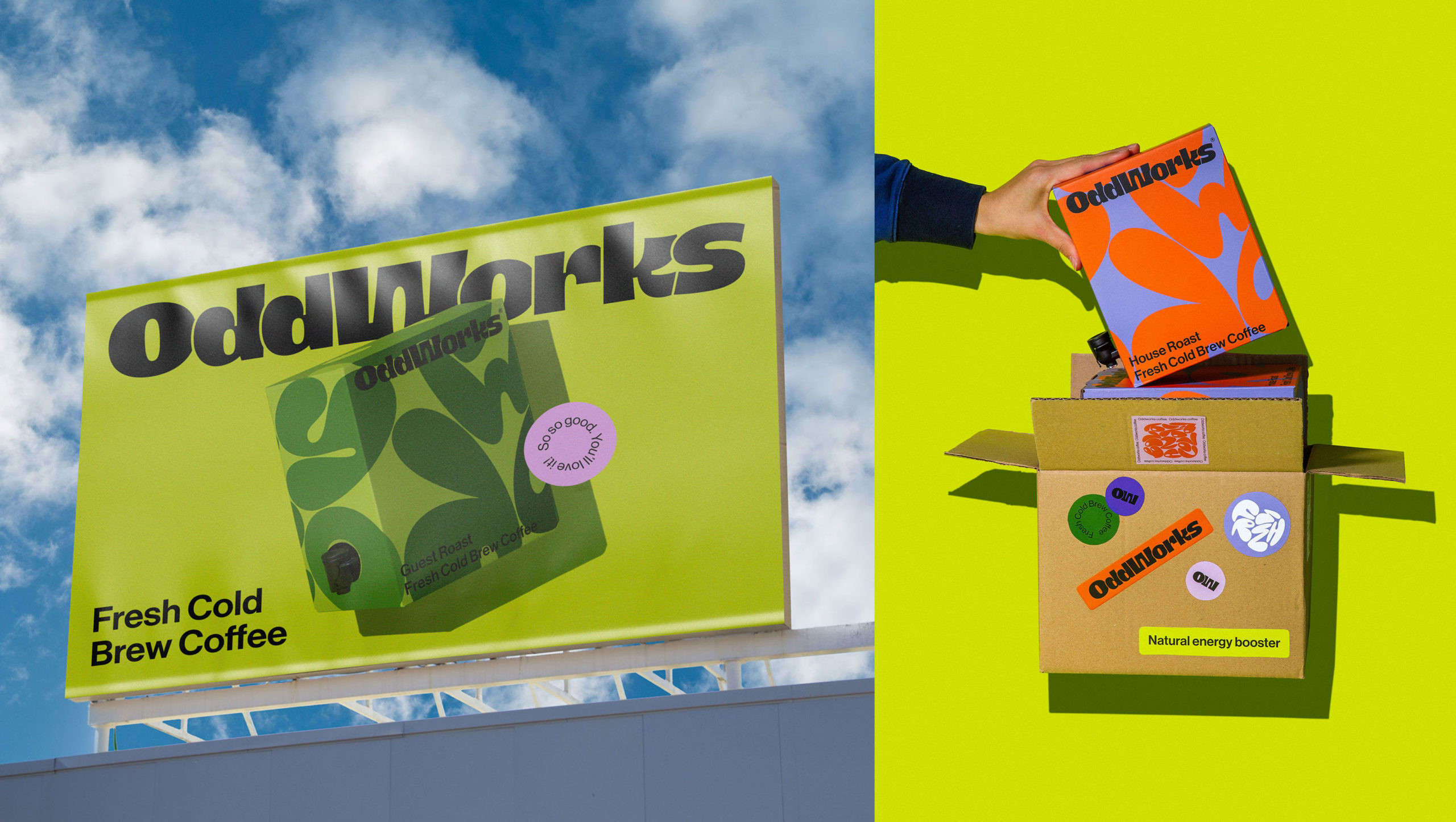
As their name suggests, OddWorks embraces the appeal of the ‘odd’ and the unusual. andstudio has therefore crafted a brand identity that is as bold and inviting as OddWorks’ aesthetic values and as innovative as its small-batch cold-brewing process and subscription-based service model.
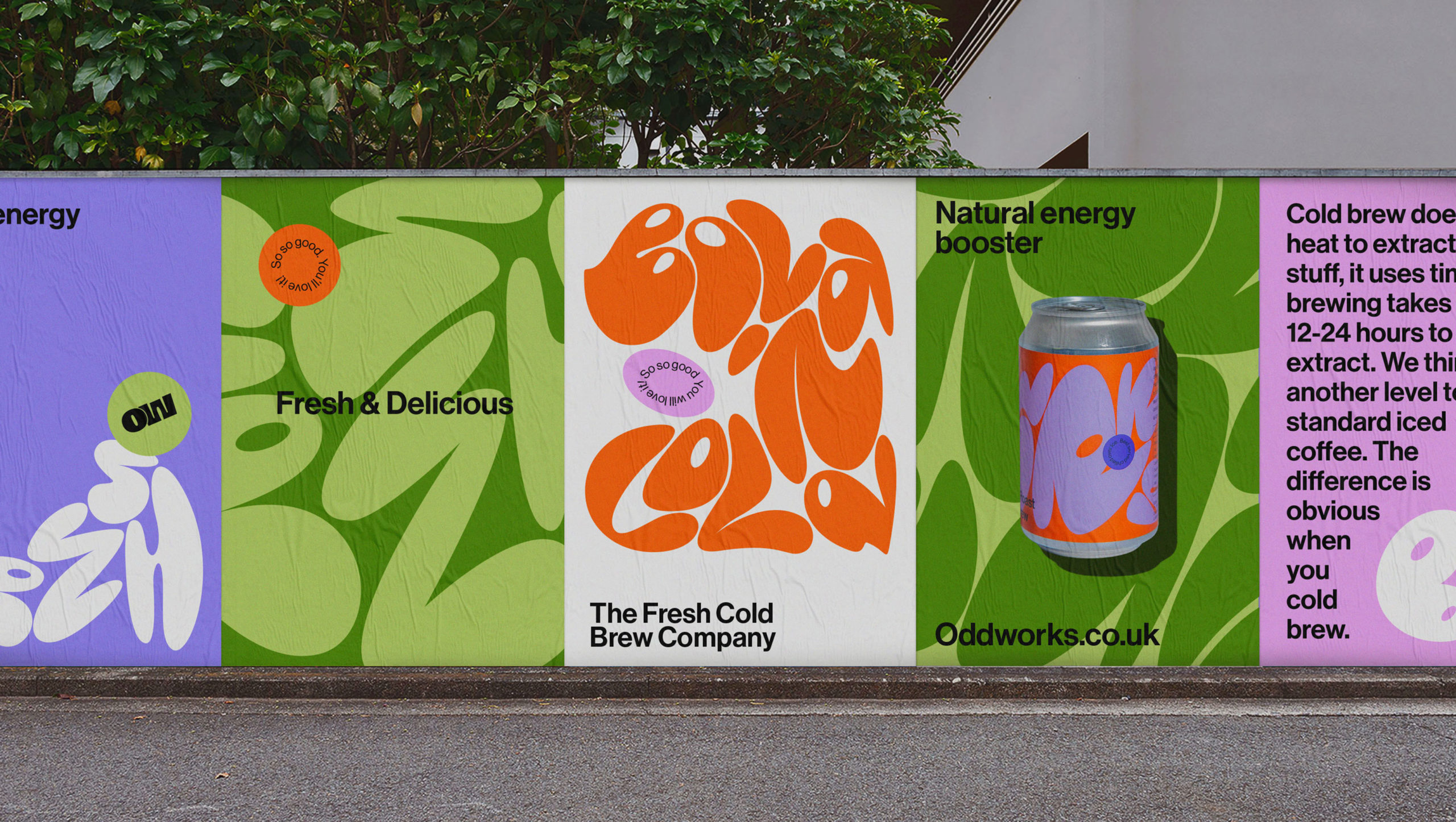
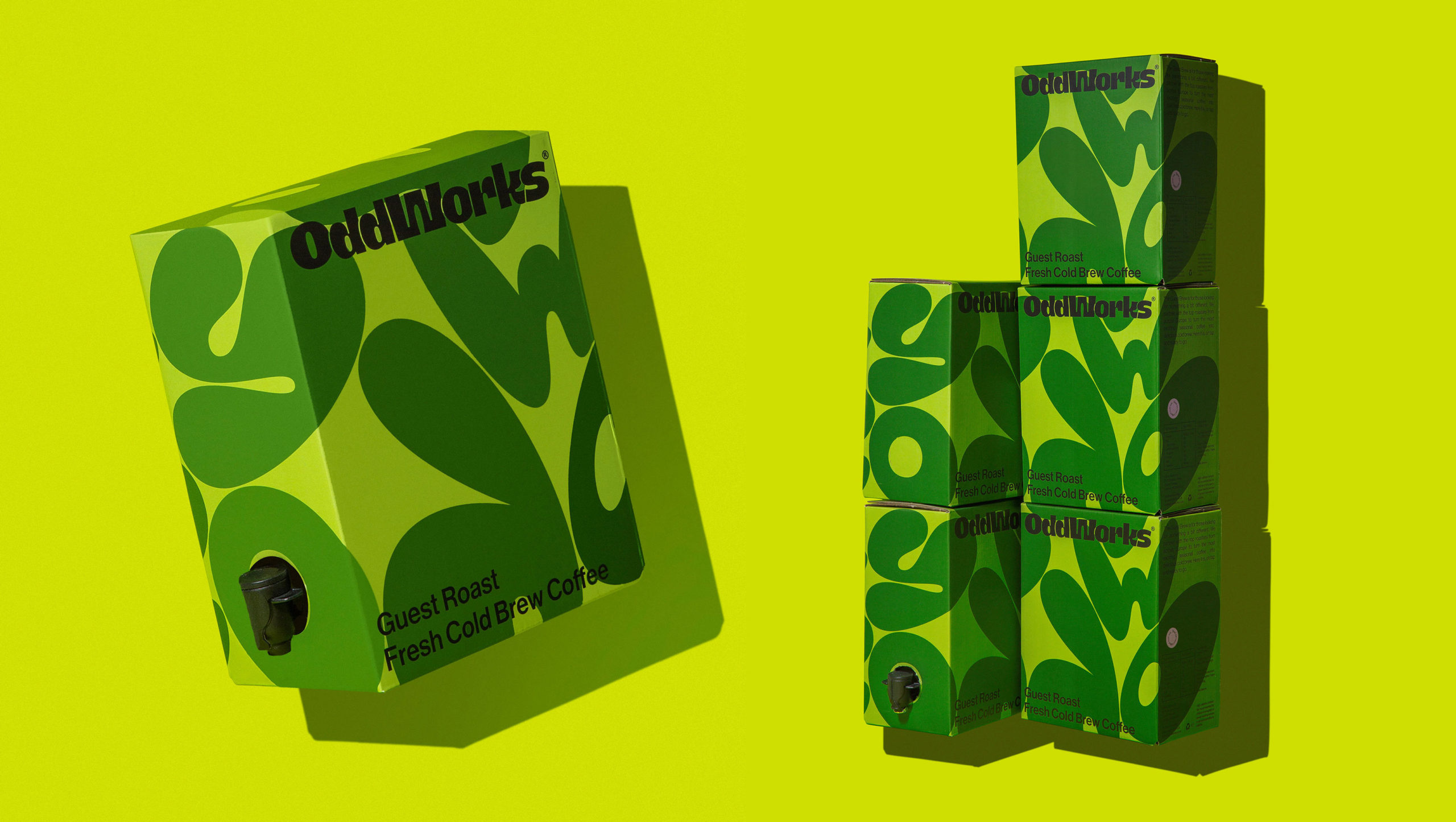
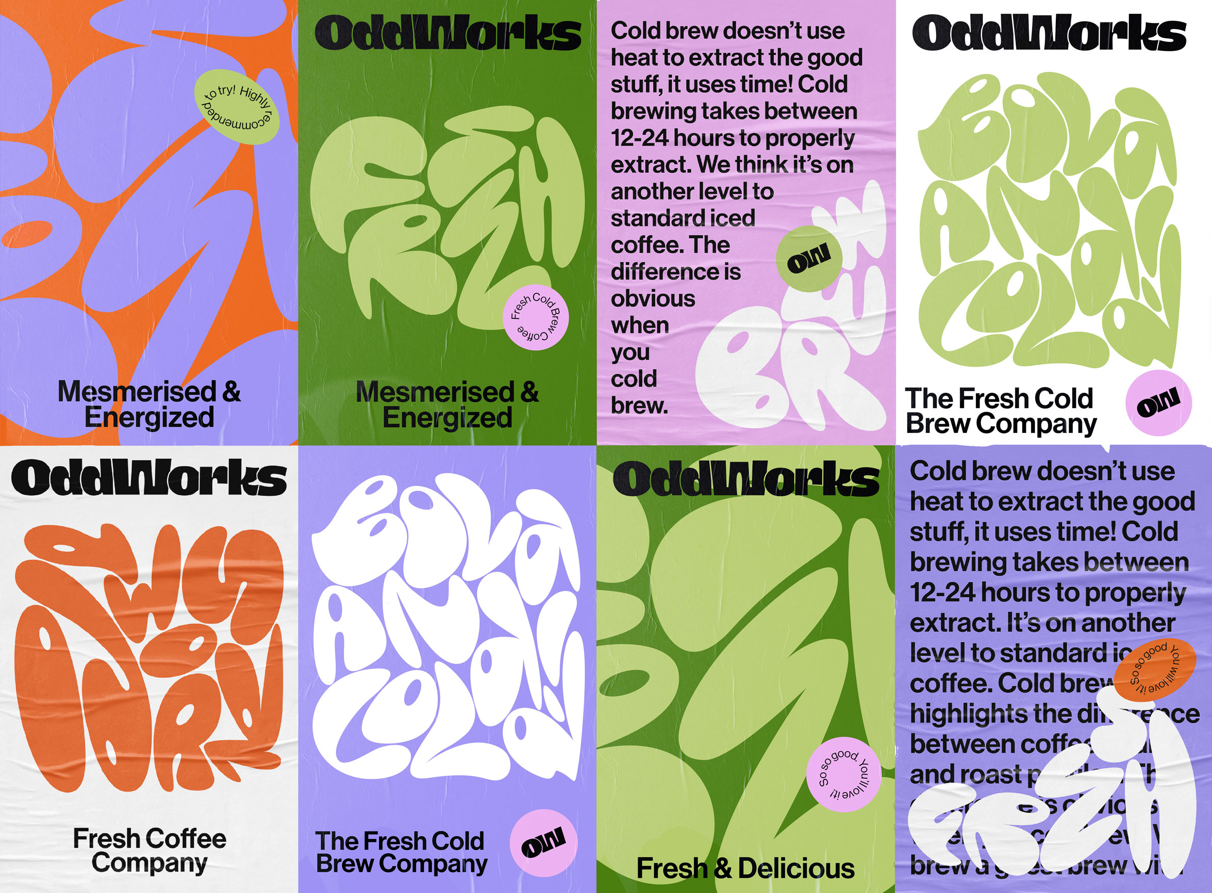
andstudio’s unique design solutions, recently featured on the behance.net blog, addressed this challenge by infusing an energetic and odd look into the brand’s visual language. Distorted letters and geometric shapes became integral components, expressing the brand’s uniqueness and inviting consumers to question and explore.

Meeting the Challenge Head-On
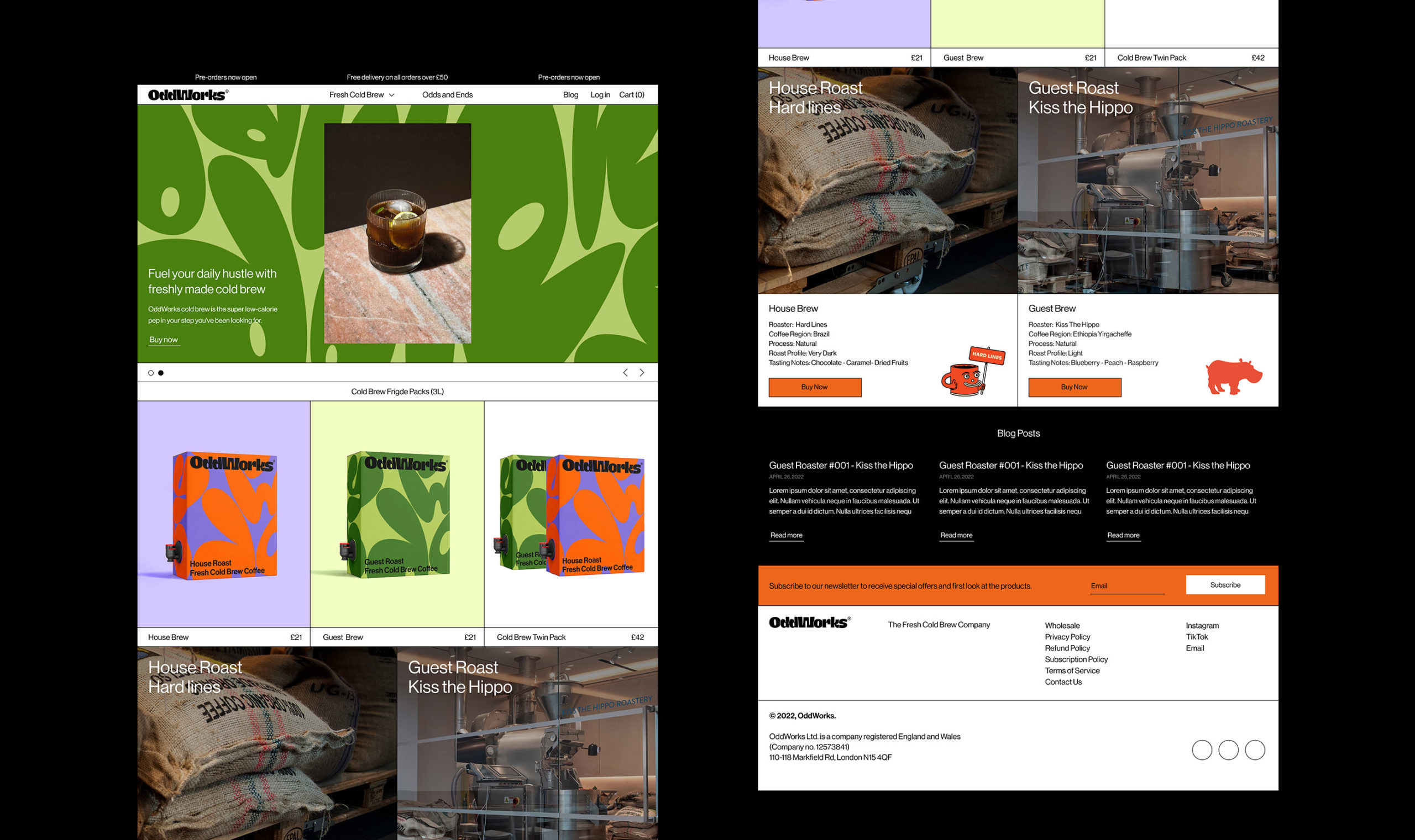
andstudio determined that OddWorks needed a brand identity that would spark customers’ interest in shaking up their usual coffee routine, trying something as new and fresh as cold-brew coffee by subscription. The brand’s original packaging was well-crafted, but it leaned towards a safe, minimalist aesthetic, such that it did not reflect the oddness of the OddWorks name or the expressiveness that the company’s founders valued.
The goal was not just to be different but to be intriguing, to transform ‘odd’ into an appealing aspect of the brand’s identity. “Our design decisions were driven by the insight that coffee is not just about taste but also about energy,” says Augustinas Paukste. “The new packaging vividly reflects this dual aspect. We developed a design aesthetic that is not traditionally ‘foodish’ in order to highlight the idea of a more open perspective on coffee culture.”
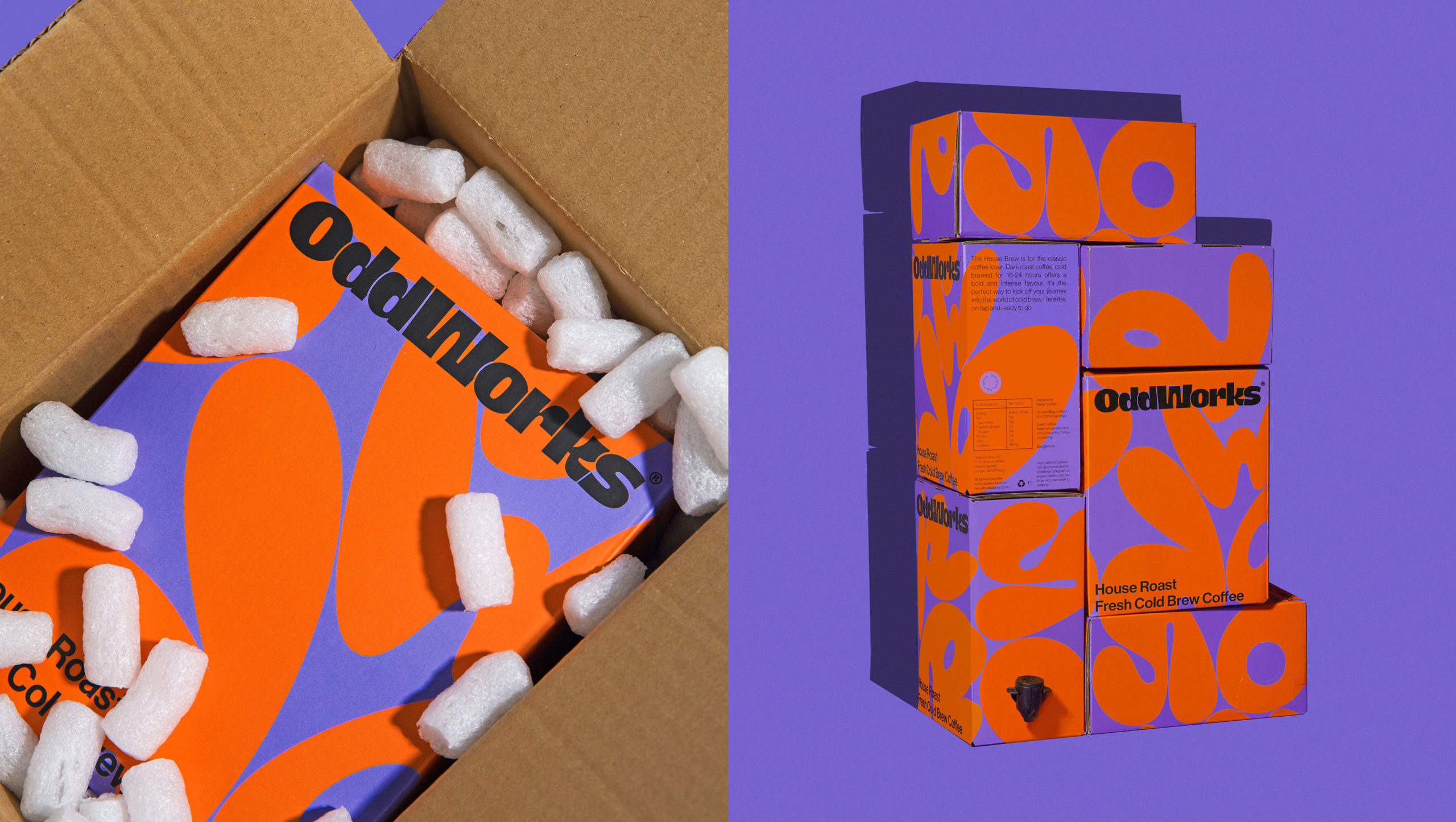
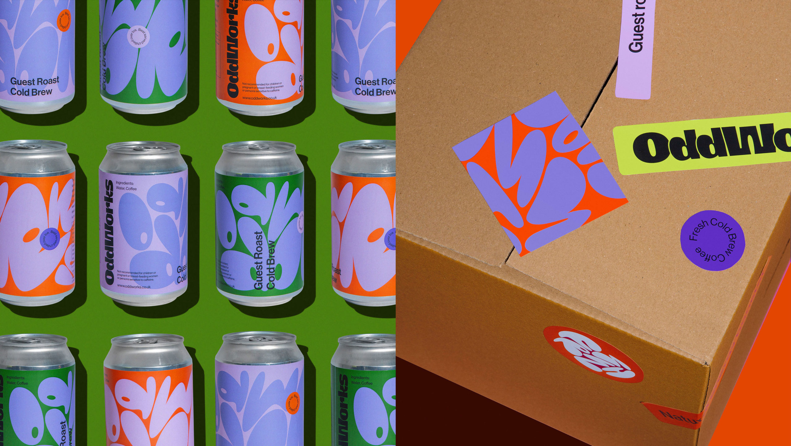
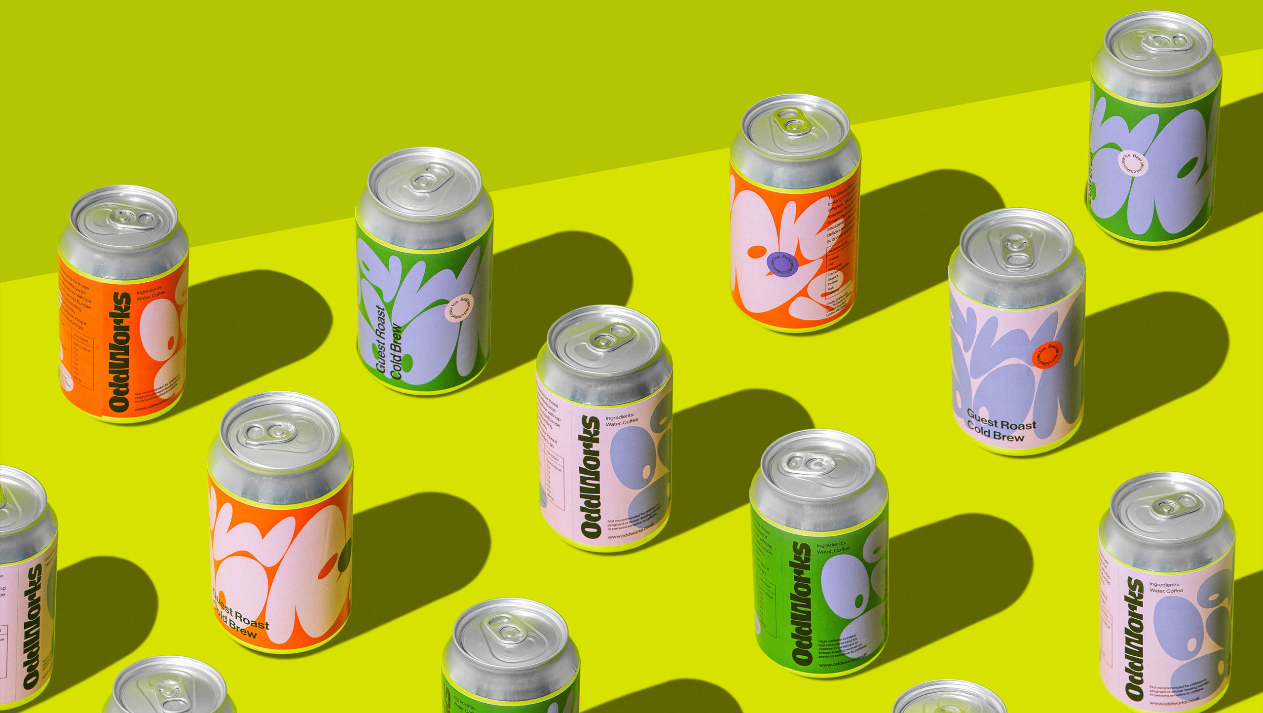
Typography played a crucial role in conveying the experimental feeling associated with OddWorks. A custom-made, organic blob form was created as the primary font, representing the odd and unperfected nature of experimentation. The secondary font, Neue Haas Grotesk, was selected for its functional aspects, providing a balance to the expressive primary font. The logo design exudes quirkiness and character, ensuring that OddWorks stands out amidst visual noise.
The Impact: A Colorful Invitation to the Unconventional
andstudio‘s rebranding efforts position OddWorks as a colorful player in the artisan coffee landscape. In a coffee house adorned in earthy tones, with numerous minimalistic coffee brands, the bold colors and irregular geometric shapes of the OddWorks branding truly stand out. “The packaging design, with its unique typography and bold colors,” says Paukste. “invites consumers to embrace the brand’s oddity and embark on a new and satisfying coffee routine.”
As the coffee industry continues to evolve, OddWorks stands out as a beacon of creativity and innovation, challenging conventions and redefining the boundaries of what a coffee brand can be. andstudio’s collaboration with OddWorks exemplifies their prowess in transforming brand narratives and creating visually striking identities that resonate with both clients and consumers.
Source: andstudio
You must be logged in to post a comment Login