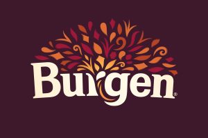
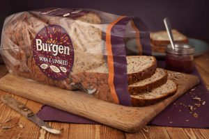
 Following recent rebrands of Kingsmill and Allinson’s, Allied Bakeries, is launching a new identity for Burgen, another key brand in their portfolio. BrandOpus has worked with Allied on all three rebrands and has helped Burgen to redesign their brand and packaging across its entire range.
Burgen is relatively new to the bread aisle, having only launched in 1997, and many consumers consider it to be quite specialist and a stretch to purchase for those who have never tried it. The challenge was to give consumers a greater understanding of Burgen, which offers genuine health benefits along with distinctive, tasty ingredients.
The brand is natural, healthy and delicious and this abundance is portrayed through a cornucopia which appears on pack providing nourishment into the loaves. The rebrand allows Burgen to appeal to consumers who are actively engaged in a healthy lifestyle but who do not want to limit their diet. Burgen offers them healthy choices to maximize life not restrict the enjoyment of it.
 The aspiring rebrand will also been rolled out to their gluten-free range and has allowed Burgen to increase their offering into sandwich alternatives such as Burgen Thins.
Ellen Munro, creative director, at BrandOpus says, “While Burgen is known for its health benefits, it’s also actually great tasting bread. We looked to bring in feelings of vitality and energy to the brand whilst giving it the taste appeal it deserved. We positioned a cornucopia at the heart of the wordmark to symbolise the abundance and goodness Burgen provides.”
Janene Warsap, Marketing Director, at Allied Bakeries says, “We really wanted to inspire delicious, health living every day with the new Burgen rebrand. BrandOpus really helped us define the role and value that Burgen can bring to the category whilst retaining the uniqueness and foundations upon which Burgen was built.”
Source: BrandOpus

You must be logged in to post a comment Login