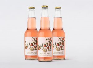
 Leading drinks design agency Denomination has designed a new product, Strongbow Blossom Rosé Sparkling Apple Cider, for Carlton & United Breweries (CUB, part of the AB InBev family), aiming to bring growth and inject excitement back into the cider category.
Denomination developed an elegant and Insta-worthy design to appeal to the repertoire of drinkers who usually enjoy white wine, cocktails or sparkling wine, enticing them to choose Strongbow Blossom Rosé Sparkling Apple Cider as an alternative ‘starter’ drink. The aesthetics of the design solution were paramount to the success of the product and establishing its position as a premium, covetable drink.
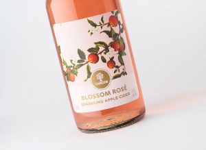
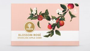
Denomination approached the design by homing in on the product’s central ingredient, apples, to establish cider cues as the main feature. The hand-drawn illustration of the apple blossom branch curving around the front label not only alludes to the tree in the Strongbow logo but also gives the product credibility and authenticity, promising taste while evoking nature and freshness.
 The chosen core colour of dusty pink mirrors the liquid colour and alludes to the light and not overly sweet taste of the cider itself. Pink hues were deliberately used to delve into the semiotics of rosé and sparkling wine, bringing cider out from the mainstream and functional thirst-quenching sphere and into a more exciting, upmarket and party-starting realm.
Although disrupting the cider market was central to both the taste and design, Denomination worked to a brief that maintained a clear connection with the current Strongbow brand, yet elevating it to attract this new consumer.
A classic Strongbow glass shape was used to ensure the product aligned to the core Strongbow branding but was produced in a flint finish for added elegance. The typeface chosen for the Blossom Rosé logo complements the Strongbow logotype and remains in tune with the style, while gold lettering elevates the design into a premium market, away from the mainstream history Strongbow has previously been known for.
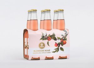
 A six-pack cluster format was selected as ideal for socialising with friends. Because the product is new, Denomination sought to ensure synergy between the label and the cluster packaging to build recognition of the brand’s assets, reinforcing the pink colour palette and the apple blossom illustration.
Paige Dawes, Marketing Manager for Cider at CUB, says: “Denomination perfectly captured the elegance and femininity that we were trying to achieve through the packaging of Strongbow Blossom Rosé Sparkling Apple Cider. The beautiful blossom illustration elevates the premium cues of the brand while creatively linking it to the cider category. The finished product speaks volumes about the talented eye for design that the team at Denomination possesses.”
 Rowena Curlewis, CEO of Denomination, says: “We worked towards ensuring the final printed packs did the design justice, as the intricacy, warmth and depth of colour in the illustration and throughout the packaging was so specific. The reaction to our design for Strongbow Blossom Rosé Sparkling Apple Cider has been so strong in both consumer research and with trade, that we believe it has the potential to positively impact the growth of the parent brand.”
Strongbow Blossom Rosé Sparkling Apple Cider is currently rolling out in retailers across Australia.
Source: Denomination

You must be logged in to post a comment Login