
Chase Design Group blends craftsmanship and confidence, transforming a regional favorite into a beacon for authentic Wisconsin cheddar
In the heart of Wisconsin’s Fox River Valley, at the crossroads of the North Woods where farm and forest intersect, is a village called Black Creek, where premium cheddar cheese gets its distinctive flavor profile. That’s where the award-winning Black Creek® Cheddar, a growing brand within the Saputo USA portfolio, story begins, producing truly authentic, bold, rich Wisconsin cheese.
Capitalizing on the cheesemaking culture and Wisconsin experience, the brand is aiming to transition from being more locally known to becoming the definitive Midwestern cheddar on a national scale.
For their first-ever brand redesign, they turned to creative agency Chase Design Group to develop a new visual identity system, logo, and packaging to make this brand more recognizable, memorable, and shoppable while honoring the rich history and story.
“While modernizing the brand, we were careful not to lose the handcrafted, artisanal feel,” says Lauren Kossar, Creative Director, Chase Design Group. “But, to stand apart, the rebrand needed to reach consumers by honing in on key aspects of their unique brand story. Research confirmed that consumers value an artisanal, locally rooted identity that celebrates small-batch craftsmanship and Wisconsin dairy pride.”
“We reimagined the brandmark to enhance legibility and impact, and introduced a new handcrafted illustration of the barn, creek, and forest landscape, bringing Black Creek’s story to life, visually expressing our Wisconsin heritage.” says Kossar.
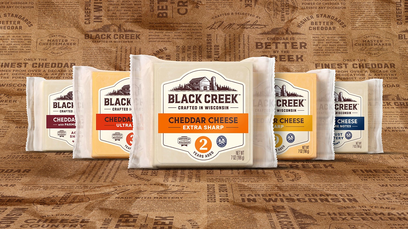
A bold, new customized typeface channels the brand’s confident, hard-working spirit, and an updated tagline below the wordmark reads, “Crafted in Wisconsin,” to reinforce the dedicated pursuit of cheddar excellence in a provenance known for exceptional cheese. The decision to shift the design hierarchy from product-led to brand-led better reflects the pride, passion, and sense of place behind the brand.
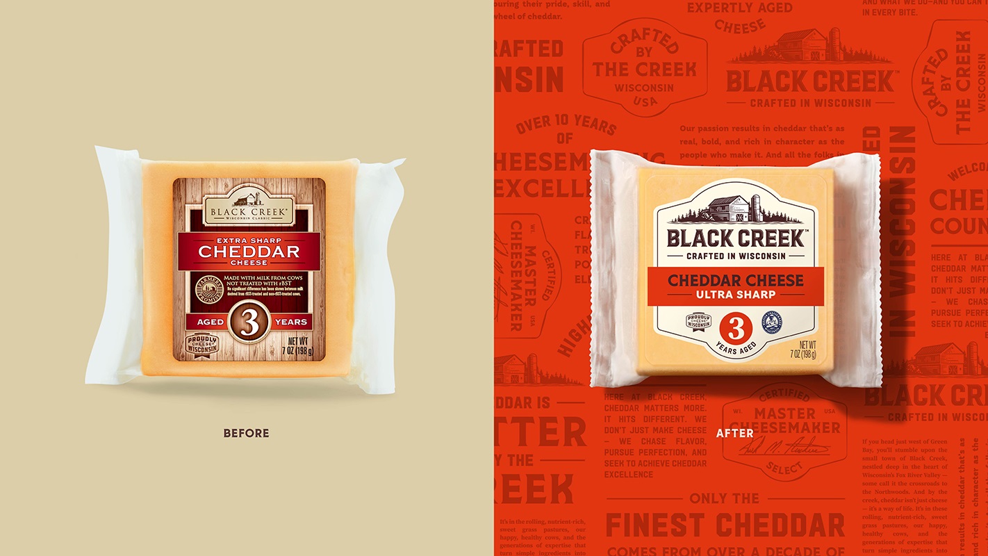
A new label shape with simple yet distinctive angles and curves at the top and bottom, as well as simplified elements on the label, modernizes and eliminates clutter, while maximizing brand impact. Bold flavor colors provide a strong contrast from the rest of the label/interior cheese product, as well as helping it stand apart from competitors. The label’s new background cream color is fresh and light, providing optimal contrast for the flavor colors.
Consumers shop for cheddar by its sharpness. The core aged line remains true to their existing colors, keeping the yellow/orange/red color space, which gets darker for the more aged cheeses. Shoppability was enhanced by using flat color instead of gradient vignettes on flavor bands to modernize as well as provide a clearer distinction between colors. The cheddar blends use rich color tones to evoke the maturity and depth of these unique and sophisticated combinations.
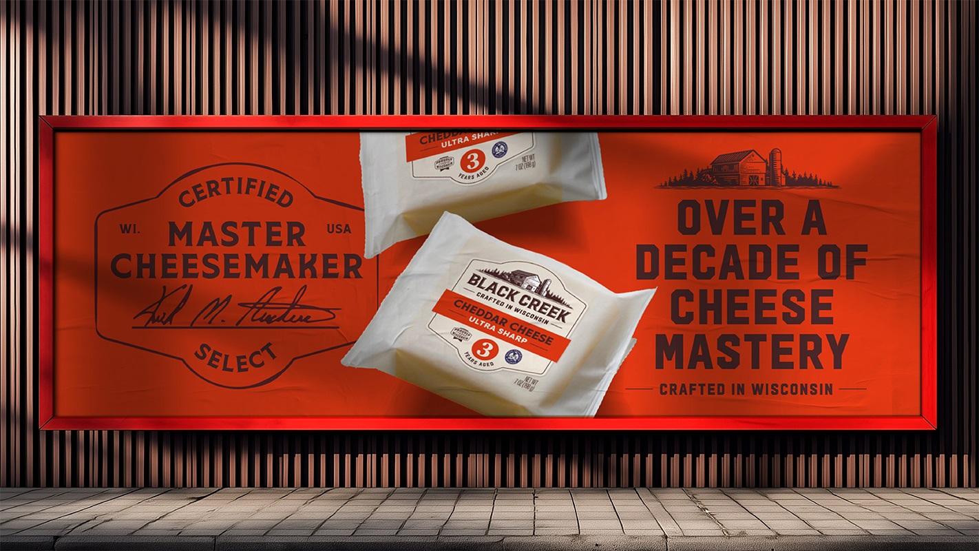
“Chase Design Group truly understood what makes Black Creek special,” says Samina Kirchen, Brand Manager, Specialty Cheese at Saputo. “They captured the craftsmanship, confidence, and pride that define our Wisconsin roots and translated them into a visual identity that feels both authentic and elevated. The new design honors where we come from while setting us up for the next chapter of growth.”
The brand is currently available regionally, but plans include expanding nationally.
Source: Chase Design Group
You must be logged in to post a comment Login