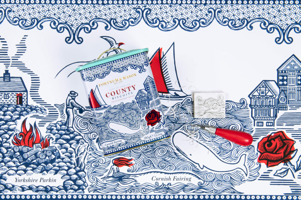
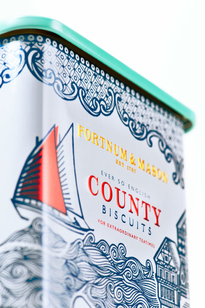
Design Bridge announced details of their latest work for Fortnum & Mason: reinvigorating the iconic British retailer’s classic County Biscuits. The branding experts have injected new appeal into the product with packaging design that depicts quirky English folklore from the counties each biscuit originates from – Cornwall, Lancashire, Yorkshire and Shropshire.
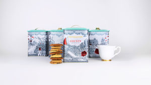
It’s the latest instalment of Design Bridge’s on-going work with Fortnum & Mason, which so far has included designs for confectionery, biscuits, honey, and the Christmas range.
Chloé Templeman, Creative Director from Design Bridge, commented: “Our approach was to attract a new wave of customers by capturing their imagination through telling the unique stories and traditions associated with the biscuits – Cornish Fairing, Yorkshire Parkin, Lancashire Flip, Shrewsbury Biscuit – using vivid illustrations of ancient folklore and traditions associated with each of the four English counties they come from.”
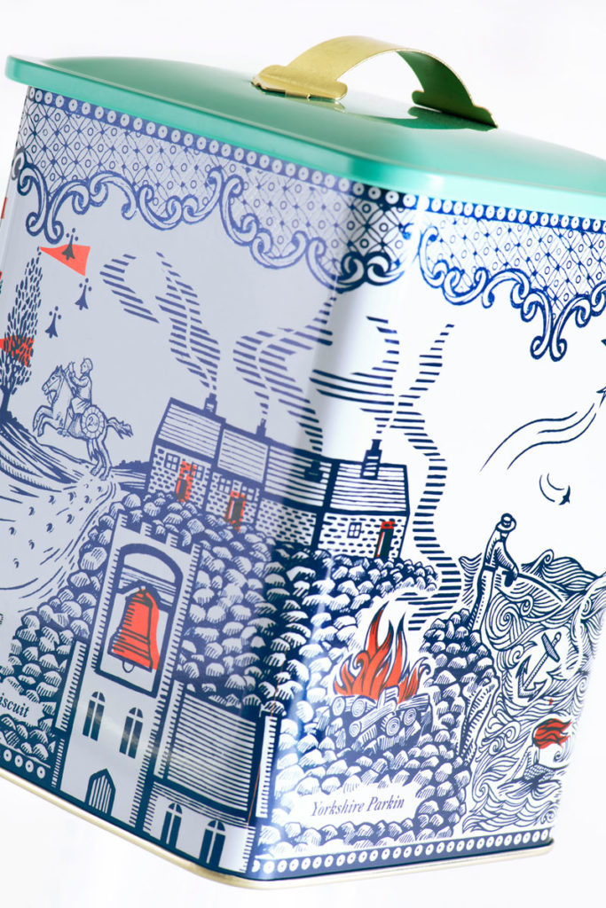
Inspired by old tapestries and woodcut prints, the agency created an intricate illustration that brings together folk tales from four English counties. The flowing composition wraps around the tin, and each corner depicts a different county; the Cornish coastline drifts into Yorkshire farmland, the Lancashire plains roll into Shropshire hills.
The addition of a bespoke illustrated decorative border, inspired by traditional serving plate patterns, subtly connects the product to Design Bridge’s previous packaging for Fortnum & Mason’s Piccadilly biscuits.
Chloé Templeman continued: “We wanted to create a biscuit tin that was appealing and charming enough that people would want to keep it and reuse again and again. That’s why we chose to combine traditional British woodcut with a tapestry of illustration that allows you to discover more every time you look at it.”
The local folklore depicted in the illustration includes the tale of a mermaid’s unrequited love for a Cornish sailor that ends in bitter revenge, the superstition of tolling the famous ‘Black Tom’ bell of Dewsbury in Yorkshire to ward off evil spirits at Christmastime, the ancient tradition of dressing wells with floral garlands in Lancashire, and the myth of a malevolent giant in Shrewsbury.
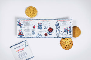
Design Bridge also created a special booklet to go inside the tin. Using evocative language to bring the history and tradition of the folk tales to life, the booklet adds extra layers of delight, discovery and storytelling when people open their biscuit tin at home.
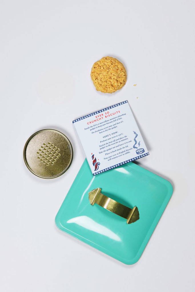
Yvonne Isherwood, Product & Packaging Design Manager at Fortnum & Mason, commented: “Design Bridge has really succeeded in breathing new life into our beloved County Biscuits, creating a design that engages customers in the stories that make these traditional biscuits so unique. We’re sure that the beautiful booklet and illustrated tin, which has a new design that keeps biscuits fresher for longer, will reignite the appeal of our County Biscuits and delight our customers for years to come.”
Source: Design Bridge

You must be logged in to post a comment Login