
DN Designs has completed the branding and packaging design for Rithm’s Enlite, a functional beverage brand positioned for today’s health-aware and performance-driven consumer. Developed for a competitive FMCG landscape, the project delivers a modern, scalable visual identity that prioritises clarity, shelf visibility, and long-term brand flexibility.
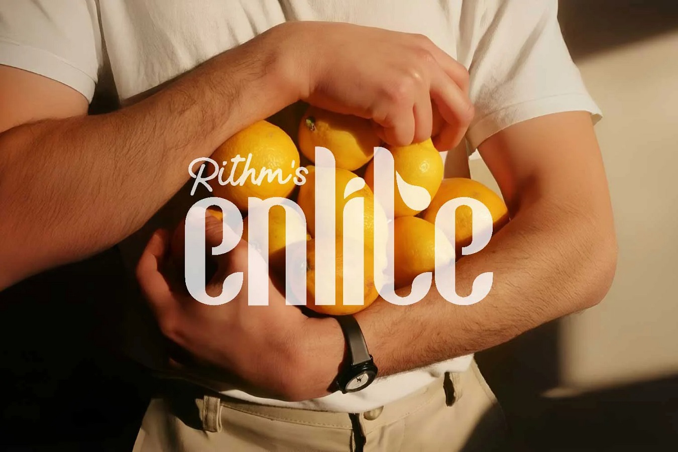
Designed as a contemporary hydration solution, Enlite enters a category crowded with bold claims and visual noise. DN Designs approached the project with the objective of creating a brand that communicates function and trust without relying on excessive graphics or technical complexity. The resulting identity balances modern wellness cues with commercial practicality, ensuring the brand is both distinctive and accessible.
A Strategic Approach to a Competitive Category
From the outset, DN Designs treated Enlite not simply as a packaging exercise, but as a full brand-building project. The studio conducted a detailed assessment of category trends, consumer expectations, and retail shelf dynamics to define a positioning rooted in simplicity and performance.
Functional beverages often struggle to communicate benefits quickly while maintaining a premium perception. The challenge was to design a system that allows instant recognition, clear information hierarchy, and strong visual consistency across multiple SKUs and future product extensions.
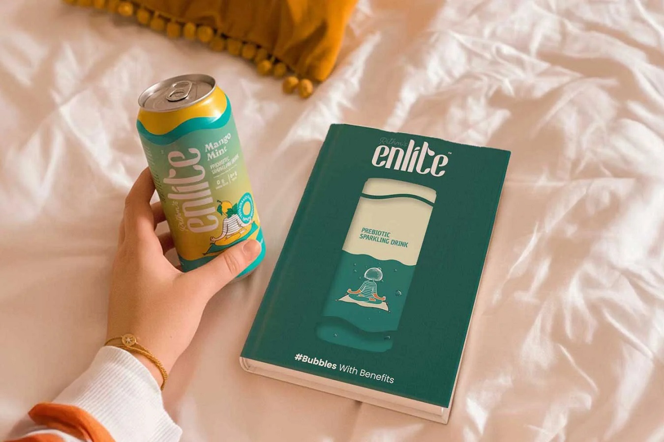
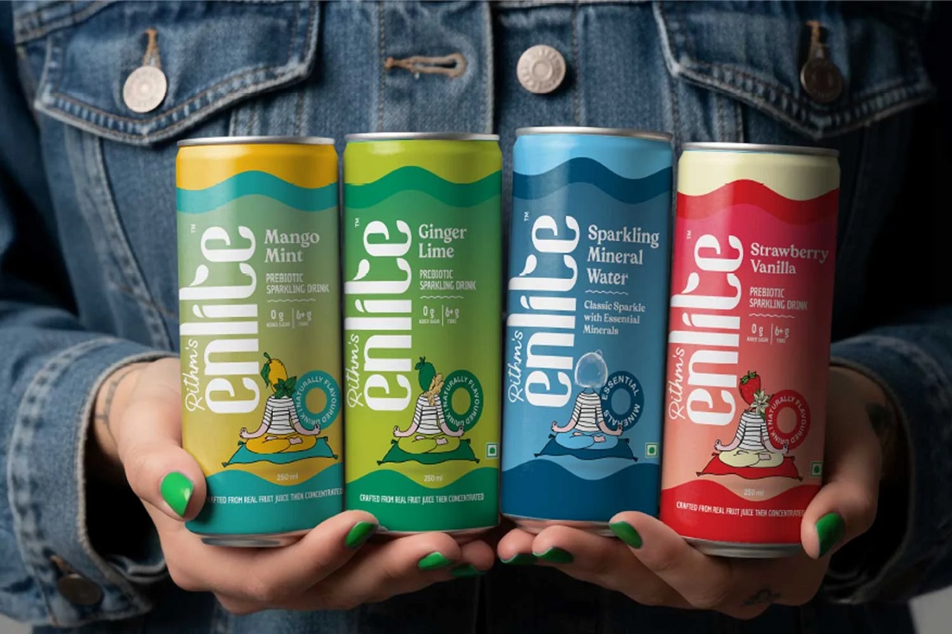
Concept and Visual Language
The Enlite brand concept is built around the idea of clarity. Both visually and in communication.
Typography plays a central role in the identity, with a strong yet minimal typographic system that ensures legibility at distance and across formats. The layout structure is clean and modular, allowing the brand name and key product information to remain the focal point without distraction.
Colour is used strategically rather than decoratively. Each variant is differentiated through controlled colour cues, while the overall system remains cohesive, reinforcing brand recall on crowded shelves.
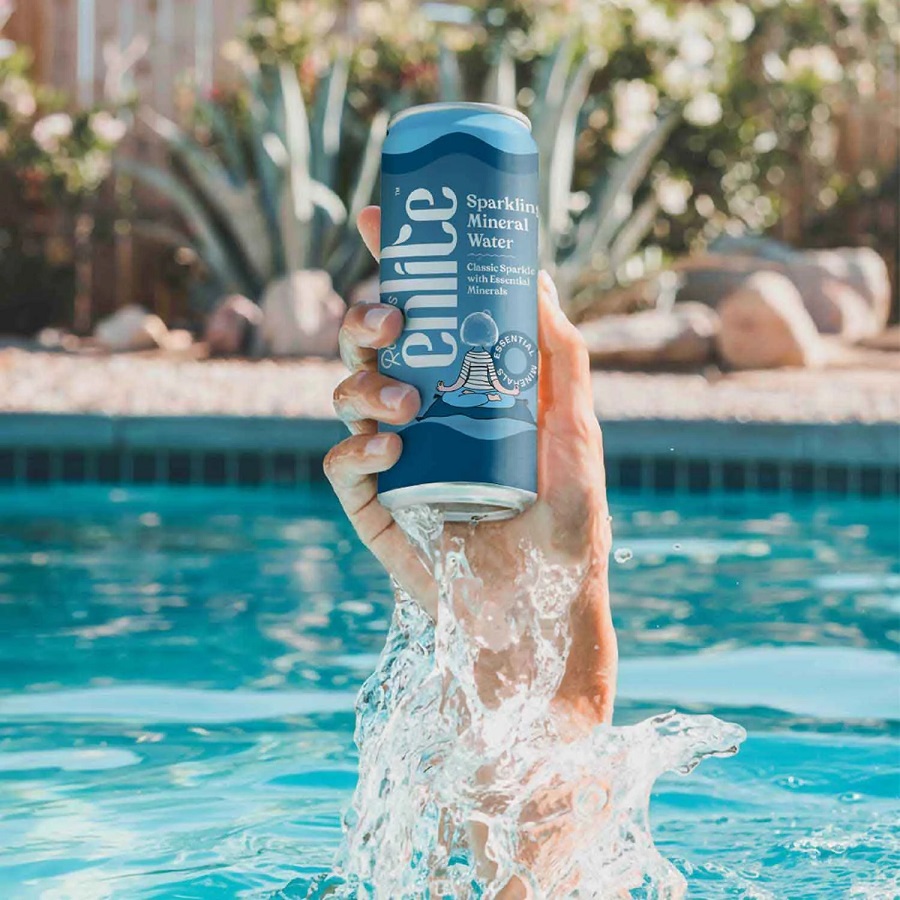

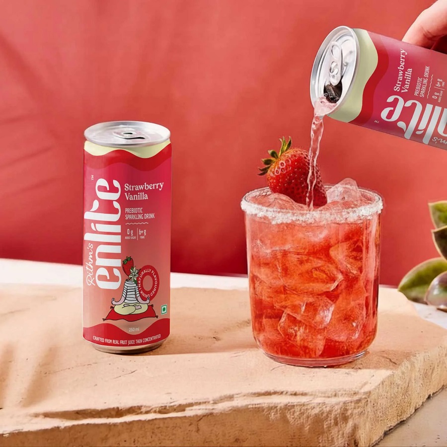
Packaging System and Scalability
The packaging design was developed as a flexible system rather than a single fixed layout. This allows Enlite to expand its product range while maintaining a consistent brand presence.
Information hierarchy was carefully considered to guide consumer attention. Brand name, functional benefit, and essential details are clearly prioritised, supporting quick decision-making in retail environments.
From a production standpoint, the system is designed to be efficient and adaptable, supporting different formats and print processes without compromising visual integrity.
Market Readiness and Brand Outcome
The completed Enlite identity positions the brand as modern, credible, and aligned with contemporary wellness values. The packaging delivers strong shelf impact through restraint rather than excess, allowing the product to stand out through clarity and confidence.
The project reflects a growing shift within the food and beverage sector towards cleaner design systems that emphasise function, transparency, and long-term brand building over short-term visual trends.
Studio Perspective
Reflecting on the project, Paras Kalra, Founder and CEO of DN Designs, said: “Enlite was an opportunity to design with intent. The goal was to create a brand that feels light, confident, and honest. In a category where products often compete through visual overload, we focused on clarity, structure, and scalability to build something that can grow sustainably over time.”
Source: DN Designs
You must be logged in to post a comment Login