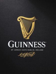
 Guinness has introduced a new design of its iconic harp logo as the Diageo owned brand aims to ‘reintroduce skill and craftsmanship’ and set it apart from the wave of new craft beers.
Created by Design Bridge, the new logo was made through collaborations with illustrator Gerry Barney, harp-makers Niebisch & Tree, and artisan letterpress studio, New North Press.
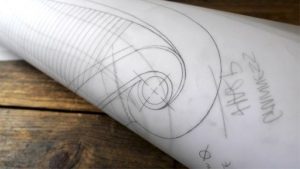
As part of the process Design Bridge made models and mock-ups of their initial harp sketches with guidance from London-based harp-makers Niebisch & Tree. The process allowed the team to ensuring their design looked and felt as authentic as possible. Design Bridge then sought the expertise of illustrator Gerry Barney, who had drawn a previous version of the Guinness harp in 1968, who hand drew the new icon from the agency’s collection of sketches and harp models.
 Mark Sandys, Diageo Global Head of Beer and Baileys, said “We’re so proud of the craftsmanship of Guinness and all the brand has stood for over 250 years of its history. The harp is the original symbol of Guinness, dating back to 1862 and it has continuously been featured on all our branding for over 150 years. In keeping with the Guinness ‘Made of More’ ethos, we have reintroduced a special handmade quality to the harp to reflect the experience, craftsmanship and passion that we put into brewing our Guinness beers.”
The new logo comes as Diageo bets bit on on its latest craft lager innovation with a seven-figure campaign investment for its Guinness branded Hop House 13.

You must be logged in to post a comment Login