McDonald’s branding is so iconic that it communicates just as well in very minimalist form, as the company’s extremely stripped-down advertising in France has long proven. Now, in Canada, the fast-food chain is applying the same approach to out-of-home ads—with surprisingly useful results.
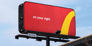
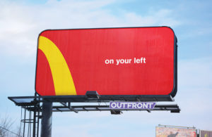
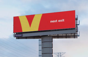
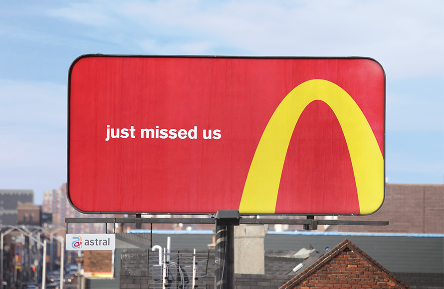
 A new campaign from Cossette crops the iconically curvy Golden Arches to direct people to the nearest McDonald’s restaurants. The “Follow the Arches” campaign turns bits of the giant yellow M into directional billboards, giving drivers easy-to-follow signs to get their McD’s fix.
It’s quite a clever idea, and we’re all for it—as long as they don’t change this classic McDonald’s directional board making fun of Burger King.
 “To create a new way-finding system, we noticed that the directions were right there in the logo,” the brand said. “By cropping the Golden Arches into a directional path, and reducing the visuals to only what’s essential, we transformed an under-utilised media space into a simple unified design system adaptable to any market around the world.”
So far, the campaign includes just four billboards (three static and one digital) in high-traffic areas across downtown Toronto and the greater Toronto area. But Peter Ignazi, chief creative officer at Cossette, said the concept could eventually solve the problem of hundreds of differently designed directional posters in Canada—and indeed, around the world.
 “We noticed that all over Canada, from major cities to small towns, you could find signs directing you to the nearest McDonald’s,” he said. “This campaign is a nod to those signs, but with a fun visual twist. With minimal text and a creative use of the brand’s colours and logo, ‘Follow the Arches’ not only translates on a national, but a global scale.”
“The campaign is a playful example of how the arches are recognisable, even when the consumer only sees a portion of the logo,” added Andrew Mumford, McDonald’s regional marketing supervisor.

Source: Adweek

You must be logged in to post a comment Login