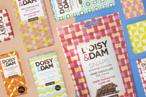
 Doisy & Dam are a UK based artisan chocolate manufacturer, who produce original flavours from innovative ingredients that have been ethically sourced from around the world, to create premium food products that provide the most delicious balance between nutrition and indulgence.
They were looking to stand out on the shelves and communicate their exotic on-trend flavours through the packaging.
Naked Ideas, a creative design agency based in London, helped rebrand the Doisy & Dam brand and designed the packaging across their new snacking chocolate product called Snaps.
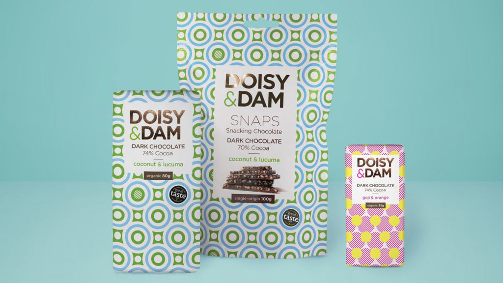
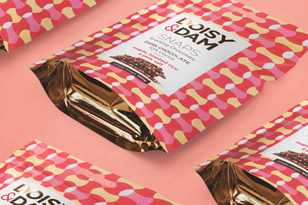
The idea behind the Snaps range was to create a product that would allow people to share their chocolate through a more simple, snack-able approach. The design house illustrated their fun and bold personality through geometric forms, type treatment and colour.
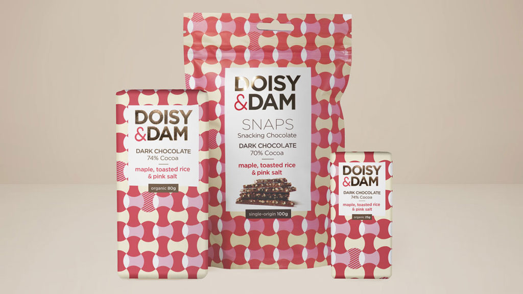
“We used an uncoated stock to reflect the organic, handmade element of the brand and punchy bright PMS tones to elevate their colourful ingredients. As Doisy & Dam are a chocolate boutique, we wanted to make the packaging look as premium as the product. Therefore, we laced copper foiling through the brand name and the inside of the Snaps product as a subtle note to luxury,” said Naked Ideas in their release.
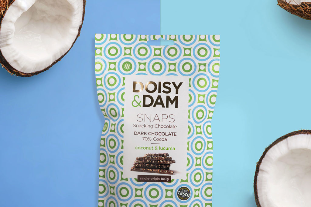
The newly branded products are now available in larger UK-wide supermarkets such as Sainsbury’s, Planet Organic and more recently Boots. They come in their original and most popular two flavours; coconut and lucuma dark chocolate; and maple, toasted rice and pink salt.
Source: Naked Ideas

You must be logged in to post a comment Login