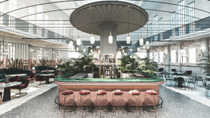
London agency FormRoom drew on the very best in service, function and interior trends within the food and beverage industry to create luxury European restaurant, Kailo.
“It’s an exciting landscape, where hospitality brands are emerging as the next generation of true powerhouses, capturing consumer’s attention in a way usually only reserved for fashion, beauty and tech brands,” the studio told us.
“Growth in spending within hospitality grew four times faster than retail in 2018, as an expanding millennial spending group tend to value experience over products. We’ve seen a sharp decline in traditional high street names that have not elevated their brand experience to match modern consumer expectations.”
The commercial design agency established that a market gap existed for a luxury, contemporary take on sustainable dining. One which operates in the mindset of the health and wellbeing trend but with the visual cues of a temptingly modern luxury environment, celebrating seasonal European cuisine.
Starting with the name Kailo, which is a loose translation from the original Indo-European word for “health”, the studio draws significant inspiration from the Roman era.
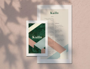
This is evident throughout all touchpoints, including the menu, graphic design and interior architecture. Working with celebrity chief, Sophie Wright, the menu was created to reflect a mix of seasonal, sustainable and botanical sharing plates and cocktails.
“The material palette was key in translating both the heritage and sustainable aspect of the brand, so our team focused on sourcing authentic elements from the Roman era such as Obsidian and Tadelakt plaster. This is combined with recycled stone, marble and Altrock surfaces, with the aim of using 80% sustainable materials throughout the design, said the studio.”
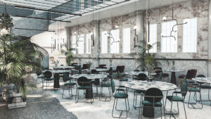
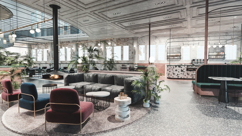
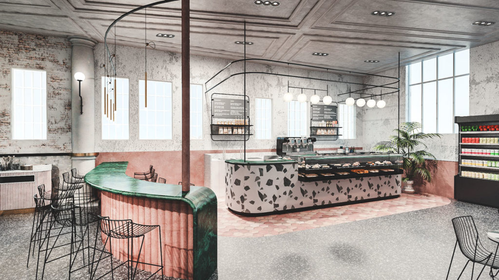
The East London building sets the structure for this multi-functional space, perfectly accommodating a different consumer need from day co-working and fast casual to an evening service more aligned with luxury cocktails and dining.
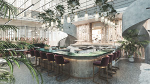
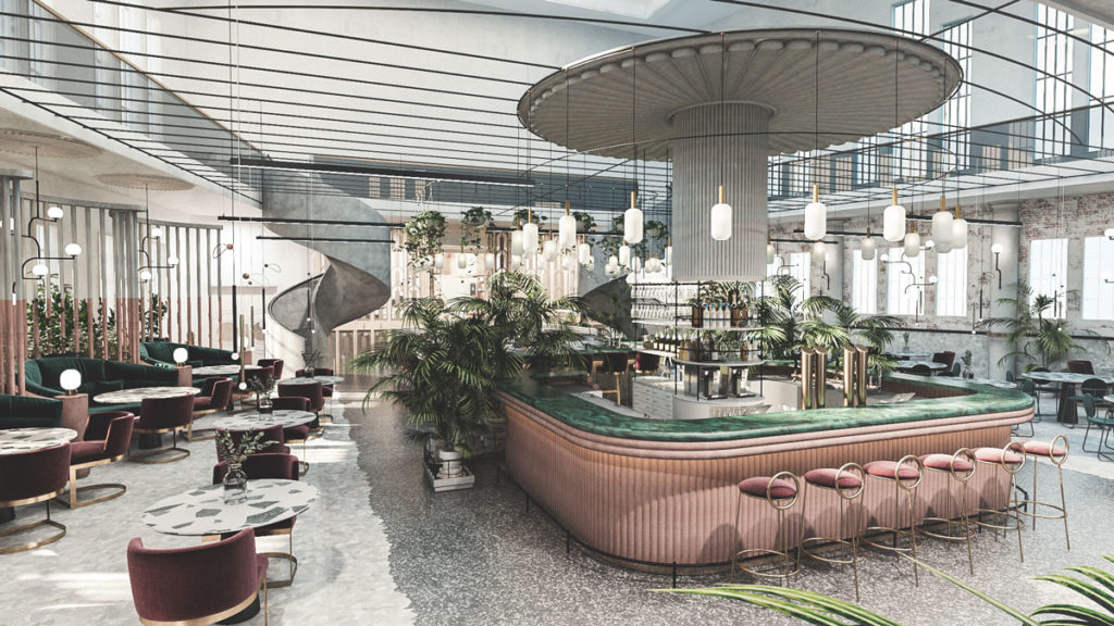
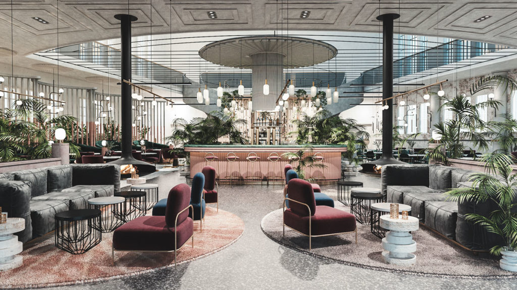
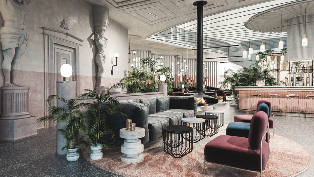
The grand central bar and sweeping arched staircase anchor the space, taking design cues from ancient Roman courtyards. Surrounding this conceptual take on the iconic roman pillar is a bar, dining area, a co-working space with a deli and to the rear; an exclusive private chef’s table experience.
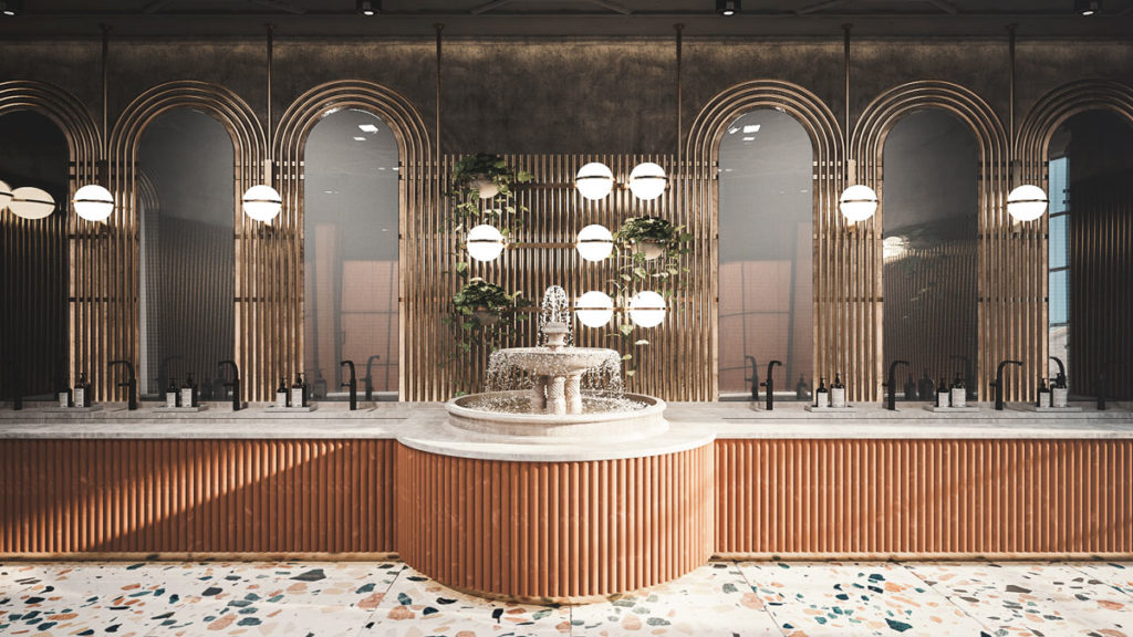
The various service areas are anchored by a consistent nod to archetypical Roman architecture with a contemporary slant. This can be seen in areas like the restrooms where the peristyle concept of a continuous porch with a central fountain has been reimagined to provide an Instagram-worthy moment for the digital hungry generation.
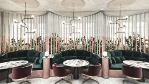
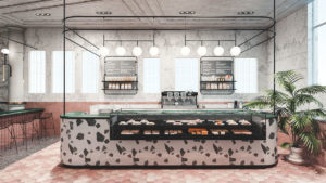
The rich obsidian stone is omnipresent and complimented with various mosaic, column or plaster finishes dependent on the zone. The lighter plaster or tile features are often offset with deeply opulent fabric choices that ensure the industrial space retains a luxuriously feel.
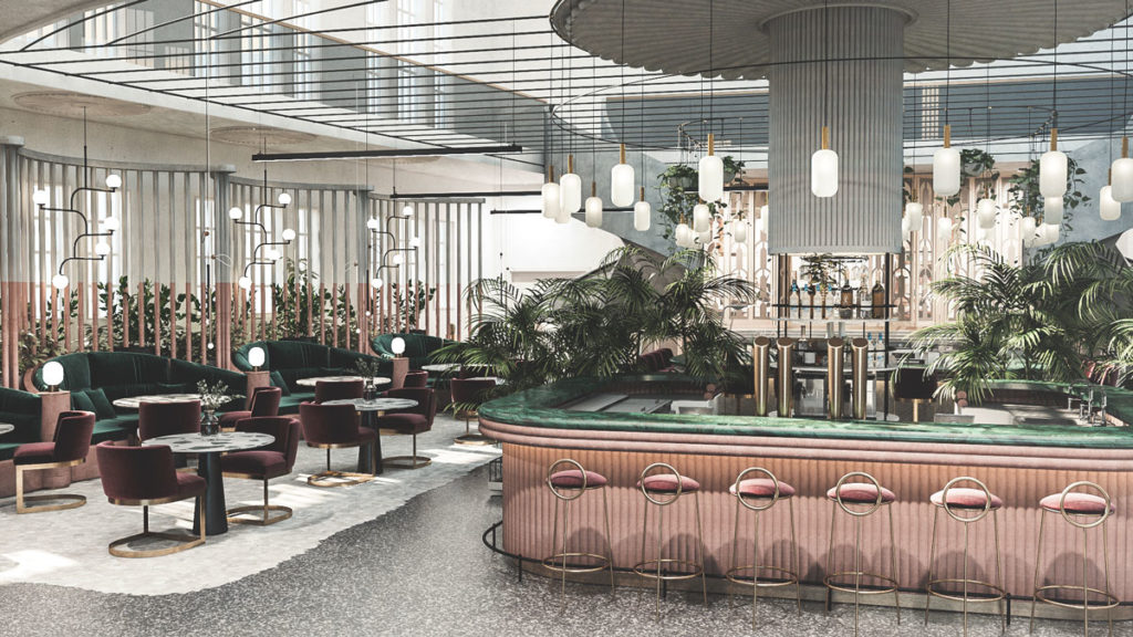
Semi-private booths line one wall, each inset with acoustically engineered materials to capture sound and provide a more intimate experience.
The lighting and general fixtures all take traditional Roman architecture cues with a more modernist design execution. This is combined with carefully selected biophilia of ivy, olive and honeysuckle to empathise the authentic Roman inspiration alongside their wellbeing properties.
Source: FormRoom

You must be logged in to post a comment Login