
 Unilever has repositioned its Flora ProActiv spreads and drinks to push a more premium, healthy lifestyle message after losing a sense of “uniqueness” in its visual identity.
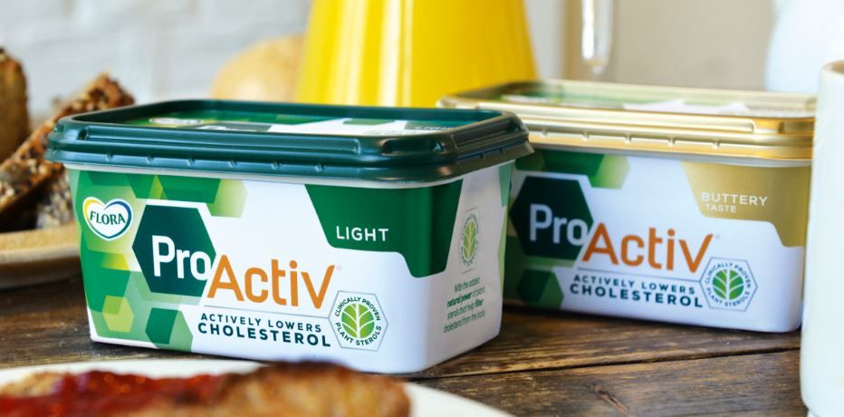
The FMCG giant worked with Design Bridge on the brief, which saw the agency create a new logo, typography, visual identity and photography style.
The design focuses on the ‘Pro’ and ‘Activ’ parts of the brand – its active plant ingredients – to hero the unique ingredients which had become lost on the packaging over time. To make this stand out, Unilever strengthened the ProActiv brand name and identity on and off the pack by framing Pro in a hexagonal shape to represent molecular structures.
Chloe Templeman senior designer at Design Bridge explained the design rationale: “The hexagons subtly suggest the science behind ‘cluster and flow’, the process by which ProActiv’s plant sterols attract cholesterol molecules in clusters and allow them to be flushed out of the body. Layering the hexagons in soft, natural green shades suggests dappled light through trees, symbolising plants, nature, the great outdoors and a healthy, active lifestyle. Placing the focus on both scientific expertise and an active lifestyle in this way once again relates back to the duality of the ProActiv brand name.”
The new identity extends beyond the margarine spreads to ProActiv’s wider range of cholesterol-lowering products designed to suit people’s needs and preferences.
You must be logged in to post a comment Login