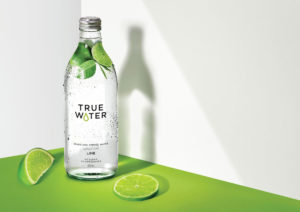
 Leading Australasian drinks company Frucor Suntory is responding to a consumer shift away from carbonated soft drinks by developing a new range of premium fruit-infused water. Called True Water, it’s designed by drinks specialist design agency Denomination.
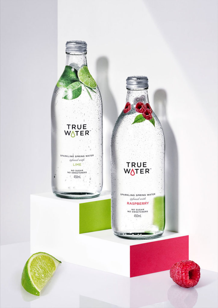
True Water will initially launch with two fruit-infused waters, raspberry and lime. Made using real fruit extracts, True Water contains no artificial sugar or sweeteners and uses pure, locally sourced Australian spring water.
Denomination developed a clean and crisp identity to communicate the brands’ ‘good for you’, healthy image while differentiating it from competitor mainstream water brands.
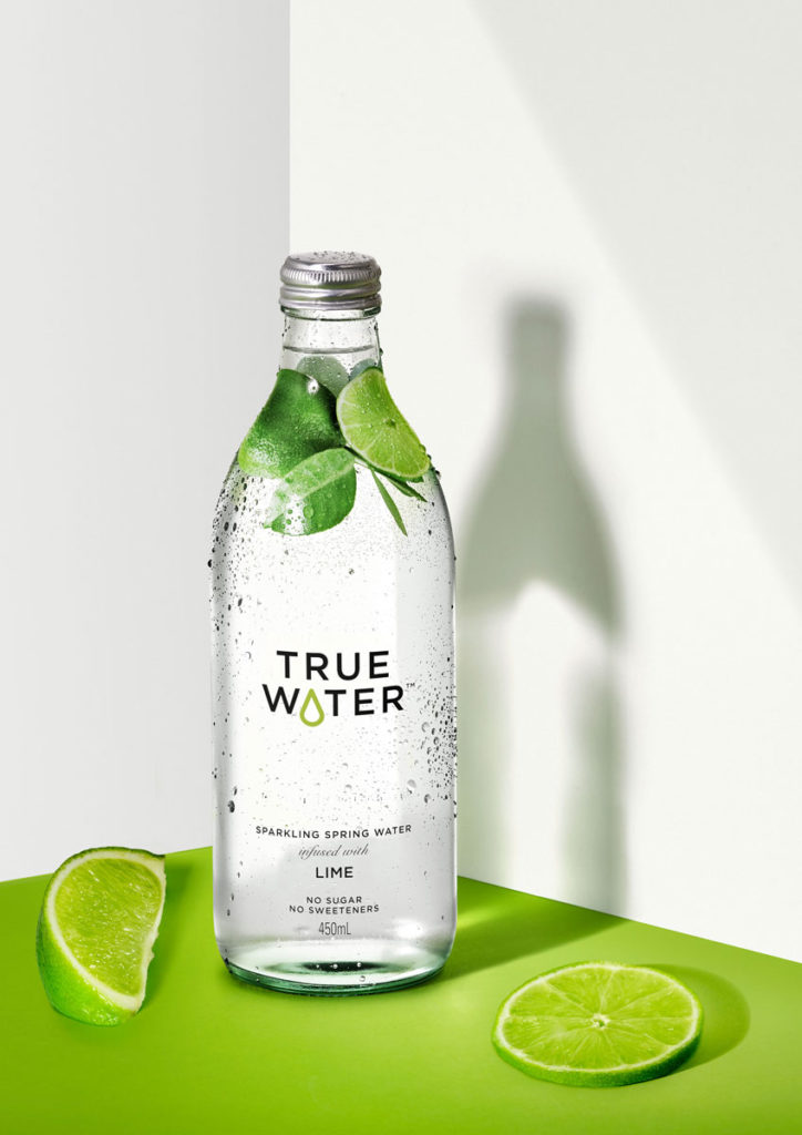
 Inspired by the simple and fresh taste, clear glass and a clear shrink sleeve with minimal graphics were chosen to showcase the purity of the water and communicate that the fruit infusions don’t add an overtly sweet taste or detract from the health benefits of the water itself.
Photographic images of real fruit were applied to the shrink sleeve at the neck of the bottles to give product clarity and look as though the fruit is floating in the water, emphasising the authentic taste True Water has over other water brands.
The True Water logo was crafted to include a drop of water, providing the brand with a distinctive asset as well as subliminally linking the graphic to the name. The water drop design changes colour dependent on which fruit extract is used, helping to distinguish flavours while maintaining simple consistency.
Denomination opted for an unusual Boston shaped glass bottle to differentiate the brand from competitors and communicate the product’s premium quality. Responding to the target audience’s desire for sustainable brands, the unique bottle design encourages consumers to keep and refill as well as recycle.
 Rowena Curlewis, CEO of Denomination, says: “Pared back, simple designs can be the most challenging to execute beautifully but they’re often the most enjoyable to create. Every expression has to be crafted perfectly and there’s nowhere to hide. We believe the creation of the drop in the logotype gives True Water the level of desired distinctiveness and ownability without resorting to conventional FMCG cues. Coupled with the unique shrink sleeve design, the packaging communicates the quality of the water inside clearly, creating something that’s photo-ready for those Instagram moments.”
Jay Tombleson, Brand Innovation Manager of Frucor Suntory, says: “Denomination has delivered a brand identity for True Water that clearly communicates our ‘good for you’ proposition and premium product, encouraging consumers to trade up from their usual water brand. The packaging design cleverly evokes the purity and fresh taste of our locally sourced waters and sets us up perfectly with an architecture that will allow us to expand the range in the future.”
Penny Cheung, Head of Innovations, Frucor Suntory, adds: “We were looking for a non-FMCG agency to disrupt the traditional water cues (blue and white snowy mountains!) by bringing in some emotion and pleasure to what is a generally boring drinking experience. Denomination’s expertise in creating wine designs that are beautiful, simple and premium made them the perfect choice for us.”
Source: Denomination

You must be logged in to post a comment Login