
Stamp-inspired storytelling meets bold typography in a new own-label beer offer rooted in authenticity and craft
Marks & Spencer is stepping confidently into the craft beer conversation with the launch of two new design-led ranges, created in collaboration with branding and design agency Thirst.
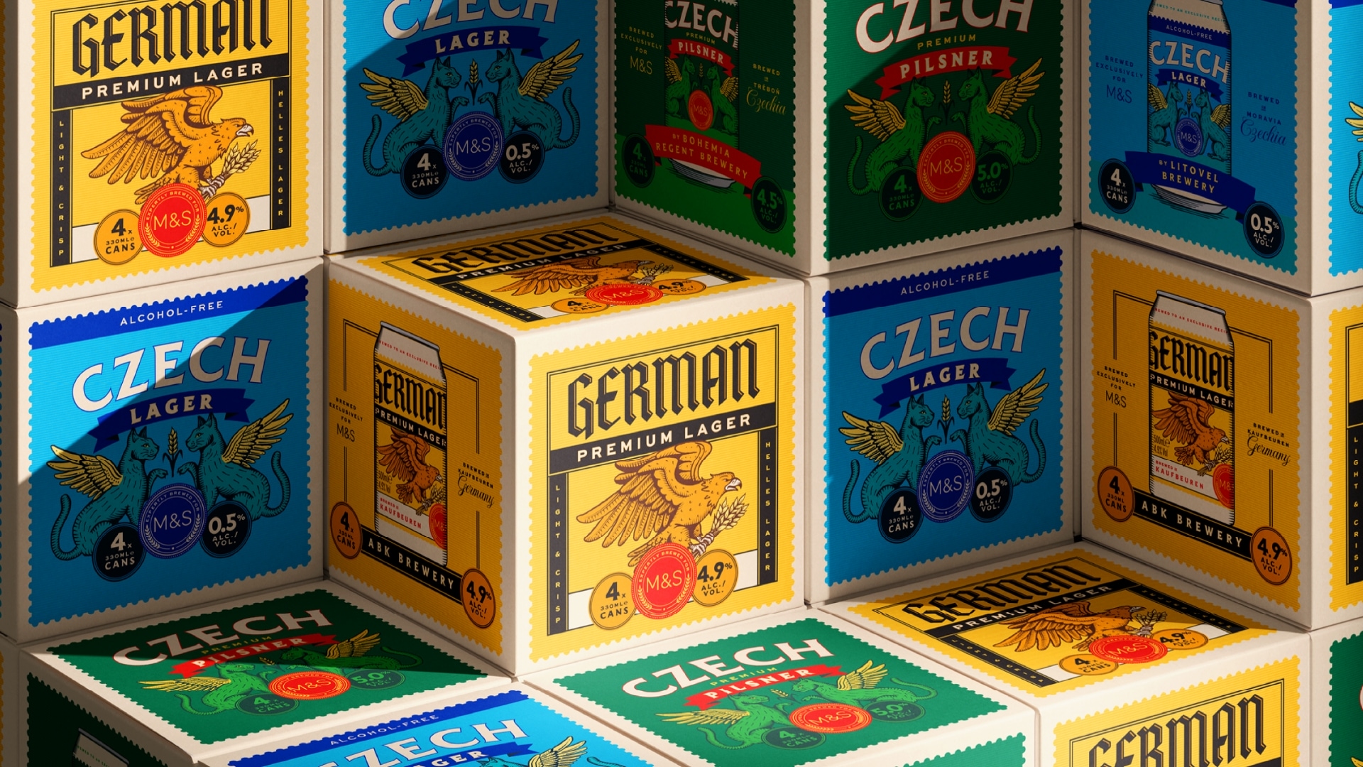
Spanning a richly detailed Continental range and a bold, modern Craft line-up, the work redefines what own-label beer can be, moving beyond functional packaging into something more expressive, authentic and engaging.
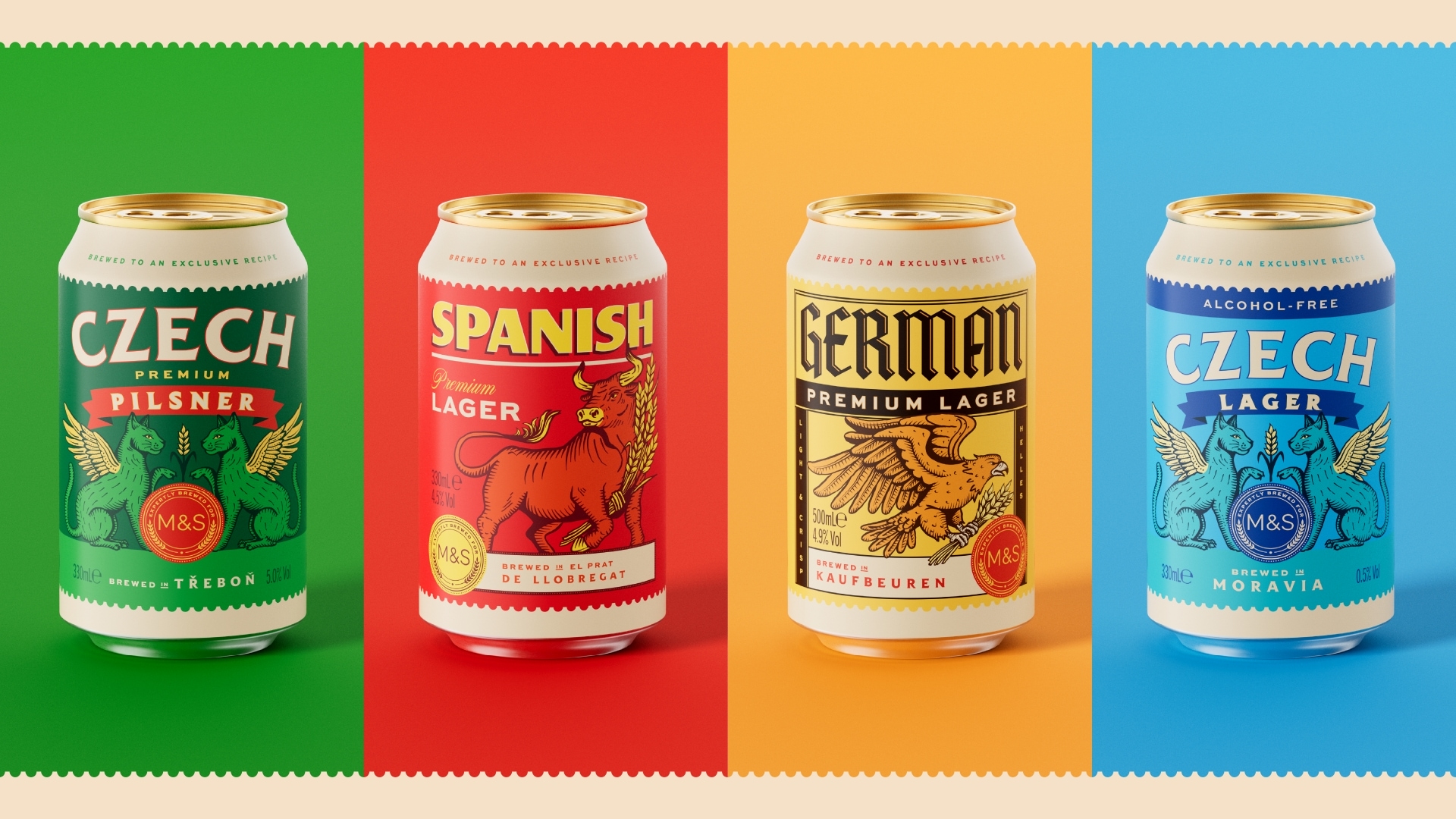
For the Continental range, the challenge was clear: communicate genuine provenance in a category where “continental” is often little more than a stylistic cue. Each lager in the range is brewed in its country of origin, and the design needed to reflect that authenticity while standing apart from both own-label and established global brands.
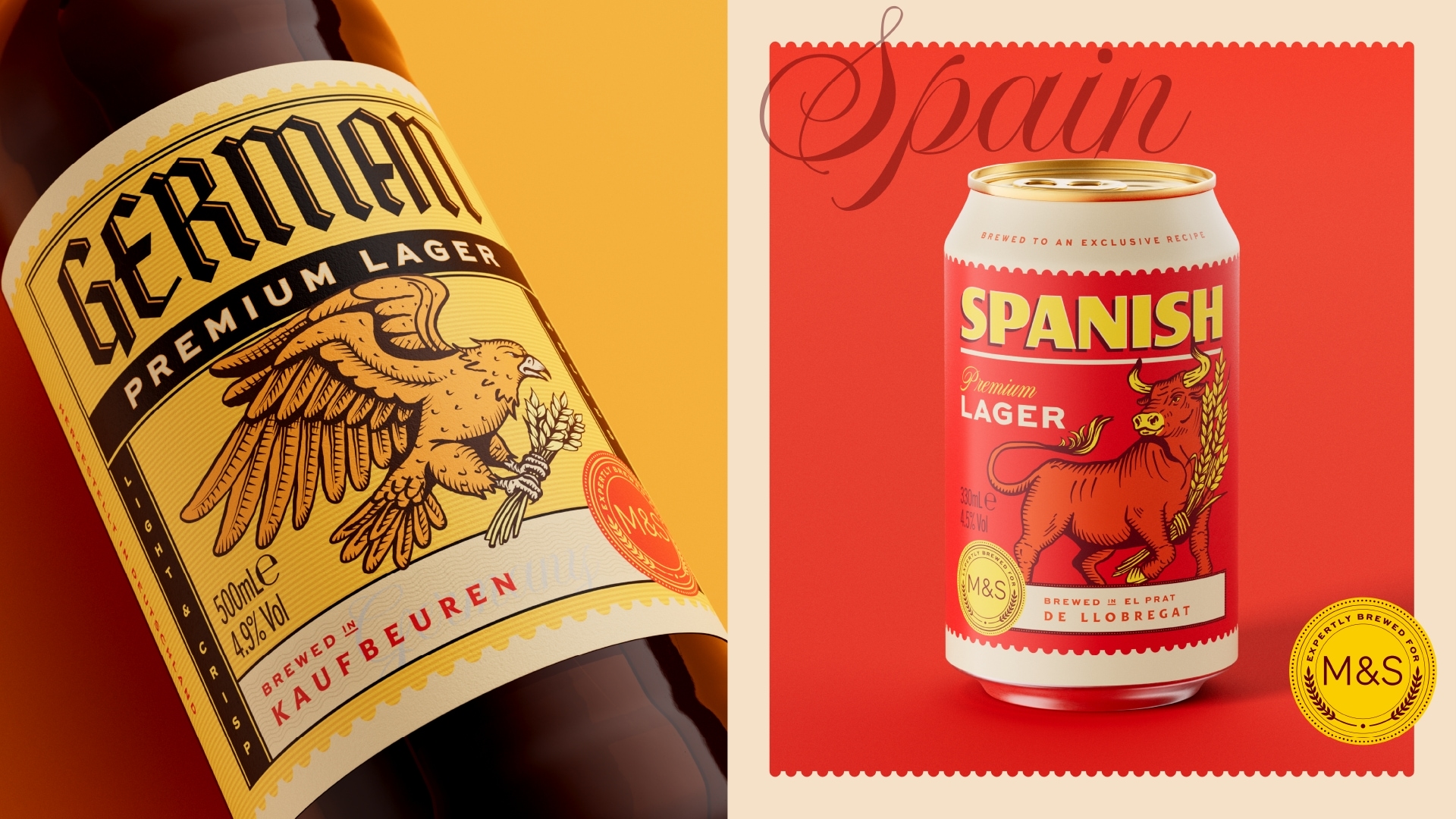
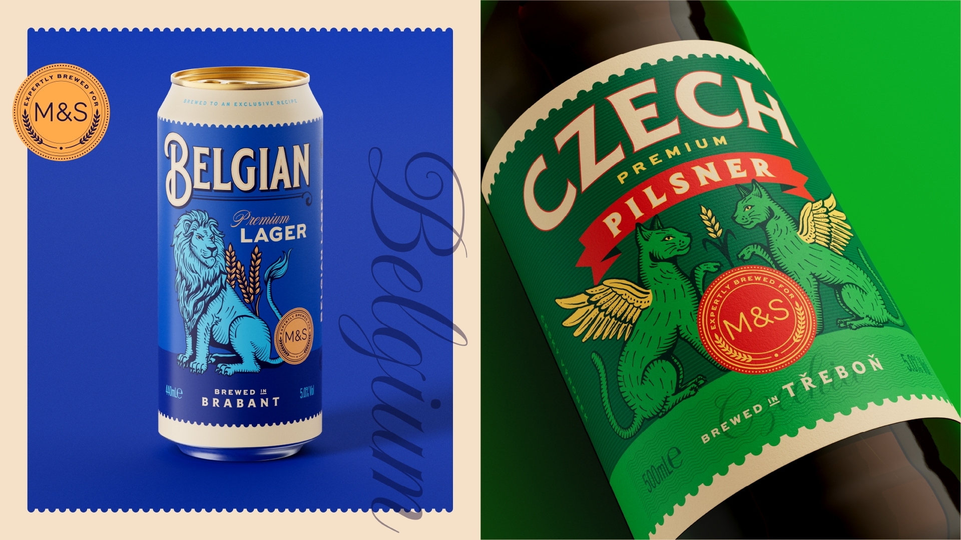
Thirst’s response was to build a storytelling system inspired by vintage postage stamps. Each beer becomes a destination, celebrating its origin through distinctive typography, bold colour and a unique illustrated mascot.
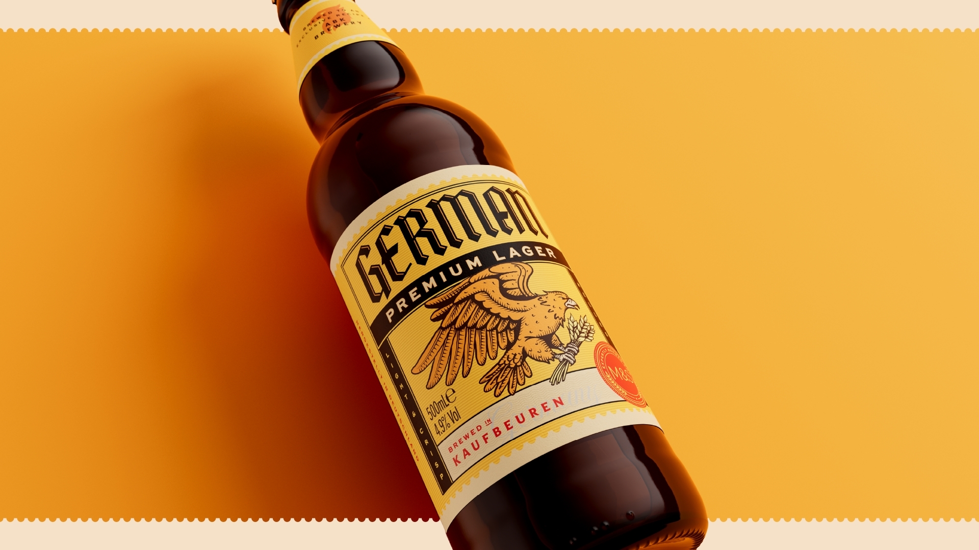
The stamp device creates a flexible but structured system, allowing each SKU to express its own character while remaining part of a cohesive whole. It also introduces a sense of collectability, encouraging shoppers to explore and engage with the range as a set.
Illustration plays a central role. Nationally significant animals from each country were brought to life in a modern etched style, referencing the intricate detailing of traditional stamp engravings. This layered visual language adds depth and craft, while reinforcing the idea of provenance and place.
Importantly, the design had to work across multiple production environments. With printing split across four different countries and limited finishing capabilities, the team focused on creating a premium feel through composition, detail and illustration alone rather than relying on embellishments such as foils or embossing.
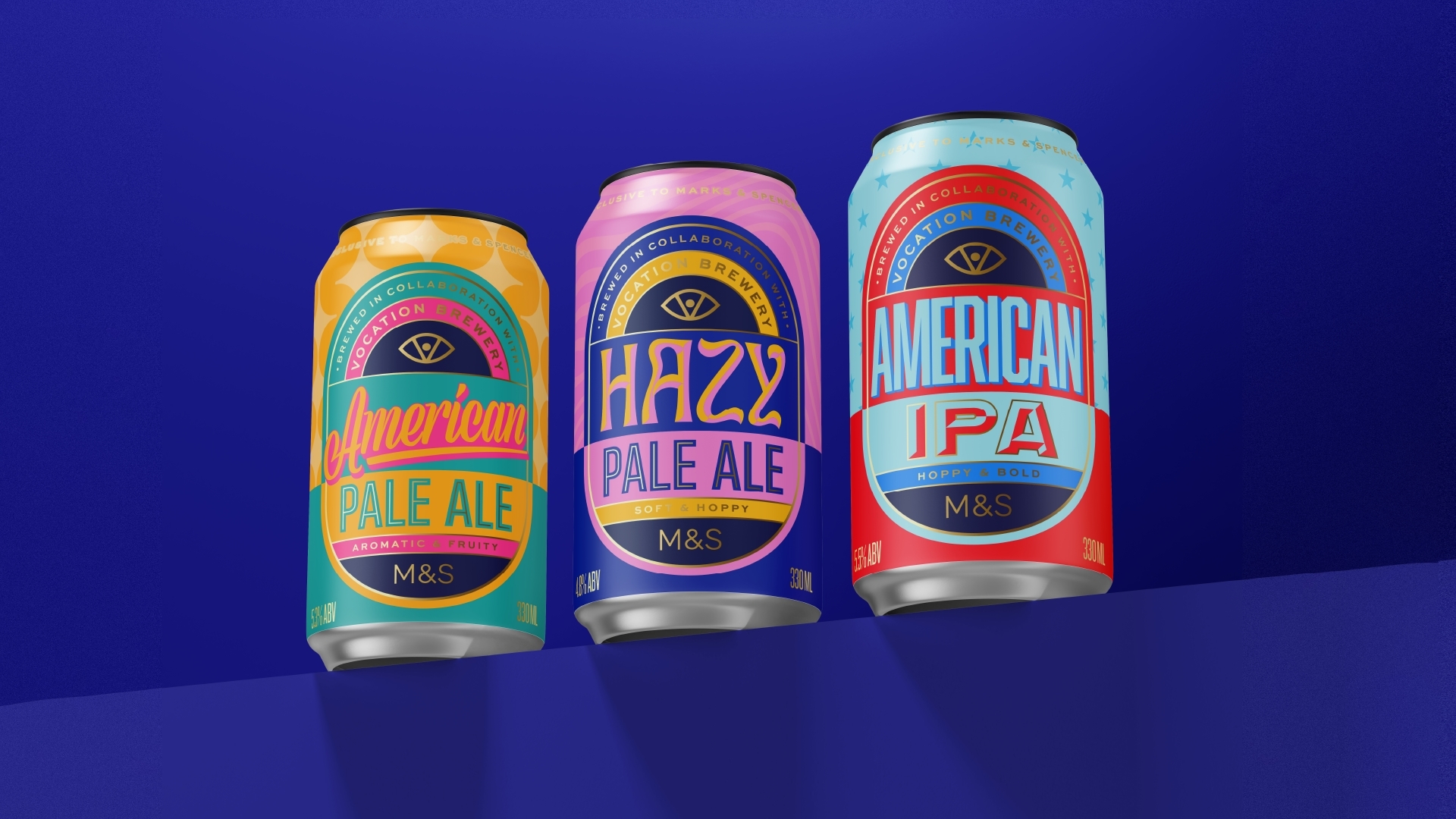
Alongside this, the Craft range takes a more direct, contemporary approach designed to hero brewery collaborations while still feeling cohesive across core, premium and alcohol-free variants.
A bold badge device sits at the heart of the system, elevating the brewery partnership to the top of the can, while M&S becomes a consistent sign-off and mark of quality. This shift in hierarchy brings greater clarity and credibility, positioning the beers firmly within the craft space.
The design language is expressive and flavour-led. Colour is used to reflect taste profiles, while typography adapts to each beer style from relaxed and easy-going for session beers, to wavy and fluid for hazy styles, and classic Americana-inspired type for US-led brews. Subtle tonal patterns and gold linework add depth and a premium feel, while ensuring the range remains visually engaging.
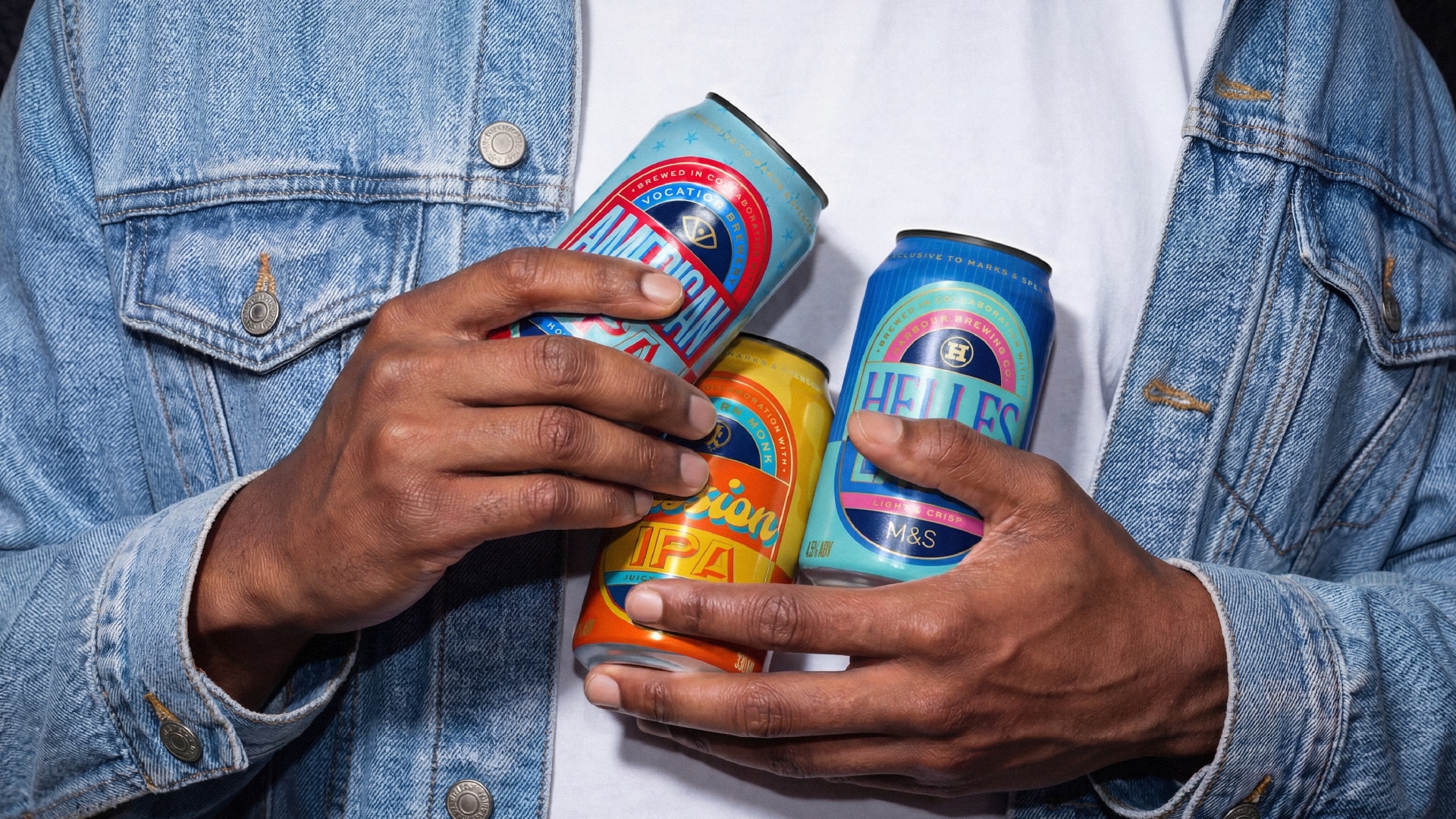
The system flexes across tiers. The premium range adopts a more tonal, restrained palette to reflect intensity, while the alcohol-free variants introduce white and blue cues to align with category expectations without losing the character and boldness of the wider range.
Together, the two ranges create a more dynamic and elevated beer offer for M&S, one that balances storytelling with clarity, and craft with consistency.
“We wanted to challenge the idea that own-label beer has to feel safe or predictable,” said Matt Burns, Executive Creative Director at Thirst. “For the Continental range, we leaned into storytelling and detail to celebrate where each beer comes from. The Craft range is more direct and expressive built around partnerships, flavour and personality. Together, they show how own-label can be just as confident and culturally relevant as anything in the independent space.”
Dave Bond, Designer at M&S, said: “Working with Thirst was a pleasure. They were tasked with redesigning both our Craft Beer and Continental Lager ranges simultaneously and delivered exceptional results across the board. From strategy through to final execution, the level of creativity and attention to detail was outstanding.
Their use of colour in particular stands out using palettes that feel fresh and contemporary, while still rooted in the visual language of beer. The new designs show a deep understanding of both the M&S brand and our customers. The difference from the previous range is night and day – this is a truly first-class outcome.”
Maddie Love, Product Developer at M&S, added: “Thirst have been a highly reliable and collaborative partner throughout. The team is clear in their communication, well organised, and efficient at every stage. Their design presentations made it easy for us to review options and make confident decisions, and the final result reflects a strong, well-managed process from start to finish.”
The new ranges are now rolling out across M&S stores, marking a step-change in how own-label beer is designed, positioned and experienced on shelf.
Source: Thirst
You must be logged in to post a comment Login