
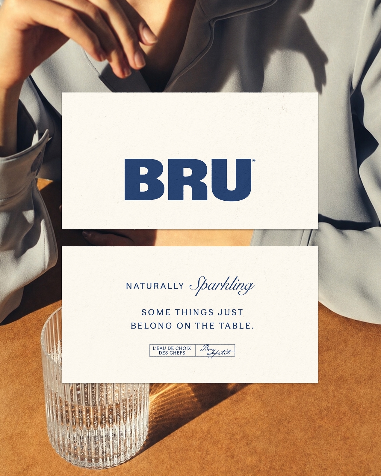
Long associated with fine dining, BRU had become increasingly perceived as distant and outdated. WeWantMore set out to change that, repositioning the brand from a restaurant staple to the finishing touch for the table, designed for every meaningful moment shared around food.
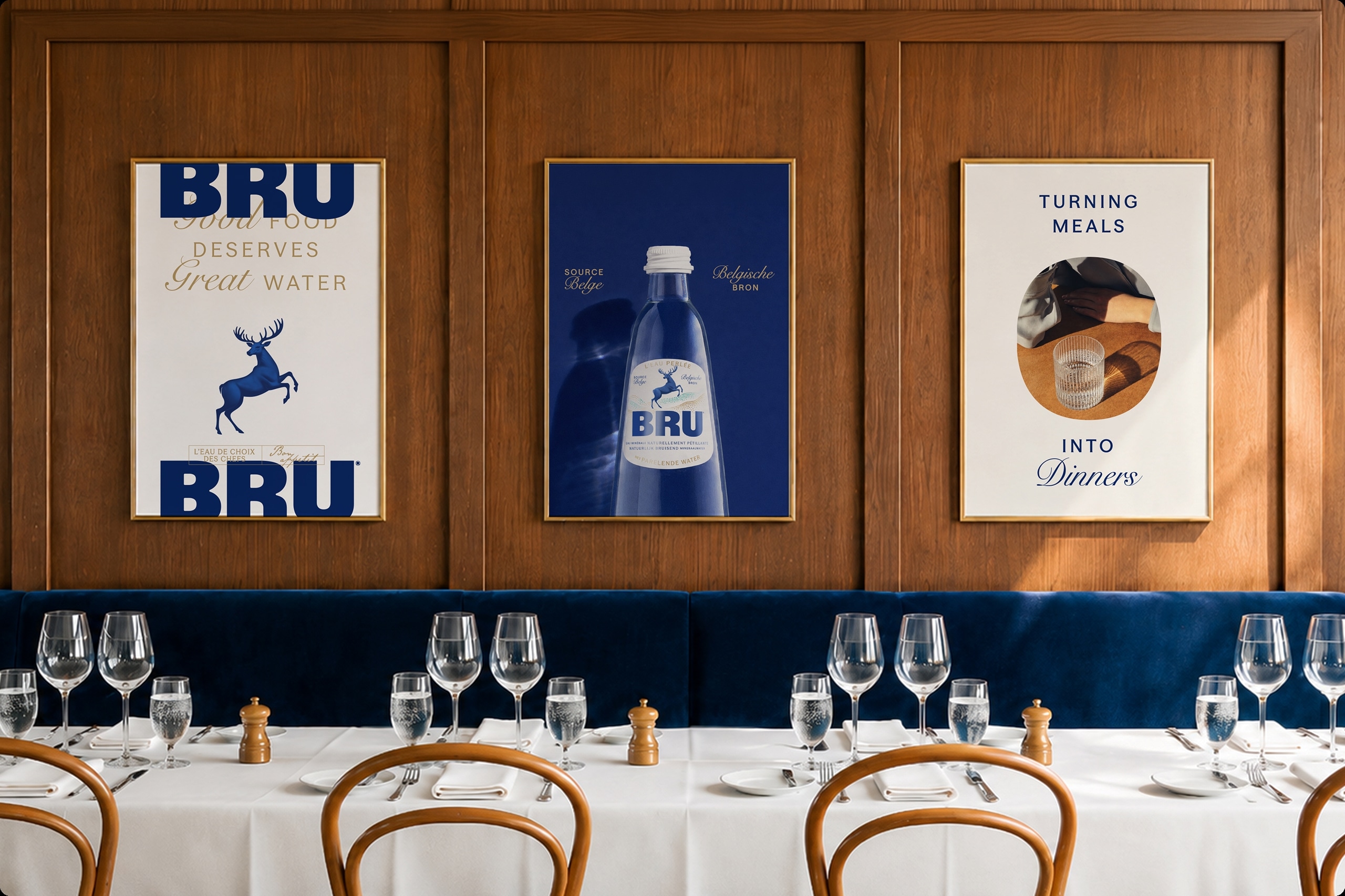
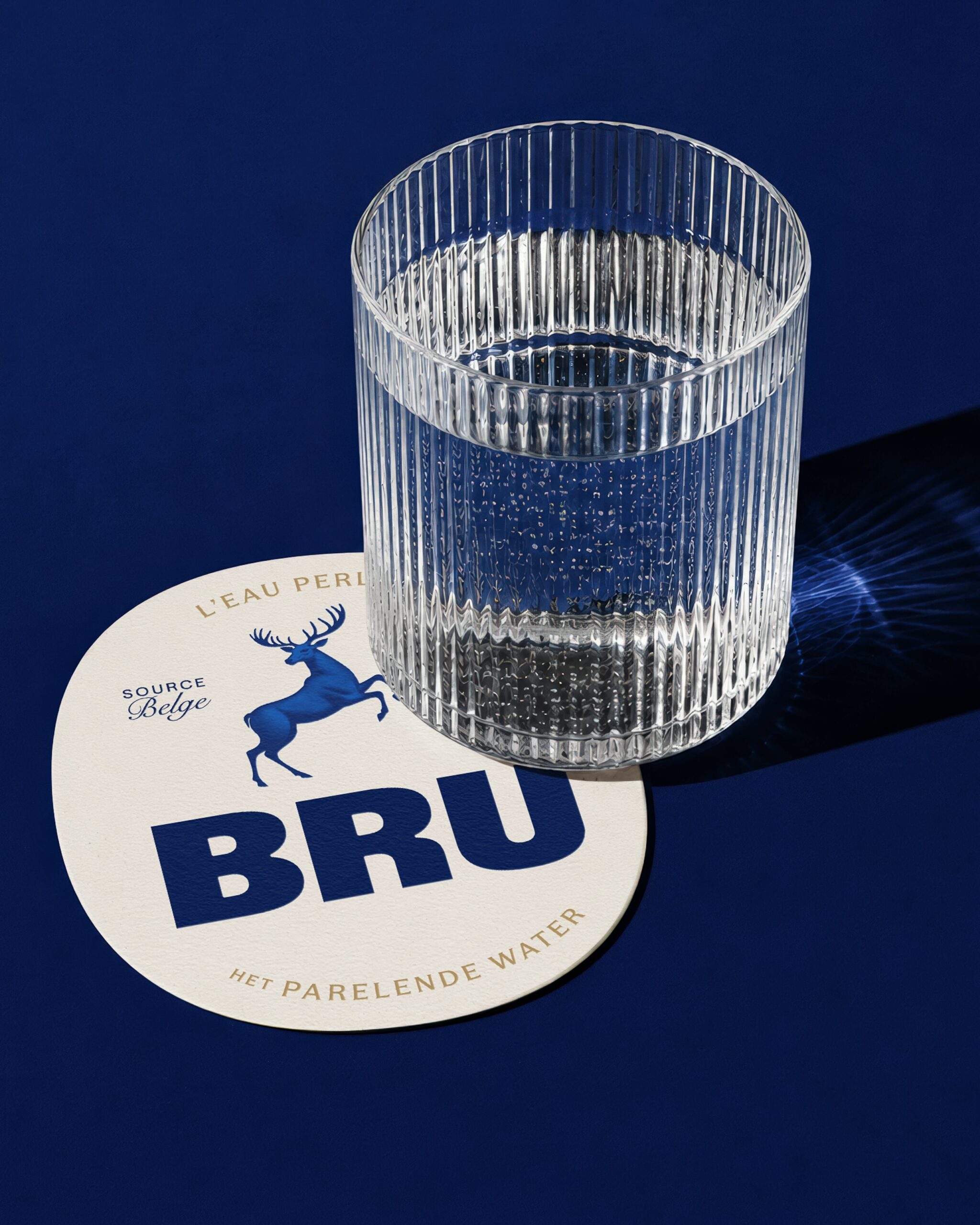
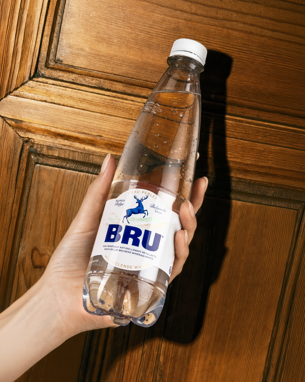
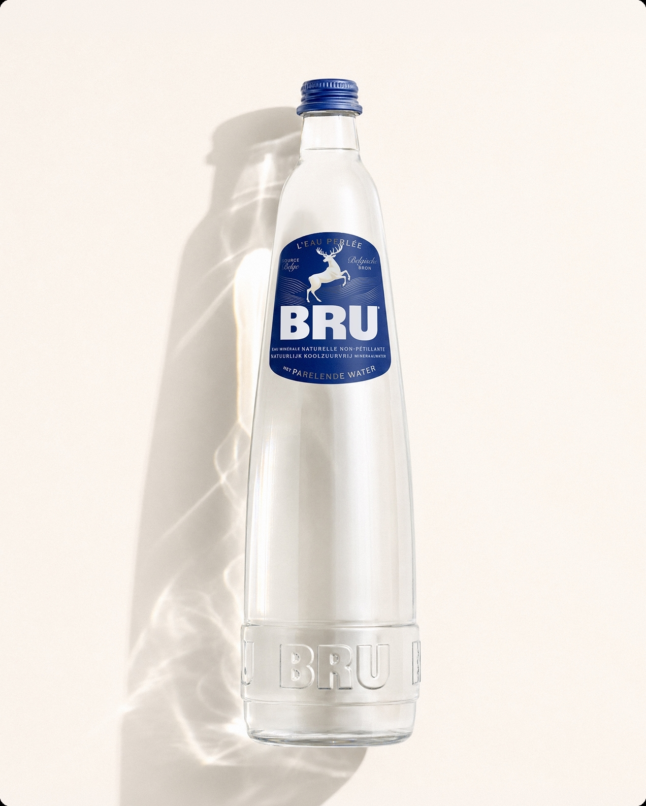
Central to the redesign was a shift in perspective: from shelf impact to table presence. Rather than creating packaging purely to stand out at the point of purchase, WeWantMore considered how BRU could become something people are proud to leave on display, a considered part of the table setting and the rituals of hosting.
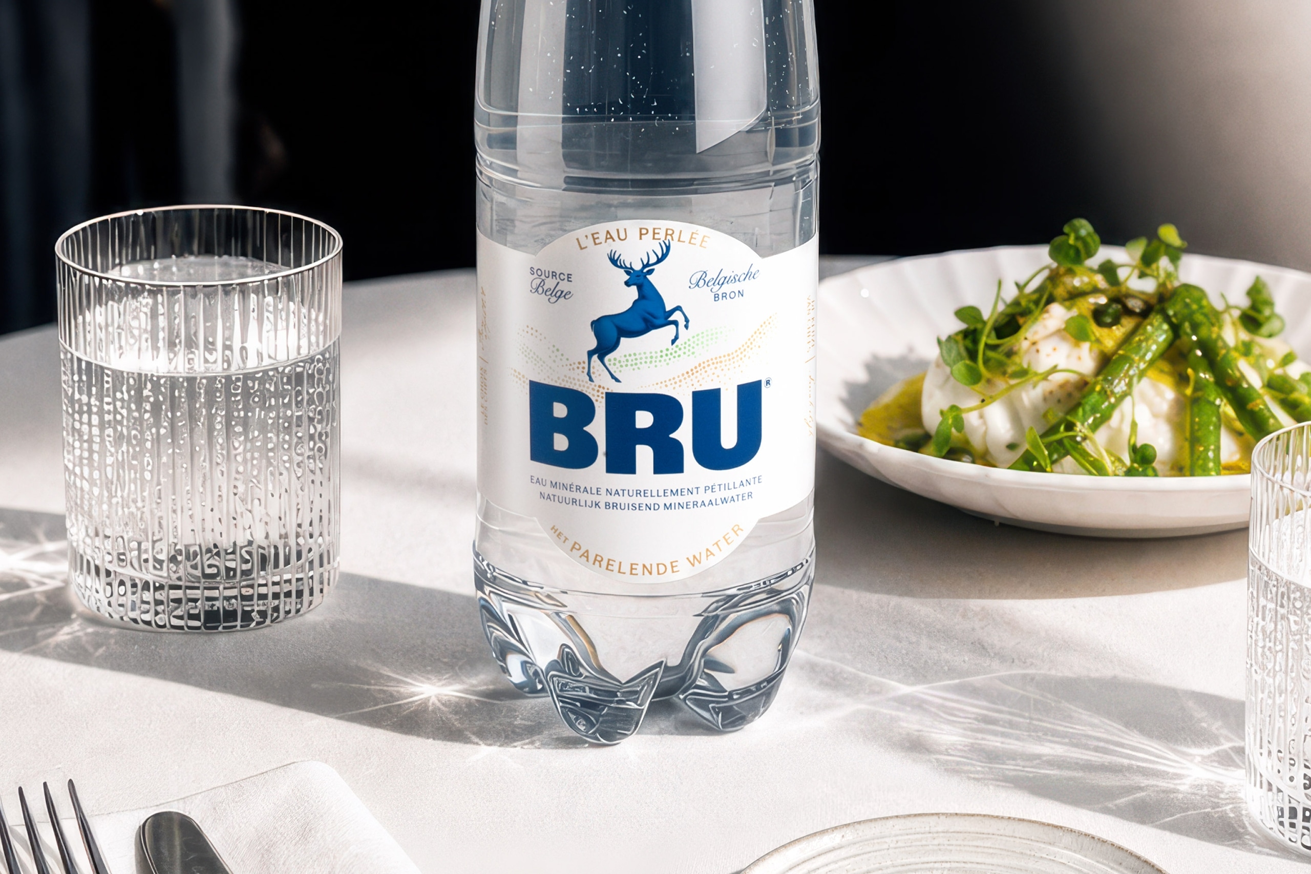
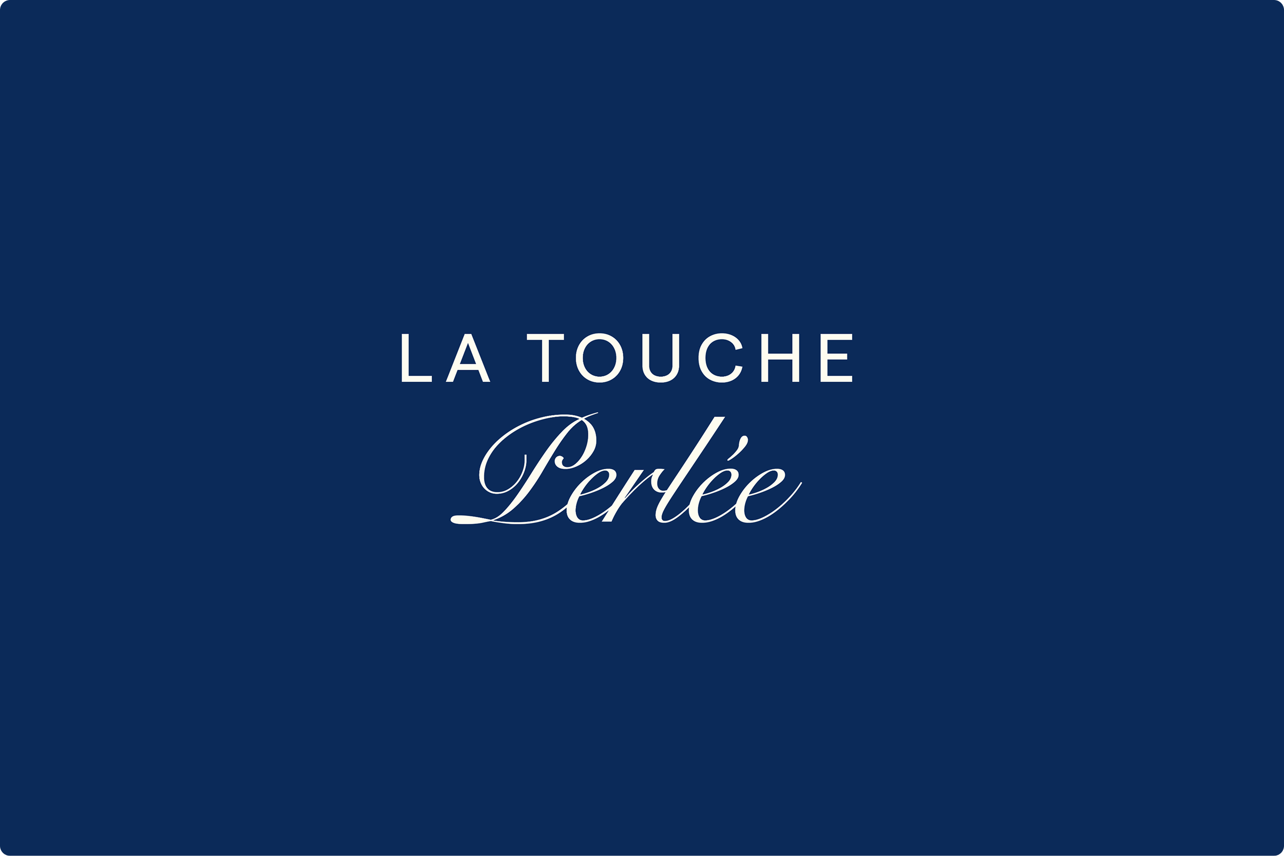
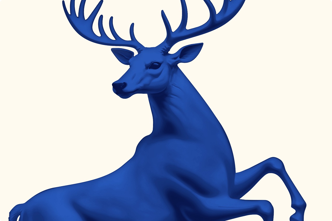
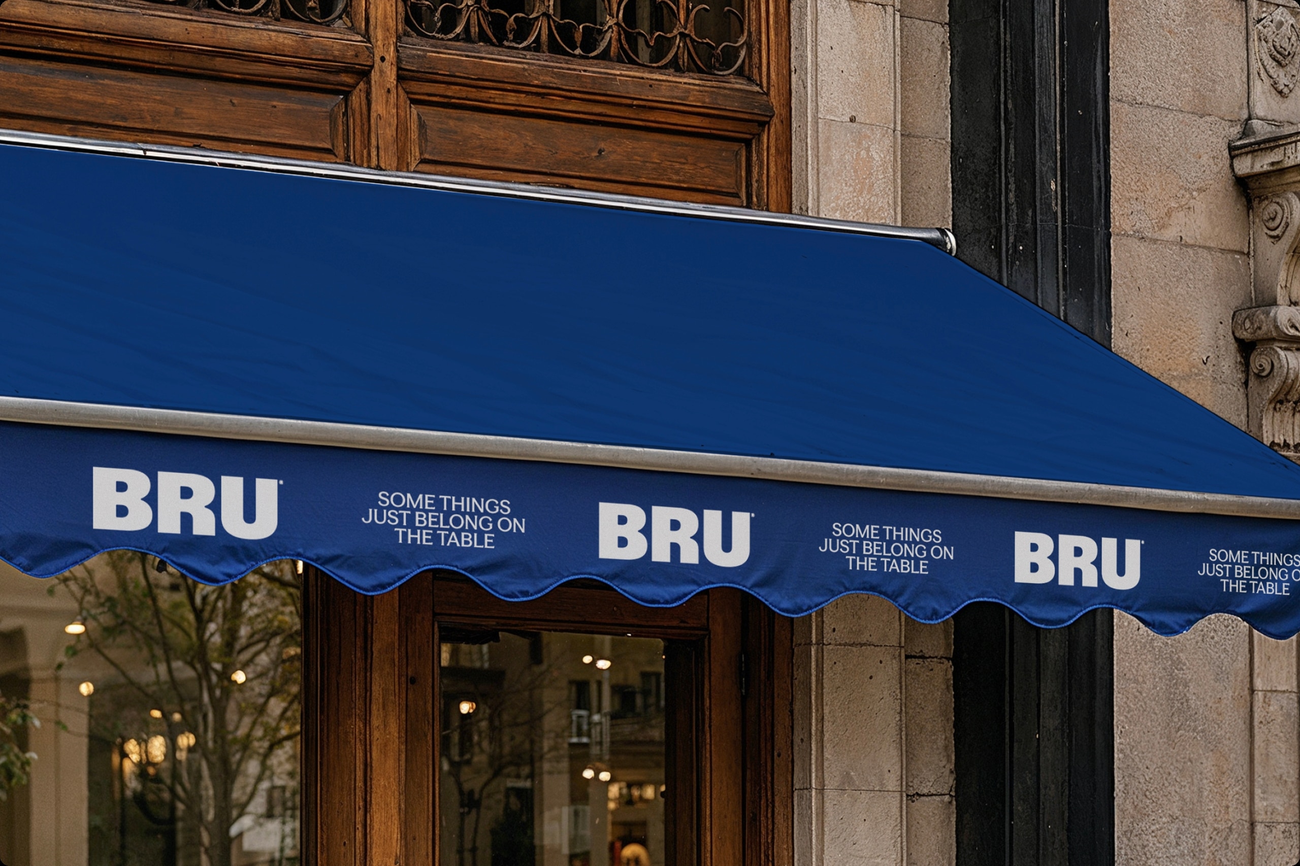
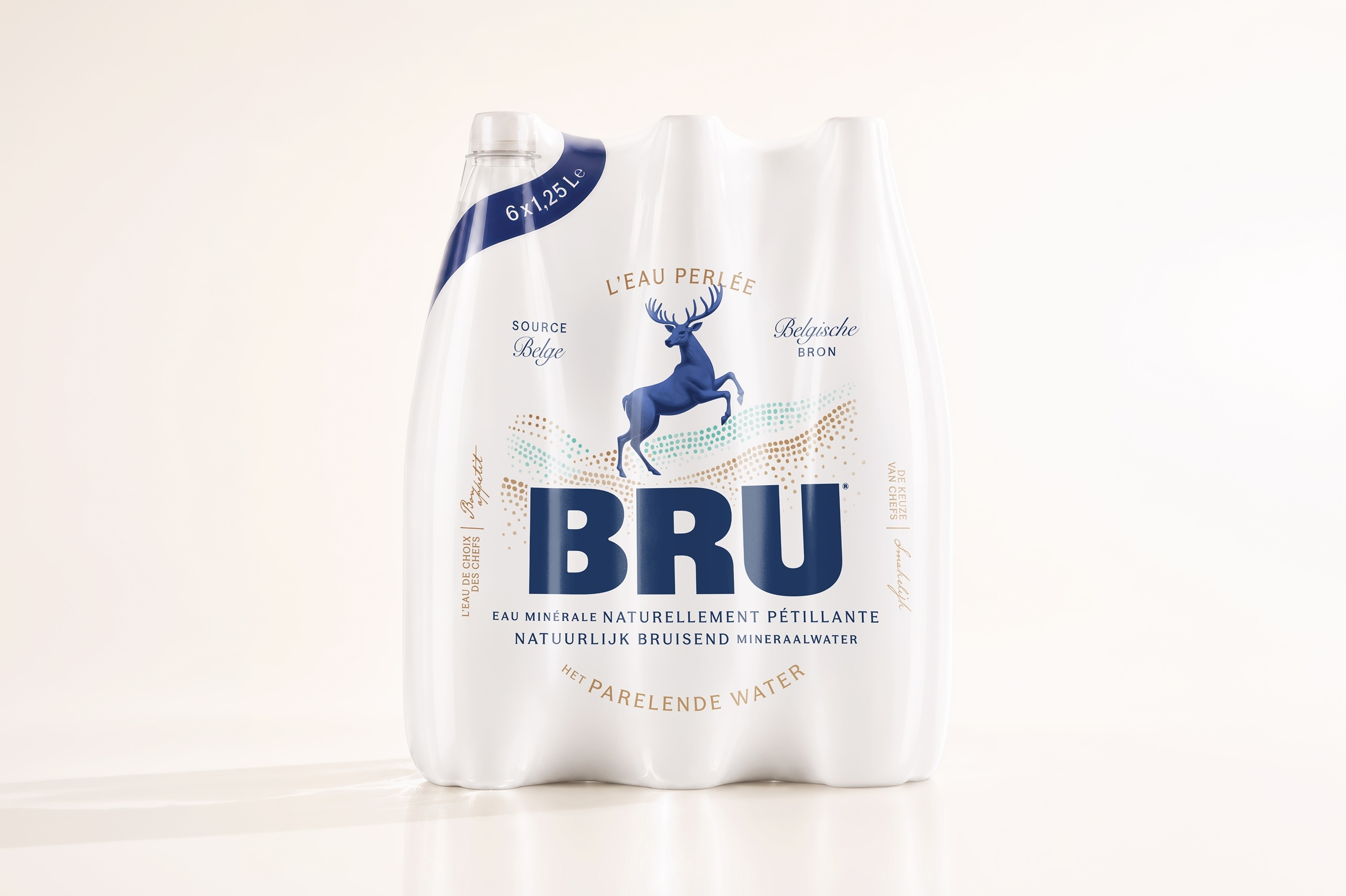
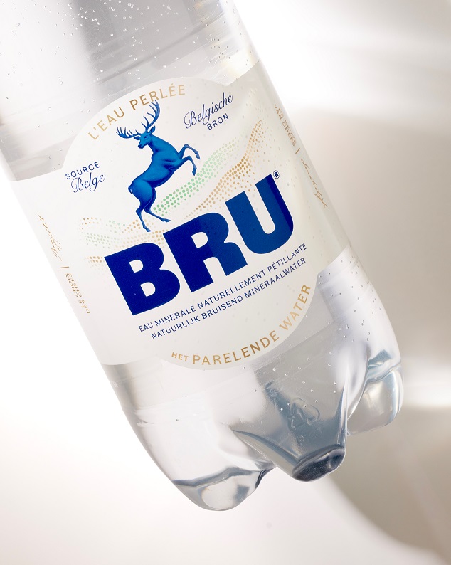
The refreshed identity draws on BRU’s heritage while bringing greater warmth and relevance to the brand. Its iconic stag has been modernised, while the pearl has been elevated to become BRU’s central symbol, creating a more refined and distinctive brand world without losing the familiarity built over generations.
The result brings BRU back to the heart of the table, celebrating the role design can play not only in how a product looks, but in the moments and rituals that surround it.
Source: WeWantMore
You must be logged in to post a comment Login