
When Gary Fish founded Deschutes Brewery 30 years ago in Bend, Oregon, less than 100 craft breweries dotted the landscape.
Today, over 7,000 craft breweries exist nationally. The huge increase in competition, along with concerns of oversaturation and slowing overall consumption trends, has created an inflection point.
The category is flooded with craft brewers large and small who have embraced quirky, whimsical branding.
“After 30 years, I realized that, in order to grow, we needed to evolve our marketing approach, starting with the Deschutes branding and packaging,” Fish says.
Rather than following the crowd, he reached back to his roots and chose a different direction: simple and bold to recapture his market and appeal to millennials who may not be familiar with Deschutes.
“Unlike many other craft brewers, we have a strong brand story that we can use to go against the grain and show how we do craft beer better than anybody else,“ Fish continues.
“If you look at the craft beer category now, it’s a sea of overwhelming visual noise,” says Simon Thorneycroft, Founder and Creative Director of San Francisco-based Perspective: Branding, who Deschutes engaged to create the packaging redesign.
“The category is completely flooded by products and styles, all looking the same by trying so hard to look different. Deschutes’ packaging was getting lost and we saw an opportunity to create clarity at the shelf by putting the brand and style first, then layering in some mystery through hidden stories. Elements of these stories start on one product, overlap and continue onto the next product on shelf,” he adds.
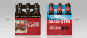
“Everyone knows that beer comes from a brewery, so we shortened the name on packaging to simply ‘Deschutes.’ By dropping the word ‘Brewery’ it gives the Deschutes name a bigger, bolder and more iconic presence that equates with its heritage and legacy as a true pioneer,” says Thorneycroft.
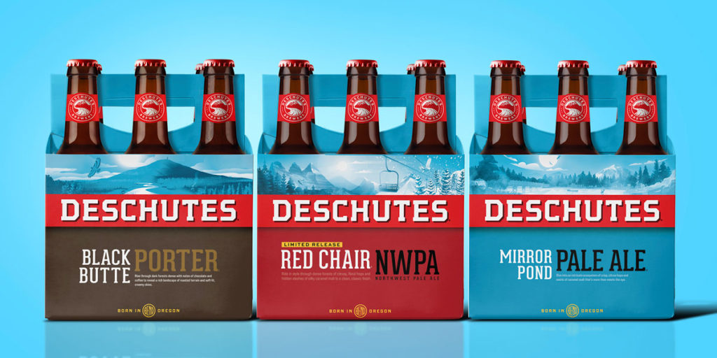
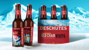
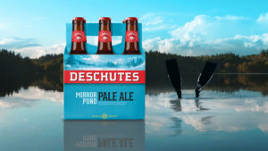
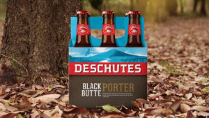
The new packaging design is a striking red and fresh blue, reflecting the colors of the soil and sky of Oregon, while also communicating refreshment, “which is something often overlooked in most craft beer branding,” says Thorneycroft.
The new Deschutes packaging design system is rolling out now beginning with Red Chair NWPA, a beloved seasonal available January to April. New products and redesigned packaging will continue to roll out throughout 2019.
Source: Perspective: Branding
You must be logged in to post a comment Login